Cart recovery
Abandoned Cart Recovery Without Popups
More popups are not always the answer to cart abandonment. Many shoppers leave because the cart or checkout becomes uncertain, interruptive, or easy to forget once they open another tab.
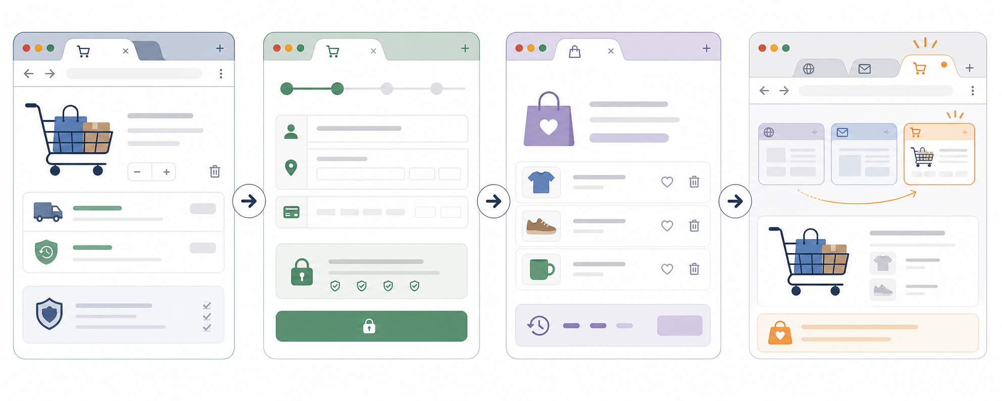
On this page
The quick answer
If you want abandoned cart recovery without popups, start with the path the shopper already chose.
- Make shipping, returns, taxes, and delivery timing easy to find before checkout.
- Keep the cart intact across return visits on the same device when possible.
- Reduce surprise costs and extra fields in checkout.
- Use permission-based email recovery for known shoppers.
- Add a short inactive-tab reminder only on cart or checkout pages where progress is preserved.
A popup can sometimes help, but it should not be your default fix for every abandoned cart.
Why carts get abandoned in the first place
Shoppers do not abandon carts for one reason. Some are not ready to buy. Some are comparing alternatives. Some get distracted. Others hit uncertainty at the worst possible moment.
- Shipping costs that appear too late.
- Return policies that are hard to find.
- Checkout forms that ask for more than they need.
- Coupon hunting that pushes the shopper into another tab.
- Cart progress that disappears when the shopper comes back later.
That matters because different causes need different fixes. A popup might remind someone to act, but it does not remove checkout friction or rebuild trust.
When popups help and when they hurt
Popups are not useless. A well-timed exit overlay can sometimes save a sale, especially for first-time visitors who are clearly leaving and have not seen key information yet.
The problem is that many stores use popups as a shortcut. They cover the cart, interrupt checkout, or train shoppers to ignore the interface before the real issue is solved.
| Helpful use | Poor use |
|---|---|
| Revealing missing information a shopper actually needs, such as delivery timing or return reassurance. | Blocking checkout with another offer when the shopper is already trying to finish. |
| Offering recovery for a truly leaving visitor after obvious friction has been reduced. | Showing the same overlay on product, cart, and checkout pages without context. |
| Testing a targeted intervention on a narrow set of cases. | Treating every abandonment problem like an attention problem. |
Lower-friction cart recovery options
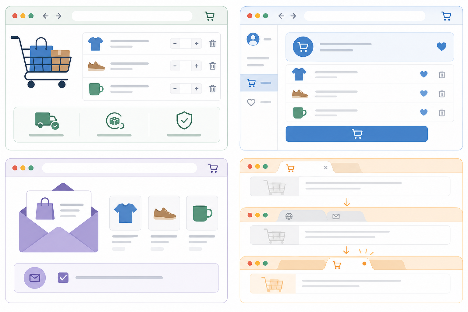
- Make shipping and returns obvious earlier. Show shipping expectations on the product page or early in the cart, and keep return information close to the cart summary.
- Remove checkout surprises. Reduce unnecessary fields, keep costs visible, and make checkout errors specific.
- Save the cart state. Preserve items, quantities, and variants so the shopper can resume without redoing work.
- Use permission-based email recovery. Link the shopper back to a stable cart or checkout state only when you have a legitimate contact basis.
- Use exit and inactive-tab reminders carefully. Wait until the tab is hidden, then use one or two calm titles instead of a loud loop.
- Use retargeting only when appropriate. Bring shoppers back after the on-site experience is sound, not before.
Which option should you use first
| If the main problem is... | Start with... | Not with... |
|---|---|---|
| Shoppers cannot find shipping or return details. | Earlier cart and product-page clarity. | A discount popup that appears before they understand the offer. |
| Shoppers drop during checkout. | Fewer fields, visible costs, and clearer errors. | More overlays in the checkout flow. |
| Shoppers come back later and lose progress. | Saved cart state and stable return links. | Reminder copy that promises saved progress you do not actually keep. |
| Known shoppers leave before buying. | Permission-based email recovery linked to the real cart. | A site-wide popup shown to every visitor. |
| Shoppers compare tabs and forget to come back. | A calm inactive-tab reminder on cart or checkout pages. | Aggressive title loops or fake urgency. |
A practical cart recovery stack
- Fix cart and checkout clarity first.
- Preserve cart state.
- Add permission-based follow-up for known shoppers.
- Add a lightweight inactive-tab reminder on cart and checkout pages.
- Test discounts and retargeting after the basics are solid.
That order matters. It keeps you from solving a trust or usability problem with a louder message.
Browser tab title examples for carts
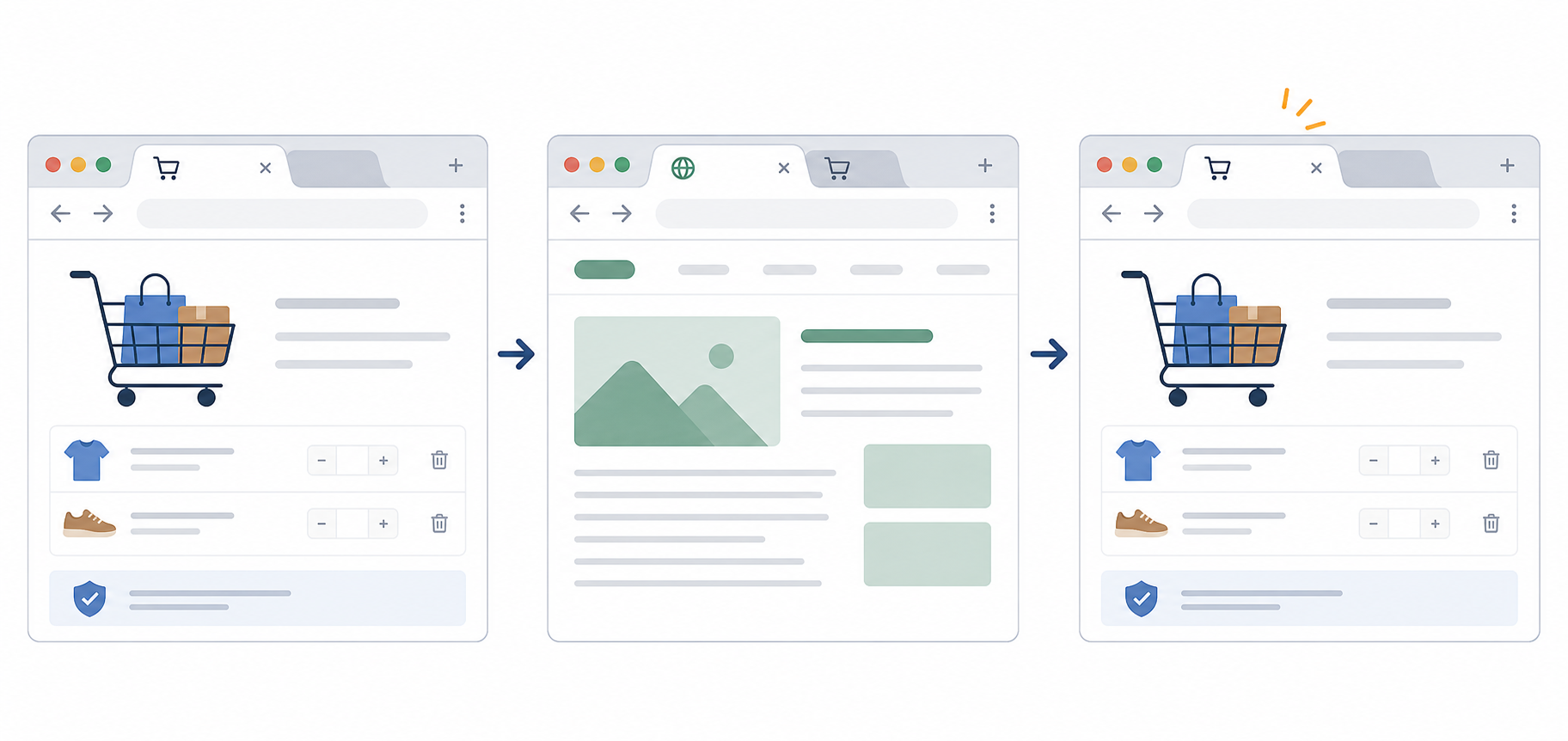
| Page context | First title | Second title | Use when |
|---|---|---|---|
| Cart page | Cart waiting | Your items are here | The cart state is preserved and easy to resume. |
| Cart with saved variants | Your size is saved | Cart waiting | The selected variant really remains selected. |
| Checkout step | Checkout is open | Finish when ready | The shopper can return to the same checkout step. |
| Saved cart account page | Saved for later | Cart is ready | The account keeps intentional saved items. |
If you want more copy patterns and tone boundaries, read the browser-tab message examples guide.
- "Buy now or lose it"
- "Do not leave your cart"
- "Claim your discount now"
- "You forgot something important"
Good use versus poor use for cart reminders
| Good use | Poor use |
|---|---|
| A calm reminder on a saved cart or checkout page after the tab becomes hidden. | Running title changes on every page, including the homepage and product gallery. |
| Restoring the original title as soon as the shopper comes back. | Leaving the reminder title in place after return. |
| Matching the message to real cart state. | Saying "Cart saved" when the cart is not actually preserved. |
| Using one or two slow title changes. | Flashing many titles or using aggressive countdown language. |
Test before shipping
- Add products to the cart and switch to another tab.
- Confirm the cart state remains intact when you come back.
- Check that the first reminder appears only after the tab is hidden for the chosen delay.
- Verify the reminder still makes sense when the tab is narrow and partially truncated.
- Return to the cart and confirm the original page title restores immediately.
- Complete checkout from the recovered session and make sure nothing about the reminder breaks form state or payment steps.
- Ask one teammate whether the message feels helpful, neutral, or pushy.
Start with an 8 to 12 second delay and a 4 to 6 second pace between two alternate titles. Slow it down if the copy feels noisy.
Mistakes to avoid
- Discounting too early before you know whether clarity or trust is the real problem.
- Covering the cart or checkout with another overlay.
- Using guilt-heavy copy that makes the shopper feel watched.
- Pretending a cart is saved when it is not.
- Sending recovery email without a clear permission basis.
- Running inactive-tab reminders on product discovery pages where there is no meaningful saved progress.
Where TitleFlash fits
TitleFlash fits when you want to build and preview a calm cart reminder after the checkout basics are already in place. You can draft a short sequence, test how it behaves after the tab becomes inactive, and export a self-contained script for your store.
The exported script is the runtime. It does not call TitleFlash after installation, does not load a TitleFlash CDN, and does not send visitor analytics back to TitleFlash.
Final checklist
- Shipping and returns are easy to find before checkout.
- Checkout does not introduce unnecessary surprise costs or fields.
- The cart state is preserved across a realistic return visit.
- Email recovery is permission-based and lands on the real cart state.
- Inactive-tab reminders run only on cart, checkout, or saved-item pages.
- The first reminder waits until the shopper has actually switched away.
- The copy is short, calm, and tied to real saved progress.
- The original page title restores as soon as the shopper returns.
Build a cart reminder tab flow.
Draft the messages, preview the inactive-tab moment, and export a script you control when you are ready.
Build a tab-title flow free