No. The exported script is under 2 KB minified and runs in an isolated scope.
It only listens for tab visibility changes. No network calls, no DOM scraping,
no rendering work.
Do I have to sign in to try it?
No. Open the builder anonymously, draft a flow, and preview it locally. You only
sign in when you want to save across devices or export the production script.
What if I cancel? Does my installed script stop working?
No. The script you installed is yours. It never phones home. Cancellation only
stops new edits and exports from the builder.
Where can I install it?
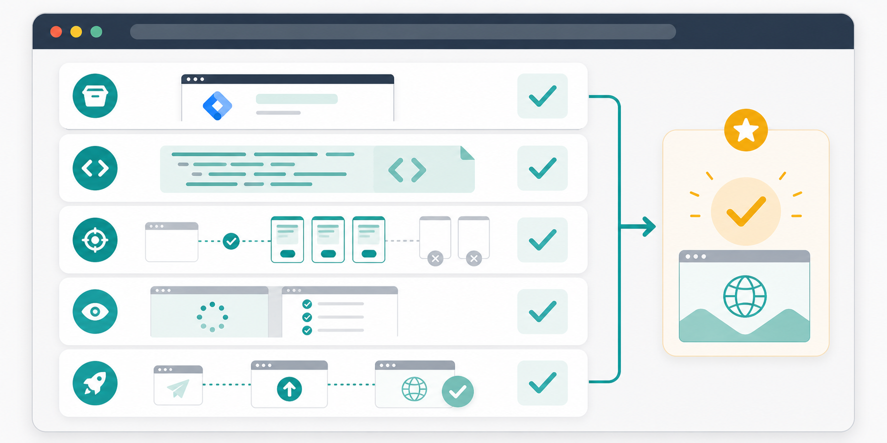
Anywhere custom JavaScript runs: direct HTML, Google Tag Manager, Webflow,
Shopify, WordPress, Framer, Squarespace, and most other CMS or page builders.
Is the message visible on the visible tab?
No. Titles only change after the visitor switches tabs, and they restore the
original title when the visitor returns. Your active page content is untouched.
Can I A/B test messages?
Not in v1. You can rotate a sequence of messages, edit and re-export anytime,
and use page-rule scoping. Multivariate testing is on the roadmap.
Ship in five minutes
Bring abandoned tabs back to life.
Open the builder, write your sequence, preview the inactive-tab moment, and
copy the self-contained script.
A small library for marketers, founders, and site owners who want respectful
visitor attention ideas without adding noisy popups or heavy runtime tracking.
How to Bring Visitors Back After They Leave Your Browser Tab
Visitors do not always reject your page. Often they open another tab, compare
options, answer a message, or simply forget what they were doing. This guide is for
site owners who want a practical way to make return visits easier without covering
the page people are actively using.
Published by TitleFlash.
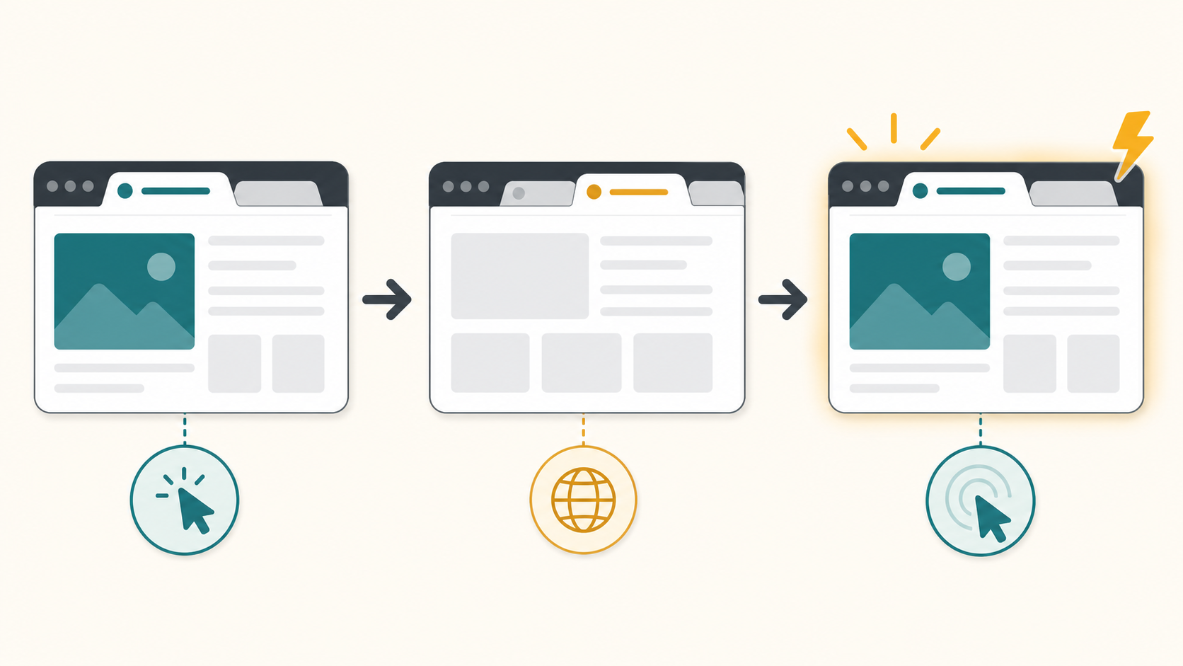
A respectful tab-title reminder works after the visitor switches away, then restores
the original title when they return.
Why abandoned tabs happen
A visitor can leave your tab for reasons that have nothing to do with dislike.
They may be comparing prices, checking a review, waiting for a teammate, or
opening several tasks at once. Once your page becomes a background tab, your
headline, button, and offer are no longer visible.
That does not mean you should chase them everywhere. It means your site should
make it easy to resume the task they already started.
The quick answer
Before adding any reminder, make the original page easier to resume. A good
recovery flow feels like a bookmark for an unfinished task, not an alarm.
Make the page's main promise and next action obvious on return.
Preserve the visitor's cart, form, filter, or reading state when possible.
Use an inactive-tab title only after the visitor switches away.
Keep the message short enough to understand in a crowded browser tab.
Restore the original title as soon as the visitor comes back.
What bringing visitors back can and cannot mean
Bringing visitors back means giving them a clear, respectful path back to the
page they chose to open. It can remind them that a cart, comparison, signup, or
article is still waiting.
It cannot fix a confusing offer, a broken checkout, or a page that asks for too
much too soon. It also should not pretend to know more than it does. If you do
not have permission to contact someone, stay inside the browser experience they
already opened.
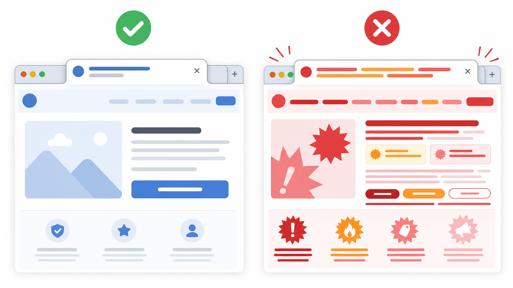
Helpful use
Poor use
Reminding someone that a cart, article, pricing page, or setup flow is still open.
Trying to rescue a page that is confusing, slow, or missing the next step.
Using calm copy that matches the page the visitor chose to leave open.
Using guilt, fake scarcity, or messages unrelated to the visitor's task.
Changing the title only while the tab is in the background.
Changing titles while the visitor is reading, checking out, or filling a form.
Five practical ways to recover attention
Improve the first screen.
A returning visitor should know what the page is, why it matters, and what to
do next within a few seconds. Fix that before trying any reminder tactic.
Make the next action visible.
Checkout, demo booking, signup, download, or continue-reading actions should
be easy to find after the visitor comes back.
Save state.
Preserve carts, form progress, filters, selected plans, and unfinished tool
input whenever possible. A reminder is much more useful when the page still
remembers the visitor's place.
Use permission-based follow-up.
Email and cart recovery are useful when the visitor has opted in, logged in,
or otherwise given you a legitimate reason to follow up.
Use tab-title reminders after they switch away.
A short inactive-tab title can keep your page recognizable without adding a popup
to the page they are actively using. It works best when the page has a clear
unfinished task.
Example tab-title flows
Keep the copy short. Browser tabs cut off long messages quickly, so the first
two or three words need to carry the meaning. Aim for two to four words when
you can.
Site type
Use when
Title sequence
Why it works
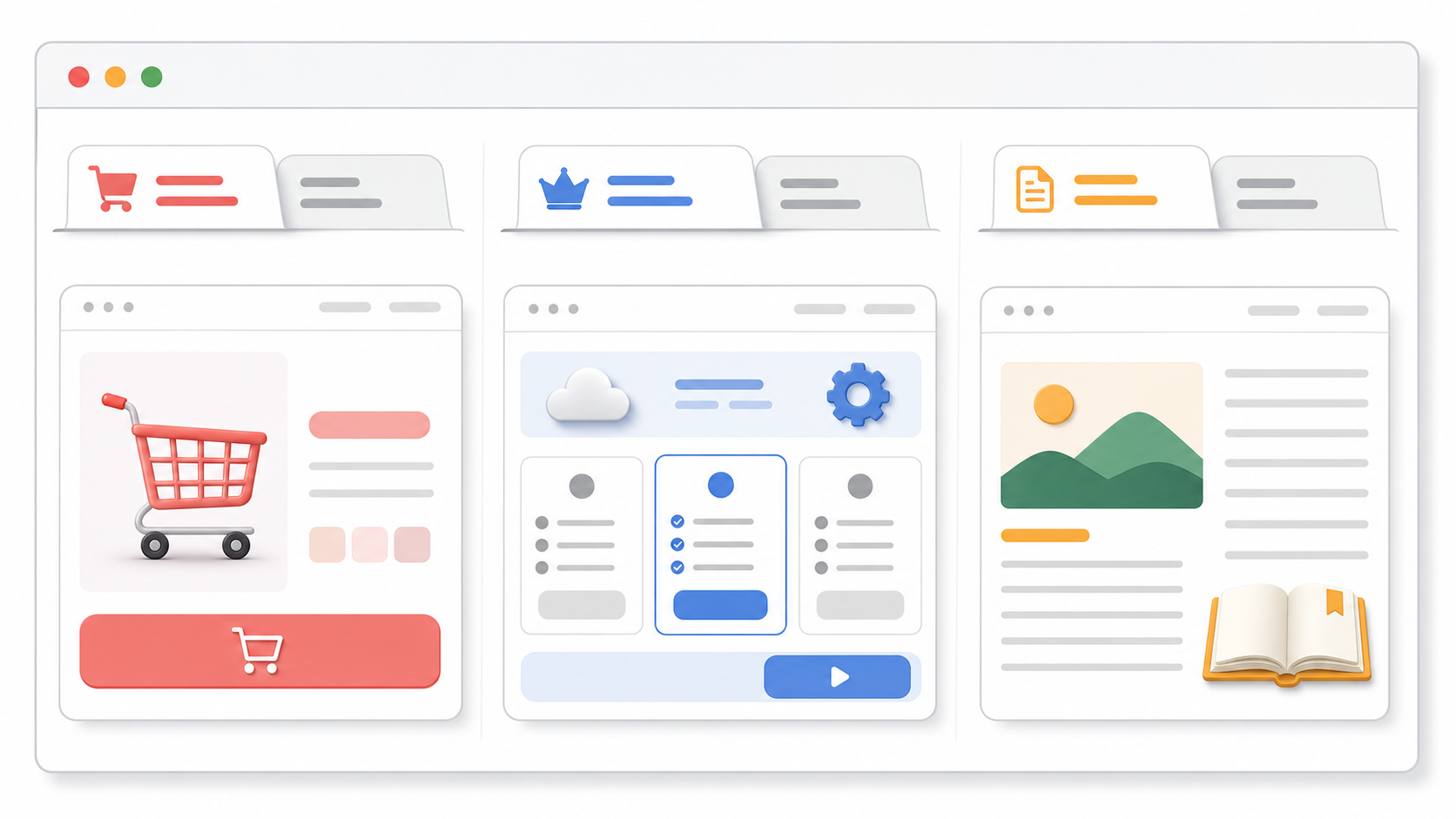
Ecommerce
The visitor left a cart, product, or checkout page open.
Still deciding? / Cart waiting
It points back to the unfinished shopping task without pressure.
SaaS
The visitor is comparing plans, demos, or signup options.
Still comparing? / See the plan
It matches the evaluation moment and keeps the next step visible.
Content
The visitor left a long article, lesson, or resource page.
Finish this guide / Saved for you
It reminds the reader that the page is still useful when they return.
A calm timing recipe
Treat this as a starting point to test, not a universal rule. The goal
is to stay visible without making the tab feel noisy.
Page moment
Delay after tab switch
Rotation pace
Message count
Cart or checkout
8 to 12 seconds
Every 4 to 6 seconds
Two short titles
Pricing or demo page
10 to 15 seconds
Every 5 to 8 seconds
One or two titles
Article or guide
15 to 25 seconds
Every 8 to 12 seconds
One calm title
Wait until the tab is hidden.
Do not change the title while the visitor is active on the page.
Add the chosen delay.
Start the first alternate title only after the tab has been inactive for a few
seconds.
Use one or two alternate titles.
More messages usually make the browser tab harder to understand.
Rotate at a readable pace.
Give each title enough time to be read. Avoid rapid flashing or urgent loops.
Restore the original title on return.
The visitor should immediately know they are back on the page they opened.
Test it before you ship
A tab-title reminder is easy to overdo. Test the actual browser behavior before
adding it to a live page.
Open the page in a browser with several other tabs already open.
Switch away and confirm the title does not change immediately.
Check that the first visible words still make sense when the tab is narrow.
Return to the page and confirm the original title restores right away.
Ask one person who did not write the copy whether the reminder feels useful or pushy.
Mistakes to avoid
Flashing too fast.
Rapid title changes feel noisy and can make the tab harder to identify.
Guilt-heavy copy.
Messages like "Don't abandon us" or "You forgot this" can make a useful
reminder feel manipulative.
Long messages.
If the important words are at the end, most visitors will never see them in
the tab.
Changing the title while the visitor is active.
The page title should stay stable when the visitor is reading, buying, or
filling out a form.
Where TitleFlash fits
TitleFlash is useful when you want to write, preview, and export a tab-title
reminder without asking a developer to hand-code it. You can build the sequence,
check how it looks in the inactive-tab state, and copy a self-contained script
for your site.
The exported script is the runtime. It does not call TitleFlash after
installation, does not load a TitleFlash CDN, and does not send visitor
analytics back to TitleFlash.
Final checklist
The page has a clear reason to come back, such as a cart, comparison, form, or article.
The page makes its main value and next action clear.
Carts, forms, tools, or reading progress are saved when practical.
Any email or cart follow-up has permission behind it.
The inactive-tab title changes only after the visitor switches away.
Each title message is short enough to understand in a browser tab.
The original page title restores when the visitor returns.
The reminder copy is calm, specific, and related to the page they left.
Try it
Build a respectful tab-title flow.
Draft the messages, preview the inactive-tab moment, and export a script you
control when you are ready.
Best Browser Tab Title Messages for Ecommerce, SaaS, and Content Sites
The hard part is not changing the browser tab title. The hard part is writing a
message that feels helpful in a small browser tab. This guide gives reusable
inactive-tab title examples you can adapt, test, and ship without making your site
feel pushy.
Published by TitleFlash.
The best message usually names the unfinished task: a cart, a plan comparison, or a
piece of content the visitor meant to finish.
The quick answer
The best browser tab title messages are short, calm, and tied to the unfinished
task.
Ecommerce: "Still deciding?", "Cart waiting", "Your size is saved", "Checkout is open".
SaaS: "Still comparing?", "See the plan", "Demo details here", "Finish setup".
Content: "Finish this guide", "Saved for you", "Keep reading", "You were here".
Use one question or reminder first, then one more specific follow-up if the page
has a clear next action. If the message does not make sense when only the first
two or three words are visible, rewrite it.
What makes a good inactive-tab title message
A good inactive-tab title message should do one small job: help the visitor
recognize why they left your page open.
It should not try to close the sale by itself. It should not create fake
pressure. It should not say more than the browser tab can show.
Rule
Good default
Why it matters
Length
Two to four words
Tabs become narrow when many are open.
Message count
One or two alternate titles
More messages are harder to scan and test.
Tone
Calm reminder
The visitor may be comparing, reading, or multitasking.
Context
Match the page
Cart copy belongs on cart pages, not every page.
Restore
Return to the original title when active
The page should feel stable when the visitor comes back.
Copy formulas you can reuse
Start with a simple formula before trying clever copy.
Formula
Use it when
Examples
Soft question
The visitor is deciding or comparing.
"Still deciding?", "Still comparing?", "Need this later?"
Saved state
The page truly preserves progress.
"Cart saved", "Draft saved", "Your size is saved"
Next action
There is a clear step to resume.
"Checkout is open", "See the plan", "Finish setup"
Content reminder
The page is something to read or watch.
"Finish this guide", "Keep reading", "You were here"
Low-pressure return
You want a general reminder.
"Still here", "Saved for you", "Come back anytime"
Do not use saved-state copy unless the site actually saves the cart, draft,
setup progress, or reading position. The message should match reality.
Ecommerce title message examples
Ecommerce copy should point back to the shopping task without making the visitor
feel trapped. Use the product, cart, checkout, or saved-selection context.
Page context
First title
Second title
Use when
Product page
Still deciding?
Your pick is here
A shopper is comparing products or tabs.
Product variant
Your size is saved
Still available?
Size, color, or variant selection remains selected.
Cart page
Cart waiting
Checkout is open
The visitor has items in the cart.
Checkout page
Checkout is open
Finish when ready
The checkout state is preserved.
Wishlist or saved item
Saved for later
Your list is here
The visitor has intentionally saved items.
Use care with scarcity. "Still available?" is only appropriate when availability
is real and visible on the page. Avoid countdown-style copy unless the site has a
real, accurate deadline.
SaaS title message examples
SaaS visitors often leave because they are comparing plans, checking with a
teammate, or reading docs. The message should help them resume evaluation.
Page context
First title
Second title
Use when
Pricing page
Still comparing?
See the plan
The visitor is comparing tiers or alternatives.
Demo page
Demo details here
Book when ready
The page has demo information or a scheduler.
Signup flow
Finish setup
Your draft is saved
Progress is saved and the user can resume.
Feature page
Still evaluating?
Details are here
The page explains a feature or use case.
Docs or onboarding
Keep setup going
Step is saved
The visitor is following setup instructions.
SaaS copy should stay plain. Avoid pretending the product is talking personally
to the visitor unless the page experience already supports that tone.
Content site title message examples
For content, the message should feel like a bookmark. Do not use urgency for an
article, guide, lesson, or resource that the reader can return to later.
Page context
First title
Second title
Use when
Guide or article
Finish this guide
Saved for you
The content is long enough to resume later.
Tutorial
Keep learning
You were here
The visitor is following steps.
Video or lesson
Continue watching
Lesson is here
Playback or lesson state is clear.
Resource page
Keep this open
Details are here
The page is a reference or checklist.
Newsletter article
Keep reading
Story is here
The reader left mid-article.
The safest content pattern is a reminder, not a demand. "Finish this guide" is
direct. "You must finish this now" is not.
Good use versus poor use
The same browser-tab tactic can feel useful or annoying depending on the copy.
Good tab-title copy stays short, related to the page, and easy to ignore if the
visitor is not ready.
Good use
Poor use
"Cart waiting" on a cart page with saved items.
"You forgot to buy!" on every page.
"Still comparing?" on a pricing page.
"Your competitors are ahead!" on a pricing page.
"Finish this guide" on a long article.
"Do not leave us!" after the reader switches tabs.
One or two slow title changes.
Rapid flashing or a long loop of different messages.
Restoring the original title on return.
Keeping the attention message after the visitor comes back.
If the copy would look strange as a small sticky note on the visitor's desk, it
probably does not belong in the browser tab.
How to test a message sequence
Test the sequence before shipping it to a live page.
Open the page with at least five other tabs already open.
Switch away and wait for the first title change.
Confirm the first two or three words still communicate the point.
Wait for the second title, if you use one, and confirm it is not noisy.
Return to the page and confirm the original page title restores immediately.
Try the sequence on the page type where it will actually run: product, cart, pricing, guide, or setup.
Ask one person who did not write the copy whether it feels helpful, neutral, or irritating.
Start with a delay of 8 to 12 seconds for carts, 10 to 15 seconds for pricing or
demos, and 15 to 25 seconds for articles or guides. Use a slower pace if the
message is not tied to a high-intent action.
Mistakes to avoid
Writing full sentences. A browser tab is too small for them.
Putting the important word last. It may be cut off.
Using guilt-heavy copy like "You forgot us" or "Do not abandon this".
Using fake scarcity when there is no real stock, deadline, or saved state.
Running the same message across every page instead of matching the page context.
Changing the title while the visitor is actively reading or checking out.
Keeping the alternate title after the visitor returns.
Where TitleFlash fits
TitleFlash is useful when you want to draft these messages, preview the
inactive-tab moment, and export a self-contained script without hand-coding the
behavior.
The exported script is the runtime. It does not call TitleFlash after
installation, does not load a TitleFlash CDN, and does not send visitor analytics
back to TitleFlash.
Final checklist
The message is two to four words when possible.
The first two or three words make sense on their own.
The copy matches the page type and visitor task.
Saved-state copy only appears when the state is truly saved.
Urgency is used only when it is real and visible on the page.
The sequence uses one or two alternate titles.
The title changes only after the tab is hidden.
The original title restores when the visitor returns.
The sequence was tested in a real browser with several tabs open.
Try it
Test your message before you ship it.
Write the titles, preview the inactive-tab state, and export a script you control
when the sequence feels right.
More popups are not always the answer to cart abandonment. Many shoppers leave
because the cart or checkout becomes uncertain, interruptive, or easy to forget once
they open another tab.
Published by TitleFlash.
Better cart recovery usually starts by reducing friction in the cart and checkout,
then adding reminders that match the shopper's progress.
The quick answer
If you want abandoned cart recovery without popups, start with the path the
shopper already chose.
Make shipping, returns, taxes, and delivery timing easy to find before checkout.
Keep the cart intact across return visits on the same device when possible.
Reduce surprise costs and extra fields in checkout.
Use permission-based email recovery for known shoppers.
Add a short inactive-tab reminder only on cart or checkout pages where progress is preserved.
A popup can sometimes help, but it should not be your default fix for every
abandoned cart.
Why carts get abandoned in the first place
Shoppers do not abandon carts for one reason. Some are not ready to buy. Some are
comparing alternatives. Some get distracted. Others hit uncertainty at the worst
possible moment.
Shipping costs that appear too late.
Return policies that are hard to find.
Checkout forms that ask for more than they need.
Coupon hunting that pushes the shopper into another tab.
Cart progress that disappears when the shopper comes back later.
That matters because different causes need different fixes. A popup might remind
someone to act, but it does not remove checkout friction or rebuild trust.
When popups help and when they hurt
Popups are not useless. A well-timed exit overlay can sometimes save a sale,
especially for first-time visitors who are clearly leaving and have not seen key
information yet.
The problem is that many stores use popups as a shortcut. They cover the cart,
interrupt checkout, or train shoppers to ignore the interface before the real
issue is solved.
Helpful use
Poor use
Revealing missing information a shopper actually needs, such as delivery timing or return reassurance.
Blocking checkout with another offer when the shopper is already trying to finish.
Offering recovery for a truly leaving visitor after obvious friction has been reduced.
Showing the same overlay on product, cart, and checkout pages without context.
Testing a targeted intervention on a narrow set of cases.
Treating every abandonment problem like an attention problem.
Lower-friction cart recovery options
The best recovery stack usually combines checkout clarity, saved progress, and
permission-based reminders instead of forcing attention with another overlay.
Make shipping and returns obvious earlier.
Show shipping expectations on the product page or early in the cart, and keep
return information close to the cart summary.
Remove checkout surprises.
Reduce unnecessary fields, keep costs visible, and make checkout errors specific.
Save the cart state.
Preserve items, quantities, and variants so the shopper can resume without
redoing work.
Use permission-based email recovery.
Link the shopper back to a stable cart or checkout state only when you have a
legitimate contact basis.
Use exit and inactive-tab reminders carefully.
Wait until the tab is hidden, then use one or two calm titles instead of a loud
loop.
Use retargeting only when appropriate.
Bring shoppers back after the on-site experience is sound, not before.
Which option should you use first
If the main problem is...
Start with...
Not with...
Shoppers cannot find shipping or return details.
Earlier cart and product-page clarity.
A discount popup that appears before they understand the offer.
Shoppers drop during checkout.
Fewer fields, visible costs, and clearer errors.
More overlays in the checkout flow.
Shoppers come back later and lose progress.
Saved cart state and stable return links.
Reminder copy that promises saved progress you do not actually keep.
Known shoppers leave before buying.
Permission-based email recovery linked to the real cart.
A site-wide popup shown to every visitor.
Shoppers compare tabs and forget to come back.
A calm inactive-tab reminder on cart or checkout pages.
Aggressive title loops or fake urgency.
A practical cart recovery stack
Fix cart and checkout clarity first.
Preserve cart state.
Add permission-based follow-up for known shoppers.
Add a lightweight inactive-tab reminder on cart and checkout pages.
Test discounts and retargeting after the basics are solid.
That order matters. It keeps you from solving a trust or usability problem with a
louder message.
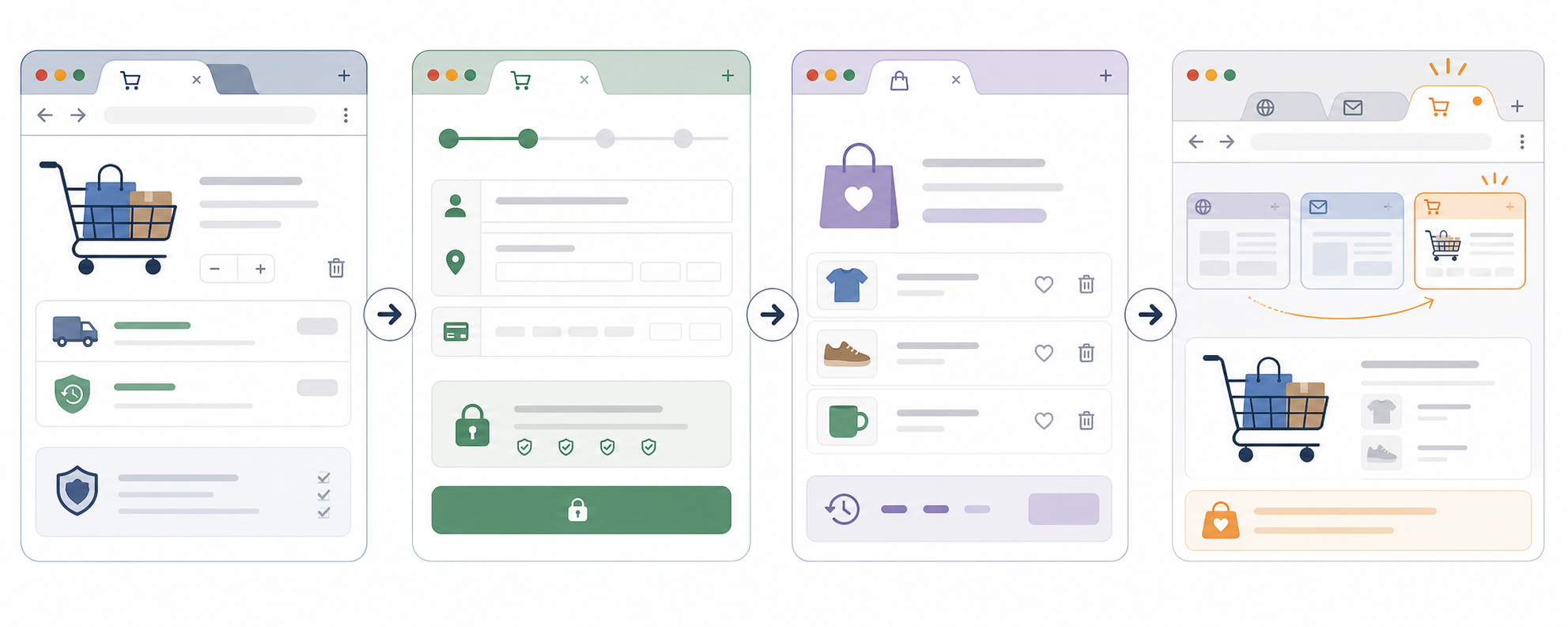
Browser tab title examples for carts
A cart tab reminder works best after the shopper switches away, not while they
are still using the page.
A calm reminder on a saved cart or checkout page after the tab becomes hidden.
Running title changes on every page, including the homepage and product gallery.
Restoring the original title as soon as the shopper comes back.
Leaving the reminder title in place after return.
Matching the message to real cart state.
Saying "Cart saved" when the cart is not actually preserved.
Using one or two slow title changes.
Flashing many titles or using aggressive countdown language.
Test before shipping
Add products to the cart and switch to another tab.
Confirm the cart state remains intact when you come back.
Check that the first reminder appears only after the tab is hidden for the chosen delay.
Verify the reminder still makes sense when the tab is narrow and partially truncated.
Return to the cart and confirm the original page title restores immediately.
Complete checkout from the recovered session and make sure nothing about the reminder breaks form state or payment steps.
Ask one teammate whether the message feels helpful, neutral, or pushy.
Start with an 8 to 12 second delay and a 4 to 6 second pace between two alternate
titles. Slow it down if the copy feels noisy.
Mistakes to avoid
Discounting too early before you know whether clarity or trust is the real problem.
Covering the cart or checkout with another overlay.
Using guilt-heavy copy that makes the shopper feel watched.
Pretending a cart is saved when it is not.
Sending recovery email without a clear permission basis.
Running inactive-tab reminders on product discovery pages where there is no meaningful saved progress.
Where TitleFlash fits
TitleFlash fits when you want to build and preview a calm cart reminder after the
checkout basics are already in place. You can draft a short sequence, test how it
behaves after the tab becomes inactive, and export a self-contained script for
your store.
The exported script is the runtime. It does not call TitleFlash after
installation, does not load a TitleFlash CDN, and does not send visitor analytics
back to TitleFlash.
Final checklist
Shipping and returns are easy to find before checkout.
Checkout does not introduce unnecessary surprise costs or fields.
The cart state is preserved across a realistic return visit.
Email recovery is permission-based and lands on the real cart state.
Inactive-tab reminders run only on cart, checkout, or saved-item pages.
The first reminder waits until the shopper has actually switched away.
The copy is short, calm, and tied to real saved progress.
The original page title restores as soon as the shopper returns.
Try it
Build a cart reminder tab flow.
Draft the messages, preview the inactive-tab moment, and export a script you
control when you are ready.
How to Install a Marketing Script with Google Tag Manager
If you already have a marketing script and do not want to edit your website code
directly, Google Tag Manager is usually the safest place to install it.
Published by TitleFlash.
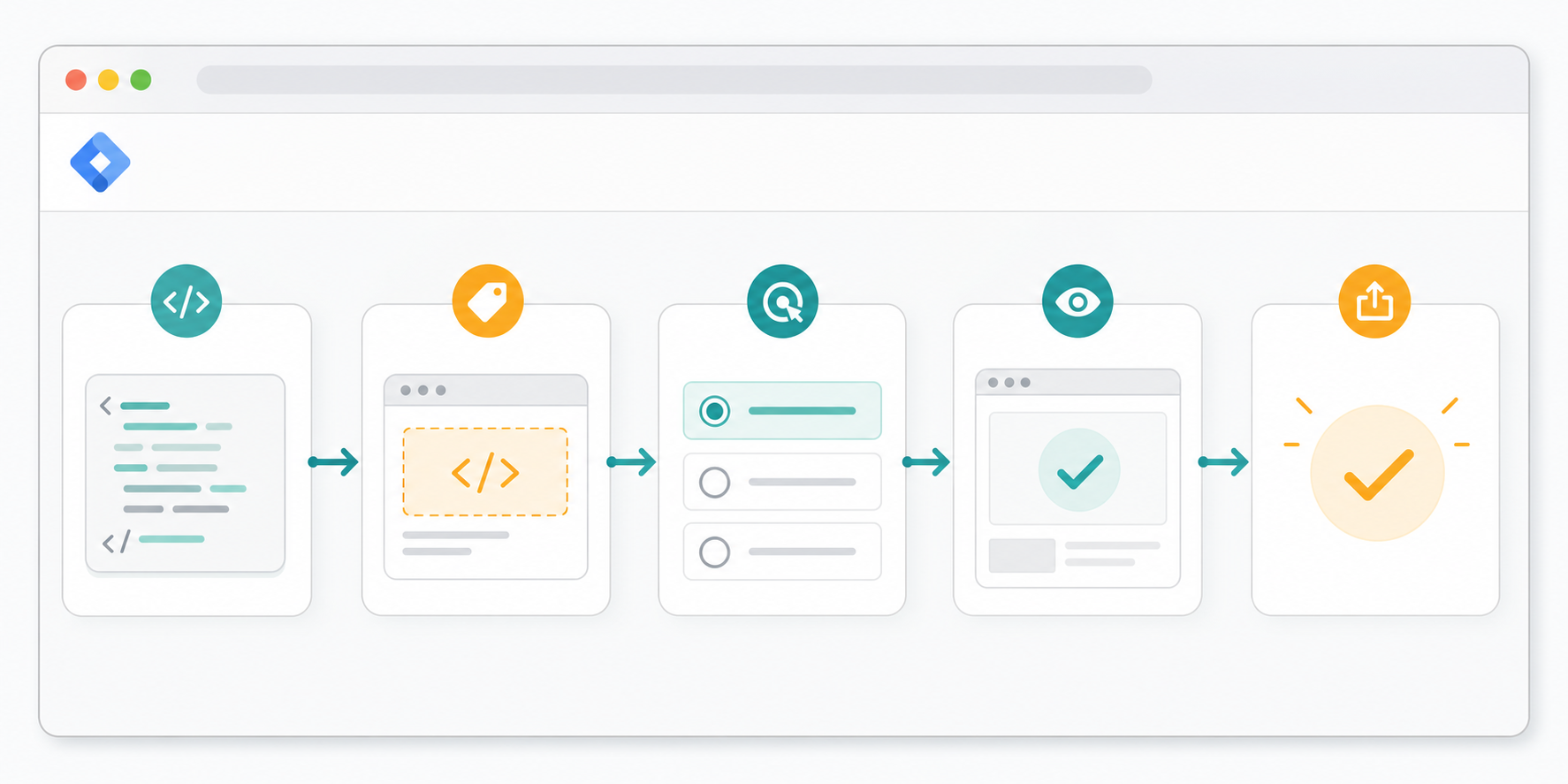
A safe GTM install usually follows the same order every time: add the tag, choose the
right trigger, preview it, then publish.
The quick answer
To install a marketing script with Google Tag Manager, open the correct container,
create a Custom HTML tag, paste the full script, scope the trigger, preview it on
the real site, then publish only after the behavior looks right.
Open the correct GTM container for the website.
Create a new Custom HTML tag.
Paste the full script exactly as provided.
Choose the trigger for the pages where it should run.
Use Preview mode on the real site.
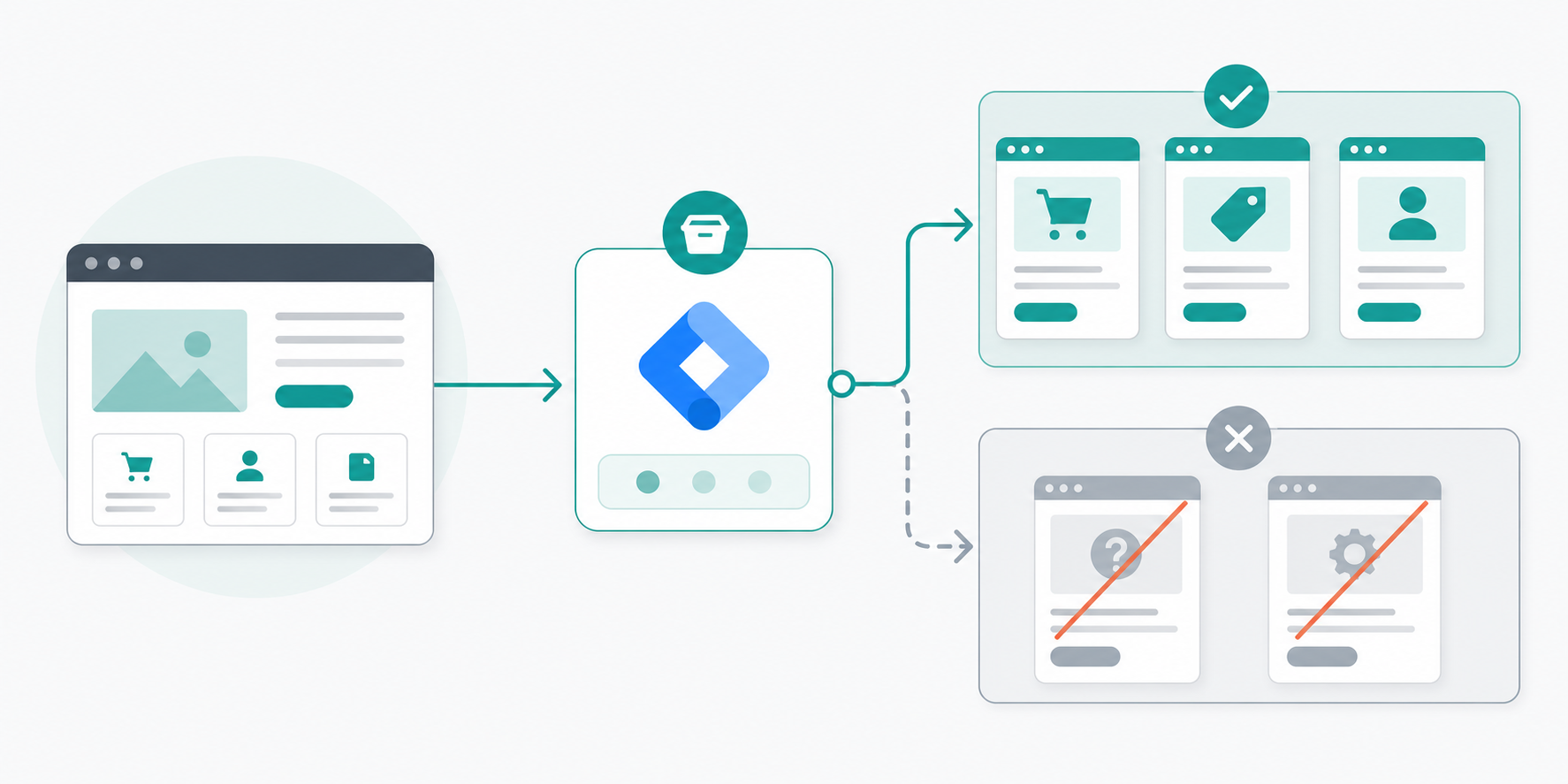
Confirm the tag fires where it should and stays off where it should not.
Submit and publish only after preview looks right.
If you are unsure about the trigger, do not default to all pages. Start with the
smallest useful page group and expand later.
What Google Tag Manager does in plain language
Google Tag Manager is a layer between your website and the browser-side scripts you
want to run.
Instead of asking a developer to hard-code every marketing or UX script into the
site template, you add the script inside GTM, tell GTM which pages should run it,
then publish that container change.
That makes GTM useful for teams that need faster control over browser-side scripts,
but it also means trigger choice and preview discipline matter. A bad trigger can
spread a script wider than you intended.
When GTM is the right way to install a script
Google Tag Manager is useful when the script is meant to run in the browser and the
provider expects you to paste a JavaScript snippet into the page.
You manage marketing tools without direct access to the site codebase.
The site already loads a GTM container.
You want preview mode before publishing.
You want a marketer-friendly way to update page-level scripts quickly.
Good fit for GTM
Poor fit for GTM
A browser-side marketing or UX script that should run on selected pages.
A backend integration, secret API key flow, or server event pipeline.
A team that already has working GTM access and preview permissions.
A team guessing which container the site uses or whether GTM is installed at all.
A script that can be tested safely in preview on a live page.
A script that must go live without any page-level verification.
Before you start
Do these checks before you create the tag:
Confirm you are in the correct GTM account and container.
Confirm the site actually loads that container.
Keep a copy of the full script snippet in a safe place.
Know which pages should run the script.
Know whether the script depends on consent, login state, or a completed checkout step.
The key GTM decision is not only adding the script, but deciding exactly which
pages should run it.
Open the website and confirm GTM is already installed there.
Check the container name against the site or domain you are editing.
Decide whether the script belongs on all pages, a page group, or one route.
Pick one or two pages you will use for preview testing.
If you cannot answer those questions clearly, stop before you paste anything. Most
GTM mistakes happen before the first click in the editor.
Step-by-step setup
Open the correct container.
Check the container name, domain label, and workspace before you edit anything.
Create a new Custom HTML tag.
Use it when the provider tells you to paste a full script snippet into the page.
Paste the full script exactly as provided.
Do not trim or rewrite the snippet unless the provider explicitly tells you to.
Choose the trigger carefully.
Start with the page group where the script clearly belongs.
Use Preview mode.
Test included pages and excluded pages before you publish.
Check page behavior, not only tag status.
Look for console errors, layout changes, duplicate behavior, or consent issues.
Submit and publish.
Give the version a clear name, publish it, then re-test one live page.
If the script is for...
Start with...
Avoid starting with...
A site-wide measurement or utility script the provider explicitly documents for all pages.
All Pages, after preview confirms it behaves safely.
A guessed site-wide launch when the provider docs are unclear.
Pricing, signup, or demo intent.
A page-view rule scoped to those routes only.
All Pages.
Cart, checkout, or saved-cart recovery.
Cart and checkout routes only.
Homepage, help pages, or account pages that do not need the script.
One campaign or landing page.
A specific URL or narrow page group.
Broad pattern matches that catch unrelated pages.
Good use
Poor use
A trigger limited to the exact page type where the script helps.
Using all pages because it feels simpler, even though only one page type needs it.
A page-view rule that matches a stable URL pattern.
A vague pattern that accidentally catches help, account, or checkout pages too.
A scoped first launch that can be expanded after testing.
Publishing a site-wide trigger before you know how the script behaves.
Testing checklist
The fastest way to avoid GTM mistakes is to review container, trigger, preview,
and live behavior before you publish widely.
The correct container was edited.
The full script was pasted.
The trigger matches the intended pages only.
Preview shows the tag firing where expected.
Preview shows the tag staying off unrelated pages.
The page still works after refresh.
The script does not conflict with consent or existing tags.
The live page behaves the same way after publish.
Common mistakes to avoid
Publishing in the wrong container.
Setting the trigger to all pages by accident.
Publishing without preview.
Pasting partial code.
Forgetting consent or policy requirements.
Test before you ship
Open a page where the tag should run.
Confirm the tag appears in preview.
Refresh the page and confirm it still behaves correctly.
Open a page where the tag should not run.
Confirm the tag stays off there.
Publish.
Re-test one live page and one excluded page.
If your team has a staging site with the same GTM container behavior, test there
first. If not, use the narrowest safe trigger on production pages and verify
carefully.
Where TitleFlash fits
TitleFlash exports a self-contained browser script that many teams install through
Google Tag Manager instead of editing templates or app code directly.
Export the final script first.
Paste the full script into a Custom HTML tag.
Limit the trigger to the pages where the title reminder should run.
Preview the page and verify the behavior after switching tabs.
The exported script is the runtime. It does not call TitleFlash after
installation, does not load a TitleFlash CDN, and does not send visitor analytics
back to TitleFlash.
Final checklist
I know which GTM container the live site uses.
I have the full script snippet, not a partial copy.
I chose the smallest useful trigger for the first release.
I previewed included and excluded pages.
I checked page behavior, not only tag status.
I tested again after publishing.
Try it
Export a TitleFlash script and install it with GTM.
Build the title sequence, preview the inactive-tab moment, then export the final
script when you are ready to publish.
Website Visitor Retention: Simple Fixes Before Buying Another Analytics Tool
If visitors leave your site quickly, another analytics tool is not always the next
best purchase.
Published by TitleFlash.
Most retention problems become easier to fix when you improve the page itself before
adding another reporting layer.
The quick answer
Before you buy another analytics tool, check whether the traffic matches the page,
whether the first screen is clear, whether the path is easy to finish, whether the
site preserves progress, and whether a return path exists for unfinished work.
Confirm the traffic source matches the page promise.
Make the first screen answer what the page is, who it is for, and what to do next.
Reduce obvious friction in speed, navigation, and forms.
Preserve useful state such as cart contents, selected plans, or partially completed steps.
Add a calm return path only where visitors are clearly leaving unfinished work behind.
If you cannot explain why visitors should stay, where they get stuck, and what
should happen next, more reporting usually gives you more screenshots of the same
problem.
Why more analytics is not always the first fix
Analytics can tell you where attention drops. It does not automatically fix why
people leave.
The page loads slowly.
The headline does not match the ad, search result, or email that sent the visitor.
The next step is buried below clutter.
The navigation makes the visitor choose too many paths.
The form asks for more work than the visitor expected.
The site forgets the visitor's progress when they come back later.
If those issues are obvious in a normal browser session, fix them before paying
for more measurement.
The retention checklist
1. Check traffic quality first
Do not treat every short visit like a page failure. Sometimes the wrong people are
landing on the right page. Sometimes the right people are landing on the wrong
page.
Check whether the ad, email, or search snippet matches the page they reached.
Check whether the page intent is informational, evaluative, or transactional.
Check whether a visitor from that source would reasonably expect the next step you are offering.
Observable check: ask whether a first-time visitor would feel correctly landed
within five seconds.
2. Make the first screen do more work
The first screen should answer three questions quickly:
What is this page?
Why should I care?
What do I do next?
Put the page promise in plain language.
Show one clear next action.
Remove visual noise that competes with the main decision.
Surface trust details only where they help the next action.
Retention often improves when visitors can understand the page, move through it
faster, and complete less work.
3. Remove friction before adding persuasion
Page speed: reduce obvious delay in the first meaningful load.
Navigation: keep the path to the next step obvious.
Forms: ask for fewer fields up front.
Calls to action: make the next move visible without forcing it.
Layout: reduce competing panels, popups, and repeated choices.
Observable check: if someone unfamiliar with the page pauses to ask where to
click, what happens next, or why you need that field, the page still has retention
friction.
4. Preserve useful progress
Retention improves when a return visit feels like a continuation instead of a restart.
A cart still contains the same items.
A selected pricing plan stays selected.
A multi-step setup flow resumes at the right step.
A long guide or lesson is easy to continue.
Do not claim saved progress unless the site really preserves it.
5. Add a calm return path
Only after the page is clear and the progress is preserved should you consider
return tactics.
A saved cart or account reminder.
A permission-based email for known visitors.
A calm browser-tab reminder for an unfinished task.
A clear bookmarkable resource page for content.
Which fixes should you do first
A useful retention review starts by checking who is arriving, what they see
first, where friction appears, and how easy it is to return later.
If the main problem is...
Start with...
Not with...
Traffic that does not match the page intent.
Tighter message match between source and landing page.
More event dashboards.
Visitors do not understand the page quickly.
A clearer headline, subhead, and next step.
A new reporting subscription.
Visitors stall during the task.
Faster load, simpler navigation, and fewer form fields.
More popups or layered prompts.
Visitors leave and lose their place.
Saved state and a stable return path.
Reminder copy that promises a saved state you do not keep.
Visitors compare tabs and forget to return.
A calm reminder on pages with real unfinished work.
Aggressive attention tactics across the whole site.
A practical review pass you can run today
Open your top landing page on desktop and mobile.
Write down the page promise in one sentence.
Check whether the first screen supports that promise clearly.
Complete the main task yourself and count every avoidable pause.
Leave the page, come back later, and see whether progress is preserved.
Ask one teammate to do the same task without explanation.
If two people struggle in the same place, you already have a better next action
than buying more reporting.
Good use versus poor use
Good use
Poor use
Fixing the page headline when the source message and landing page do not match.
Studying a drop-off chart for another week while the mismatch remains obvious.
Shortening a form before running more retargeting.
Adding another popup on top of the same long form.
Saving cart or setup progress so a return visit feels easy.
Saying "saved" when the visitor must start over.
Adding a browser-tab reminder only on pages with clear unfinished work.
Running attention tactics on every page, including pages with no meaningful next step.
If a human review can spot the problem in one session, start there.
Test before you ship changes
The traffic source and landing page promise still match.
The first screen makes the next step obvious.
The main path works on desktop and mobile.
The page does not ask for unnecessary fields or clicks.
Saved state works on a realistic return visit.
Any reminder appears only after the visitor actually leaves the active page.
Change one or two things at a time, then re-check behavior. A smaller improvement
you can explain is better than five changes you cannot attribute.
When another analytics tool does make sense
You already fixed the obvious clarity and friction issues.
You need deeper segmentation or journey analysis that your current tools truly cannot provide.
Several possible causes remain and you need better instrumentation to separate them.
Do not buy it as a substitute for checking whether the page is confusing, slow, or
forgetful.
Where TitleFlash fits
TitleFlash fits near the end of this checklist, not the beginning.
It is useful when visitors leave a page with real unfinished work, such as a cart,
pricing comparison, setup step, or long guide, and you want a calm browser-tab
reminder that helps them recognize the page later.
The exported script is the runtime. It does not call TitleFlash after
installation, does not load a TitleFlash CDN, and does not send visitor analytics
back to TitleFlash.
Final checklist
Traffic source and landing page promise match.
The first screen explains the page and next step quickly.
Load, navigation, and form friction have been reduced.
Useful progress is preserved across a return visit.
Return tactics are limited to pages with real unfinished work.
More analytics is only added after the obvious page issues are fixed.
Try it
Build a calm return-path reminder.
Draft the message, preview the inactive-tab moment, and export a self-contained
script when your page already deserves the return visit.
Self-Hosted Marketing Script vs CDN: Which Should You Choose?
If you are adding a browser-side marketing script, the first technical choice is
often not the message or effect. It is where that script should come from.
Published by TitleFlash.
The main tradeoff is not visual polish. It is whether your page runs one script you
ship or depends on another fetch at runtime.
The quick answer
If the script is small, specific to your site, and does not need frequent remote
updates, a self-contained script is usually the safer default.
Choose self-contained delivery when you want one version you can review before publish.
Choose self-contained delivery when you want fewer runtime dependencies outside your own stack.
Choose self-contained delivery when you want clear ownership of when changes go live.
Choose self-contained delivery when you need a simpler explanation for privacy-conscious stakeholders.
Choose CDN delivery only when centrally managed updates solve a real operational need.
A CDN-delivered script can make sense when a tool truly requires centrally managed
updates across many sites, but it should be a conscious tradeoff, not the default
just because it is common.
What these two models actually mean
Self-hosted or self-contained
In this model, the script that runs in the browser is served as part of your own
website deployment.
An inline snippet you exported and pasted into your site.
A JavaScript file you host with the rest of your site assets.
A tag-manager snippet that still contains the full logic you reviewed and shipped.
The important point is that the browser can run the script without fetching its
behavior from someone else's runtime host.
CDN-delivered
In this model, your page includes a reference to a script hosted elsewhere,
usually on a vendor domain or shared CDN.
That means the browser depends on an extra runtime request before the script can
do its work. It can be fast and perfectly acceptable in many cases, but it
introduces another system, another deployment surface, and another source of
change outside your own release cycle.
Why this choice matters
A page effect stops working because a third-party script did not load.
A security or privacy reviewer asks exactly what runs on the page and where it comes from.
A team wants to roll back behavior quickly but does not control the vendor's last change.
Someone assumes "installed once" means "fully owned," even though the page still depends on an outside runtime.
If none of those situations would matter to your site, you may accept the extra
dependency. If they would matter, the delivery model deserves real attention.
A practical comparison
1. Ownership and change control
Self-contained scripts usually win when you care about knowing exactly which version is live.
Your team decides when a new version ships.
Code review can happen inside your normal release process.
Rollback is usually tied to your own deploy or tag-manager change history.
With a CDN-delivered script, part of the runtime behavior may change outside your site deploy.
2. Reliability and runtime dependency
Every extra runtime request is another thing that can fail, stall, or be blocked.
Another host being reachable.
Another response arriving fast enough.
Another asset not being blocked by network policy, consent tooling, or browser conditions.
If the script drives a nice-to-have enhancement, that may be fine. If it affects a
core visitor path, many teams prefer the tighter control of a self-contained asset.
3. Privacy and stakeholder clarity
Privacy review is easier when you can explain the runtime simply.
Which host serves it?
What else loads with it?
Can the provider change runtime behavior later?
Does it make outbound calls after load?
Choose the delivery model by checking control, reliability, and maintenance fit
before you worry about convenience alone.
4. Update speed and maintenance convenience
This is where CDN delivery often has a fair advantage.
Reduced deployment control.
Less obvious version ownership.
Harder incident diagnosis when behavior changes unexpectedly.
Ask a practical question: "Do we need remote runtime updates often enough to justify the extra dependency?"
5. Team fit
The right answer depends partly on how your team works.
Self-contained fits better when you already have a predictable deploy process.
Self-contained fits better when you want implementation reviewed once and shipped intentionally.
CDN delivery fits better when central updates are a strong operational benefit.
CDN delivery fits better when graceful failure is acceptable and the behavior is clearly non-critical.
Which option should you choose first
The script is short or moderate in size.
The behavior is specific to your site.
You want to review the exact runtime code before launch.
You want rollback to stay inside your own publish flow.
You do not need the vendor to change behavior remotely every week.
Start with a CDN-delivered script only if the vendor-managed update model solves a
real operational need, not just a vague preference for convenience.
Good use versus poor use
Good use
Poor use
Using a self-contained script for one focused site behavior that rarely changes.
Adding a hosted runtime by default without checking whether you need remote updates.
Choosing a CDN-delivered tool because you truly need vendor-managed fixes across many sites.
Calling a hosted script "fully installed" when the page still depends on an outside fetch.
Reviewing what happens if the script fails or loads slowly.
Treating script delivery as a small technical detail that does not affect page reliability.
Explaining the runtime model clearly to privacy or security reviewers.
Assuming no one will ask where the page behavior actually comes from.
A pre-launch review you can run today
List every browser-side marketing script on the page.
Mark whether each one is self-contained or fetched from an outside host at runtime.
Decide which ones affect a core visitor path.
For each core-path script, ask who controls changes, how rollback works, and what happens if the script fails.
Remove any dependency you cannot explain clearly.
This review often surfaces more useful decisions than another round of tool
comparison pages.
Test before you ship
The page still works if the script loads late.
The page still works if the script is blocked.
The behavior is limited to the pages where it belongs.
The current live version is easy to identify and roll back.
The team can explain where the runtime code comes from.
If you are using a self-contained script, confirm the deployed page matches the
reviewed version.
If you are using a CDN-delivered script, confirm you know the runtime host,
expected request path, and failure behavior.
Script delivery choices are easier to trust when the team tests scope, fallback
behavior, and ownership before launch.
Mistakes to avoid
Treating "works on my page" as enough testing.
Assuming a hosted runtime is harmless because it is common.
Choosing self-contained delivery but skipping version review before publish.
Forgetting to check what happens when the script does not load.
Mixing critical page behavior with a dependency the team does not really control.
Where TitleFlash fits
TitleFlash is built for teams that want the browser-side script itself to be the deliverable.
The exported script is the runtime. It does not call TitleFlash after
installation, does not load a TitleFlash CDN, and does not send visitor analytics
back to TitleFlash at runtime.
That makes it a good fit when you want browser-tab reminder behavior you can
review, export, install, and own inside your existing site workflow.
Final checklist
I know whether this page behavior is self-contained or CDN-delivered.
I know who controls runtime changes.
I know what happens if the script loads late or fails.
I tested page scope and rollback behavior before launch.
I chose convenience or control deliberately, not by habit.
Try it
Export a script you can review and own.
Build the browser-tab reminder, preview the inactive-tab moment, and export a
self-contained script when you want the runtime itself to be the deliverable.
Website Launch Checklist for Founders: What to Fix Before You Drive Traffic
Launching a website feels like the finish line, but it is usually the start of the
first useful feedback loop.
Published by TitleFlash.
A launch checklist should connect messaging, action paths, discovery basics, mobile
behavior, and return paths before traffic arrives.
The quick answer
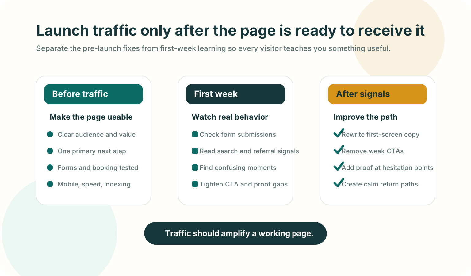
Before you drive traffic to a new website, confirm five things:
The first screen says who the site is for, what problem it solves, and what the visitor should do next.
The main CTA works on desktop and mobile, including forms, booking, checkout, email links, and thank-you states.
The offer feels trustworthy enough to act on, with visible pricing or next-step expectations, contact details, proof, and support links where they matter.
Search and measurement basics are live: analytics, Search Console, indexable pages, sitemap, page titles, meta descriptions, and useful internal links.
Visitors who leave mid-task have a reasonable way back, such as saved state, opted-in follow-up, or a calm browser-tab reminder for unfinished work.
If one of those fails, fix it before spending real money on traffic.
Why this matters
More traffic does not make a weak page easier to understand. It only makes the
weakness visible faster.
The visitor cannot understand the page quickly enough.
The visitor understands the page but does not trust the next step.
The visitor tries the next step and something breaks, feels slow, or feels unclear.
A good launch checklist catches those problems before they become wasted ad spend,
confusing outreach replies, or search visitors who bounce before they understand
the offer.
Fix these before traffic
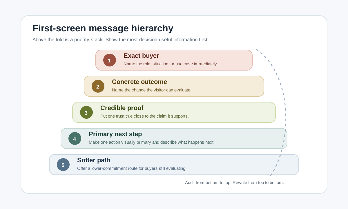
1. First-screen clarity
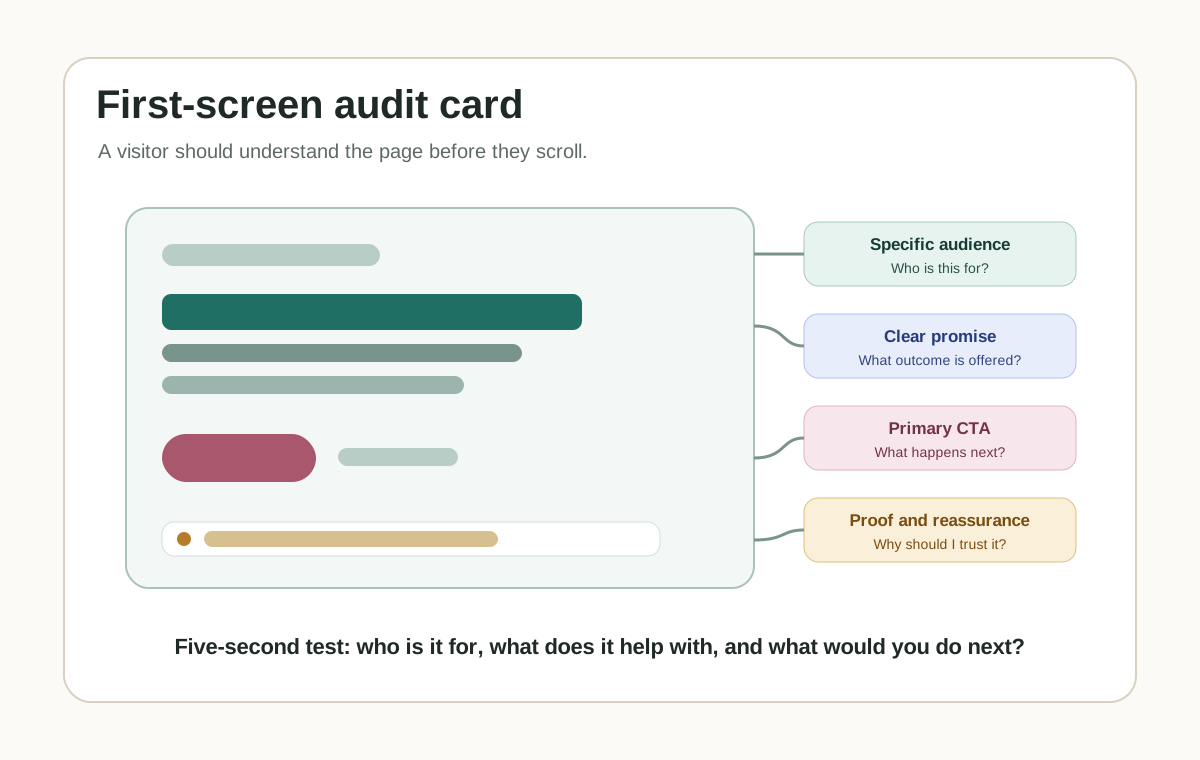
Open the homepage or landing page on a normal laptop screen and a phone. Without
scrolling, a new visitor should understand who this is for, what problem it helps
with, what changes after they use it, and what the next step is.
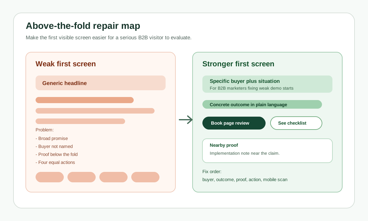
Weak first-screen copy usually sounds broad: "Grow smarter," "Unlock efficiency,"
or "The future of customer engagement." Stronger copy names the buyer, the
situation, and the outcome.
For [specific audience] who need [specific outcome], [product] helps you [specific job] without [specific friction].
2. One primary next step
Every important page needs one obvious next step. A homepage can have secondary
links, but the main path should be unmistakable.
The primary CTA appears in the first screen.
Button copy says what happens next, such as "Book a demo," "Start free," "View pricing," or "Download checklist."
The CTA leads to a working destination.
The page does not ask a cold visitor to choose between five equal actions.
3. Forms, booking, checkout, and contact routes
Run the complete action path yourself before sending traffic.
Contact form submission.
Demo booking or calendar flow.
Checkout or payment link.
Signup and email confirmation.
Mobile keyboard behavior on inputs.
Success, error, and thank-you states.
Notification delivery to the right inbox or CRM.
If a lead arrives and nobody sees it, the website is not launched.
4. Trust and offer clarity
Visitors do not need a giant proof wall, but they need enough confidence to
continue.
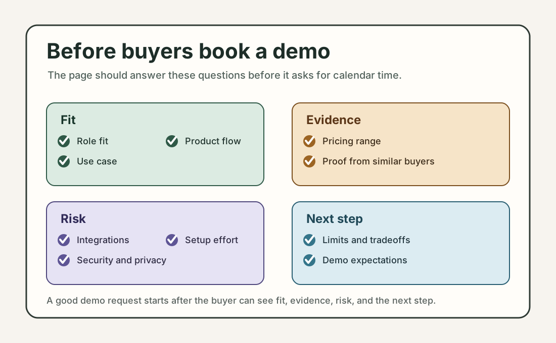
What does this cost, or what happens before pricing is shown?
Who is behind the product?
How does support work?
What data or access does the product need?
What proof, examples, screenshots, or references make the promise believable?
Are privacy, terms, billing, or support pages easy to reach when they matter?
Do not invent proof. A clear product walkthrough is better than fake logos, vague
testimonials, or inflated claims.
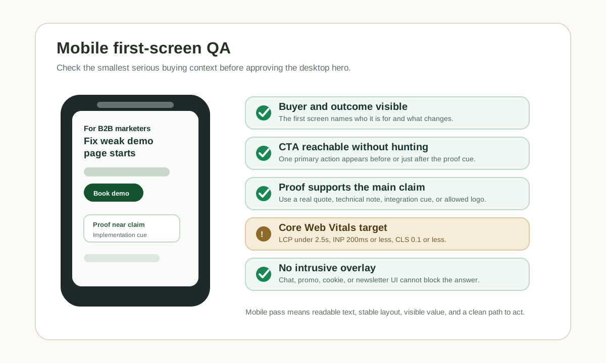
5. Mobile and speed basics
Open the page on a real phone, not only a desktop browser narrowed to mobile
width.
The hero, CTA, form, pricing, and footer fit without horizontal scrolling.
Buttons are easy to tap.
The page does not jump while loading.
The largest visual content appears quickly enough to keep the page feeling alive.
Menus, accordions, and forms work with touch.
For a practical performance pass, watch Core Web Vitals: Largest Contentful
Paint, Interaction to Next Paint, and Cumulative Layout Shift.
6. Measurement and discovery basics
You do not need an analytics stack with twenty events on day one. You do need
enough signal to know whether the launch worked.
Install one analytics tool and confirm it records page views.
Set up Google Search Console or the search console for the search engine you care about.
Submit or verify a sitemap if the site has one.
Confirm important pages are not blocked by robots.txt or noindex.
Give each page a unique, descriptive title and meta description.
Use internal links so visitors and crawlers can find the important pages.
Add structured data only when it accurately describes visible page content.
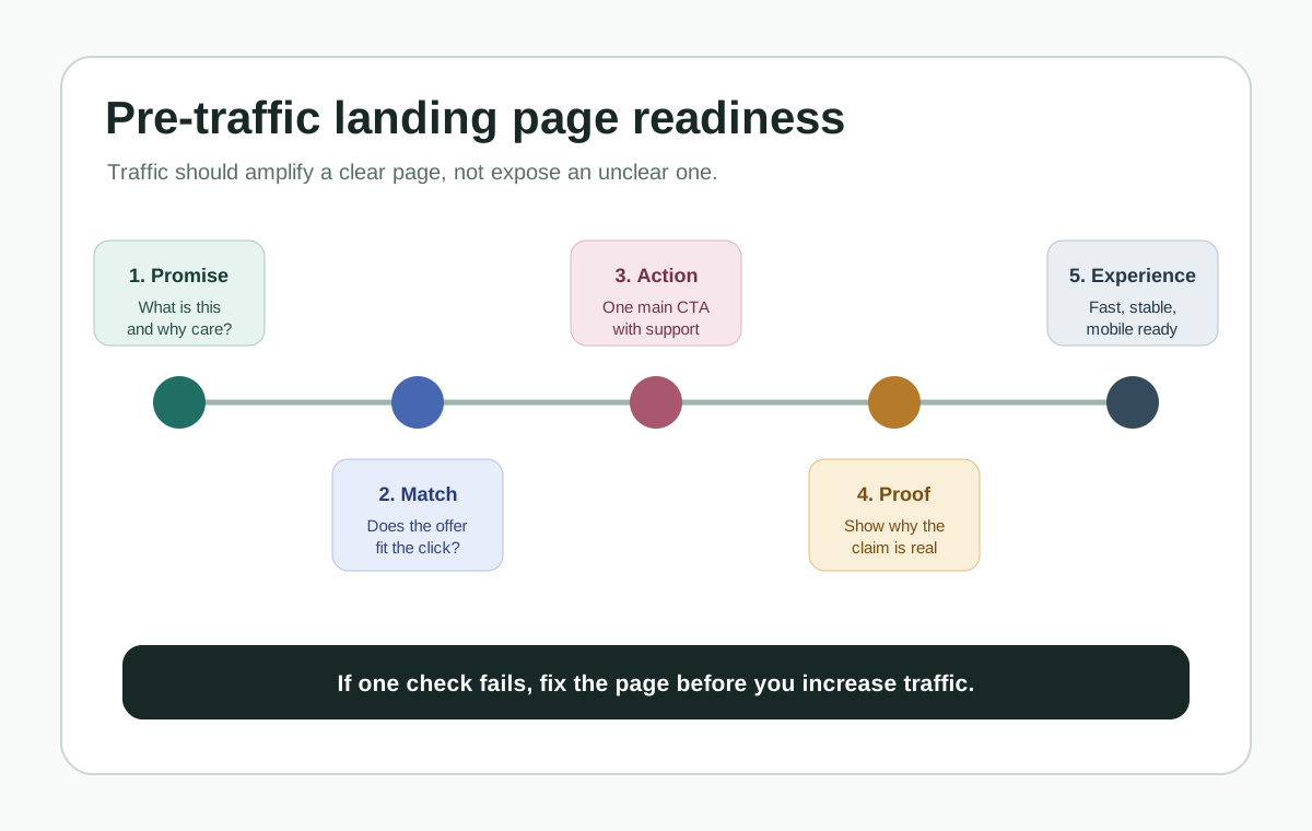
Traffic should amplify a working page, not expose an unfinished one.
SEO and AEO launch check
For a founder site, SEO and AEO are not separate from clarity. Search engines,
answer engines, and AI assistants all need pages that are specific, crawlable,
and easy to summarize.
Put the real answer on the page, not only inside images, video, or JavaScript-only UI.
Use descriptive headings that match the questions your buyer asks.
Define the product category in plain language.
Add examples, constraints, pricing context, setup details, or comparison criteria where useful.
Keep important facts consistent across the page, sitemap, structured data, and agent-readable files if your site has them.
Use image alt text that explains the information in the image.
Avoid fake FAQ sections that exist only for search.
Google's SEO Starter Guide frames SEO as helping search engines understand
content and helping users decide whether to visit. That is the right standard for
AEO too: write pages that are useful enough for a person and explicit enough for
a machine to quote accurately.
Return-visitor basics
Some visitors will leave because they are comparing options, asking a teammate,
checking pricing, or opening your site between meetings. The right fix depends on
the page.
Page moment
Useful return path
Avoid
Long form or onboarding
Save progress and show a clear resume point
Making the visitor restart from the first field
Pricing or demo page
Keep the plan, calendar, or demo details easy to find
Hiding key details behind repeated forms
Cart or checkout
Preserve cart state and show delivery, tax, and return details clearly
Surprise costs after the visitor returns
Guide or resource
Keep headings scannable and add related next steps
Forcing newsletter capture before value
Browser tab left open
Use a calm inactive-tab reminder after the visitor switches away
Flashing titles rapidly or changing titles while active
The first seven days after launch
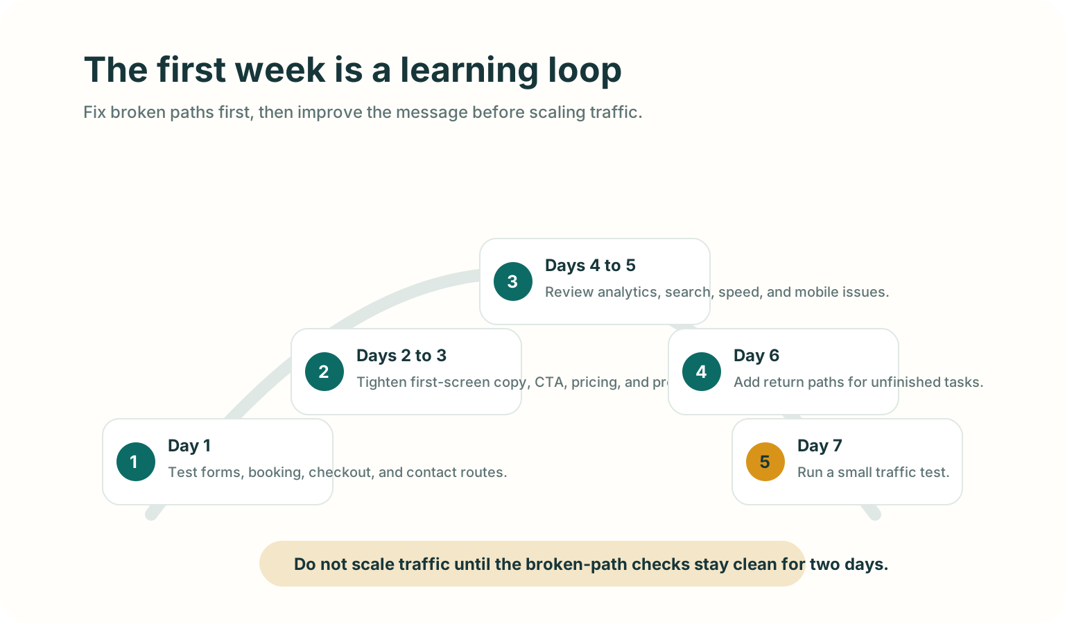
The first week is not for random changes. It is for watching where the page fails
and fixing the highest-friction paths first.
Fix broken paths first, then improve the message before scaling traffic.
Day 1: test the action path again
Submit forms, book a test meeting, run checkout, and click every header and footer link.
Days 2 to 3: tighten the first screen
Ask two people who match your target reader to open the page for 10 seconds, then
tell you what the product does and what they would click next.
Days 4 to 5: review discovery and behavior signals
Which pages were visited.
Which traffic sources sent visitors.
Whether search tools found crawl or indexing issues.
Whether mobile visitors behave differently from desktop visitors.
Whether people reach the CTA but fail to complete it.
Day 6: add or improve return paths
If visitors leave important pages open, make the path back clearer. Preserve form
state, keep pricing details accessible, or use a short inactive-tab title on a
cart, pricing, demo, or guide page.
Day 7: run a small traffic test
After the basic path stays clean for a couple of days, send a small amount of
higher-intent traffic. Use the result to decide what to fix next before scaling.
Good use versus poor use
Good use
Poor use
Fixing the CTA path before buying ads.
Driving paid traffic to learn that the form is broken.
Writing a clear headline for one specific audience.
Publishing broad copy because it sounds bigger.
Checking mobile behavior on a real phone.
Assuming desktop QA covers mobile visitors.
Adding Search Console, sitemap, titles, and crawlable content early.
Treating SEO as something to bolt on months later.
Adding a calm return path after the page already makes sense.
Using popups or tab reminders to compensate for unclear messaging.
Test before you ship
Open the site in a fresh browser session.
Read only the first screen and say the audience, value, and next step out loud.
Click the primary CTA and complete the path.
Repeat on a real phone.
Turn off any browser extensions that may have helped during development.
Check the page title, meta description, canonical URL, sitemap, and robots.txt.
Submit one real test lead and confirm the team receives it.
Ask one person outside the build team whether the page feels clear enough to trust.
Mistakes to avoid
Buying traffic before the main action path works.
Asking every visitor to "contact us" when the page has not explained the offer.
Hiding pricing, requirements, or setup friction that a serious buyer needs to know.
Measuring everything except the one action that matters.
Treating AI visibility as a metadata trick instead of a content clarity problem.
Adding aggressive interruption tactics before fixing page comprehension.
Where TitleFlash fits
TitleFlash helps after the launch basics are working.
If a visitor leaves a cart, pricing page, demo page, setup flow, or guide open in
another tab, a short inactive-tab title can make the page easier to notice again.
Use it as a calm return path, not as a substitute for clear messaging.
The exported TitleFlash script is self-contained. It does not call TitleFlash
after installation, does not load a TitleFlash CDN, and does not send visitor
analytics back to TitleFlash at runtime.
Final checklist
The first screen says who the site is for, what it helps with, and what to do next.
The primary CTA works on desktop and mobile.
Forms, booking, checkout, and notification routes are tested.
Trust, pricing, support, privacy, and contact basics are visible where they matter.
Search and measurement basics are active.
Important content is crawlable and easy for a person or agent to summarize.
Return paths support unfinished work without pressuring visitors.
The first-week review loop is ready before traffic scales.
Website Homepage Marketing Best Practices for B2B Teams
Use this teardown to sharpen your homepage message, move proof closer to the claim,
explain the product more clearly, and reduce friction in the next step.
Published by TitleFlash.
A strong B2B homepage should clarify the promise, prove it, explain it, and move
the buyer to one next step.
The quick answer
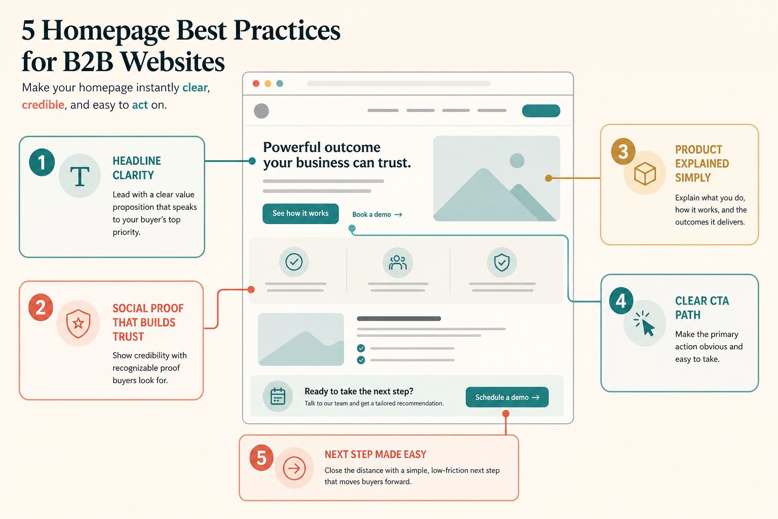
If your B2B homepage is not converting enough qualified visitors, check five
things first: clear positioning, nearby proof, simple product explanation, one
primary CTA path, and a low-friction next step.
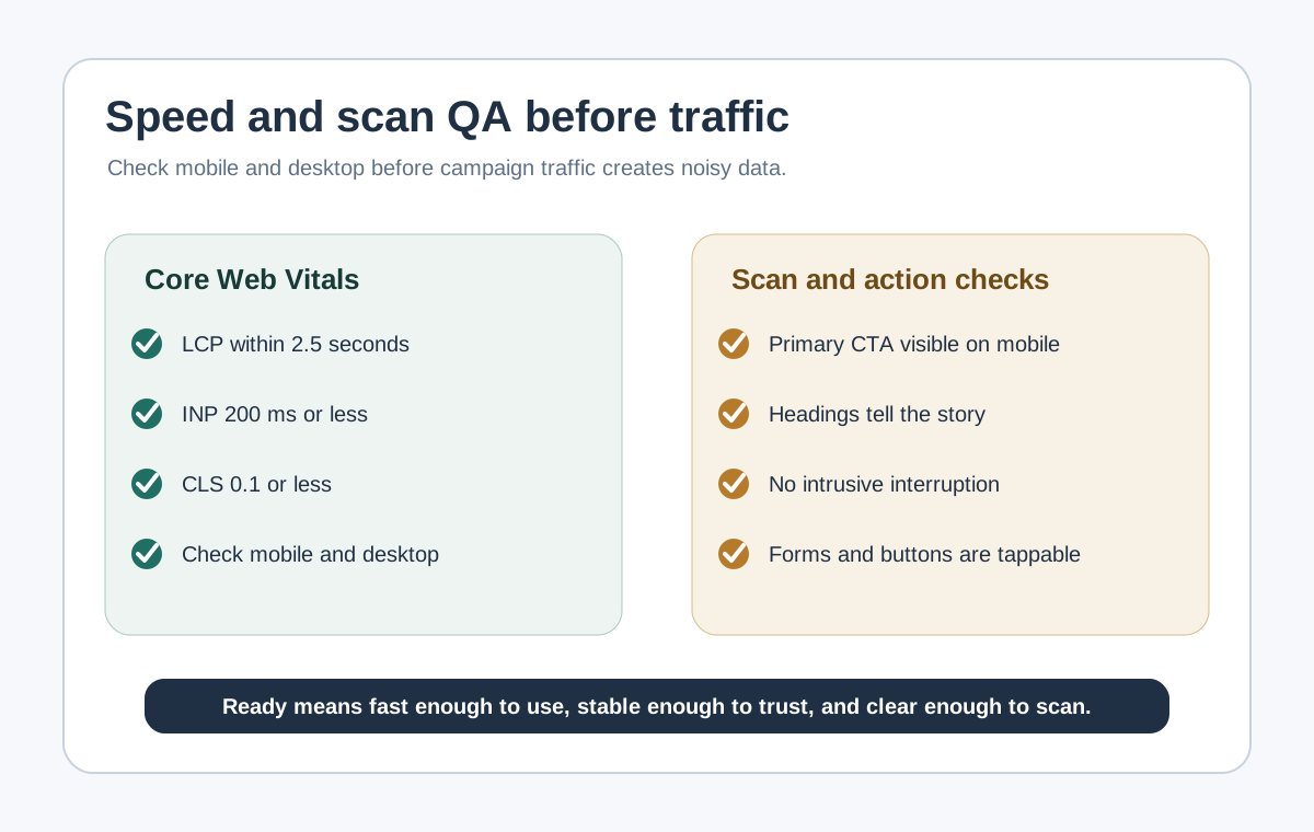
1
Clarify the hero
Say who the product is for, what outcome it helps create, and why it matters.
2
Move proof earlier
Place logos, outcomes, and trust cues near the first claim they support.
3
Explain the product
Show the workflow in plain language before asking the buyer to commit time.
4
Prioritize one CTA
Make the next step obvious instead of asking the visitor to sort six actions.
5
Reduce next-step friction
Answer the last buyer doubt before the request for a meeting or signup.
Why B2B homepages lose good visitors
B2B buyers usually arrive to qualify fit, not to admire branding. They want to
know whether the product is relevant, credible, and worth carrying into the next
conversation.
When the homepage fails, it usually fails in one of three ways: the promise is too
vague, the proof is too weak or too late, or the next step feels too high-friction.
Is this for a team like mine?
Does it solve a problem I actually care about?
Is the promise specific enough to trust?
Can I understand the product before booking time?
What should I do next if I might be a fit?
The five best practices
1. Lead with a clear category and outcome
The homepage hero should help the right buyer self-identify quickly. A strong hero
makes the audience, the problem, the outcome, and the difference clear.
Help [specific team] solve [specific problem] without [specific friction].
If your team cannot complete that sentence cleanly, the public headline will
probably drift into vague category language.
2. Put proof next to the promise
Proof should reduce doubt before the visitor starts to drift. Use outcome context,
recognizable customer evidence, implementation clarity, or deployment trust cues
near the claim they support.
Do not rely on a generic logo wall to do all the credibility work.
Do not use metrics without explaining what changed or for whom.
Do not hide the first real evidence below several decorative sections.
3. Explain the product simply before you sell the meeting
Many B2B homepages jump from slogan to demo CTA without helping the visitor
understand what the product actually does. Show the workflow, the input, the output,
and how it fits into the buyer's current stack or process.
4. Make the CTA path match buyer intent
Pick one primary action based on the buying motion. Book a demo works
when live qualification matters. Start free works when time-to-value is
fast. View pricing works when transparency helps qualify serious buyers
earlier.
Primary pathOne buyer-relevant action
Give the most likely next step the strongest visual weight.
Supporting pathOne softer alternative
Offer pricing, product walkthrough, or examples without equal competition.
5. Close the distance to the next step
A low-friction homepage answers the last buyer question before commitment: what
happens after booking, who the product is best for, how hard implementation is, or
whether the visitor can see the workflow first.
Clutter versus clarity
Most homepage improvement work is subtraction. Remove competing hero messages,
repeated CTA clusters, decorative sections that do not help qualification, and proof
that looks impressive but does not resolve doubt.
Most B2B homepage fixes are subtraction and hierarchy fixes before they are
redesign projects.
Recommended homepage section order
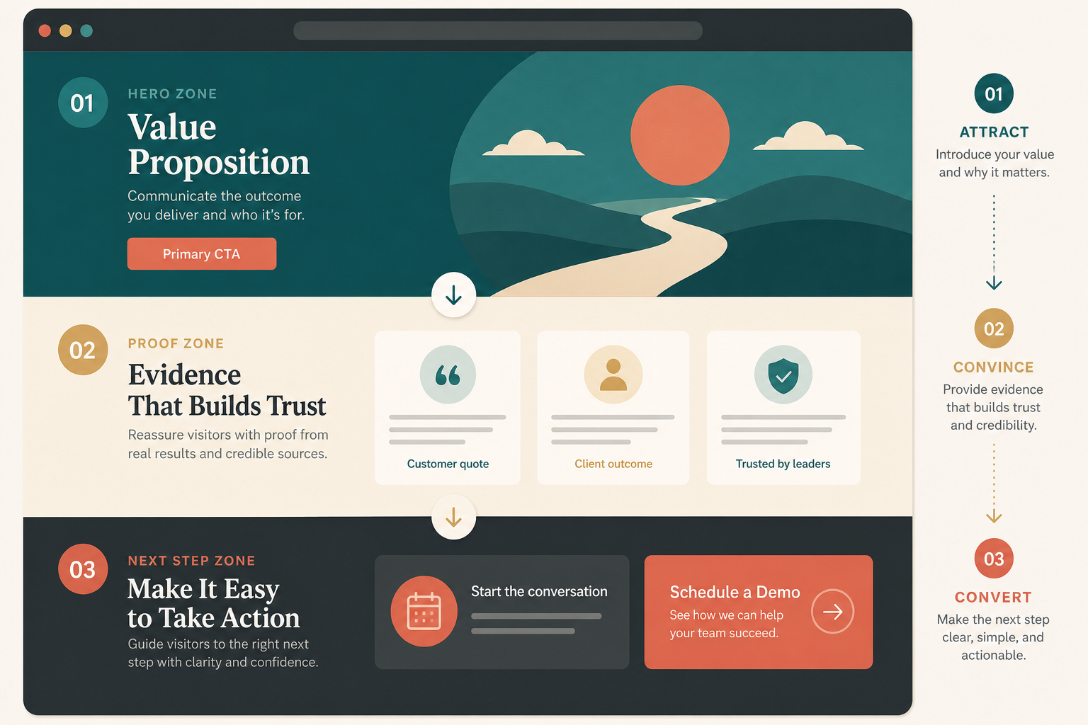
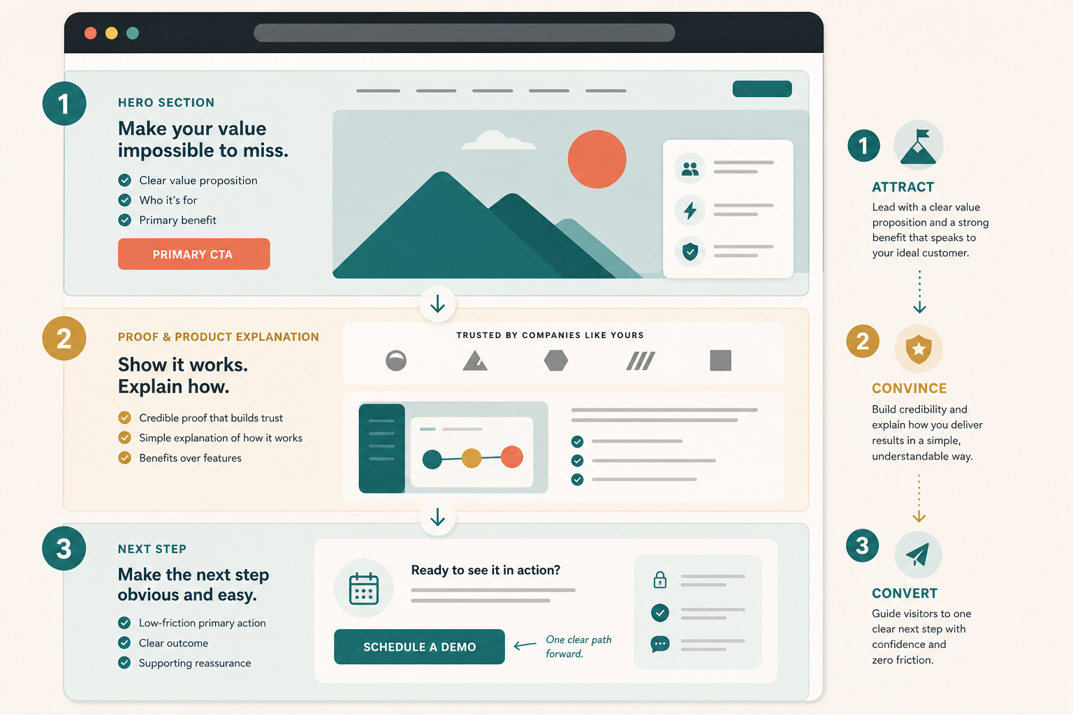
A practical B2B homepage usually works best in this order: hero, immediate proof,
product explanation, supporting sections, then the closing CTA.
The homepage should help a B2B buyer move from attraction to conviction to action
without guessing what to do next.
Attract with clear audience, problem, outcome, and one main CTA.
Convince with nearby proof and a simple product explanation.
Convert with one cleaner path that answers the last real objection.
Good use versus poor use
Good use
Writing the homepage for one buying motion instead of all of them.
Showing proof where the main doubt appears.
Explaining the workflow in plain language before asking for time.
Using one primary CTA with one softer fallback.
Leaving enough detail for a buyer or AI assistant to summarize the offer accurately.
Poor use
Treating the homepage like a brand manifesto.
Hiding the product behind abstract copy.
Asking for a demo before the visitor understands what the product does.
Stuffing every possible CTA into the hero.
Using SEO terms that never answer a real buyer question.
SEO and AEO checks for a B2B homepage
Based on Google's SEO Starter Guide, the right baseline is simple: help search
engines understand the page, and help users decide whether they should visit.
Name the product category and primary use case in visible text.
Keep the main value proposition in HTML text, not only in images or video.
Use headings that reflect buyer questions, not only brand slogans.
Keep metadata, on-page claims, and structured data aligned to the same story.
Use alt text that explains what each image teaches the reader.
Keep structured data tied to visible page content.
Check practical performance basics so the hero and CTA still feel responsive.
AEO is an inference from those same rules: if a search engine or assistant cannot
summarize who the product is for and what it does from the page itself, the
homepage is still too vague.
Test before you ship
Open the page in a fresh browser session.
Give yourself 10 seconds to answer who the product is for, what it does, and what the next step is.
Check whether the first proof block supports the hero claim.
Ask whether the page explains the product before it asks for commitment.
Click the primary CTA and complete the path on desktop and mobile.
Ask one teammate outside marketing or design to summarize the homepage after one pass.
Check title, meta description, canonical URL, structured data, and performance basics after the copy changes are live.
Where TitleFlash fits
TitleFlash is not the homepage strategy. It is one supporting return-path tactic
after the homepage already makes sense.
If a qualified B2B buyer opens pricing, product, or demo pages in another tab and
gets distracted, a short inactive-tab title can help them notice the page again.
That works best after the message, proof, and CTA path are already clear.
Use return-path tactics after clarity is working.
The exported TitleFlash script is self-contained. It does not call TitleFlash
after installation, does not load a TitleFlash CDN, and does not send visitor
analytics back to TitleFlash at runtime.
Use this traffic-fit framework to choose one useful channel, match the source to
the right page, and measure whether visitors are taking the next step before you
scale.
Published by TitleFlash.
Useful traffic starts when the source, landing page, and next action all match the
visitor's intent.
The quick answer
To attract the right visitors to your website, do not start with "more traffic."
Start with a route: choose one audience, one source, one matching page, one next
step, and one first-wave review.
1Audience
Choose one segment with a real reason to care.
2Source
Pick where that audience already searches, listens, or trusts.
3Page
Match the source promise in the first screen.
4Action
Give one next step that fits the visitor's intent.
5Review
Use the first traffic wave to check useful action.
For a new site, a good starter test is one search-focused guide, one founder or
operator post, one partner or customer loop, and one 7 to 14 day measurement
window before changing the page again.
The wrong visitors are not a growth win
A visitor is not useful just because analytics counted a session. The visitor is
useful when the source, page, and next step match.
Visitors arrive with a question the page does not answer.
Visitors expect education but land on a hard sales page.
Visitors are curious but not close enough to the problem to take action.
Visitors trust the referrer but the landing page does not mention the same promise.
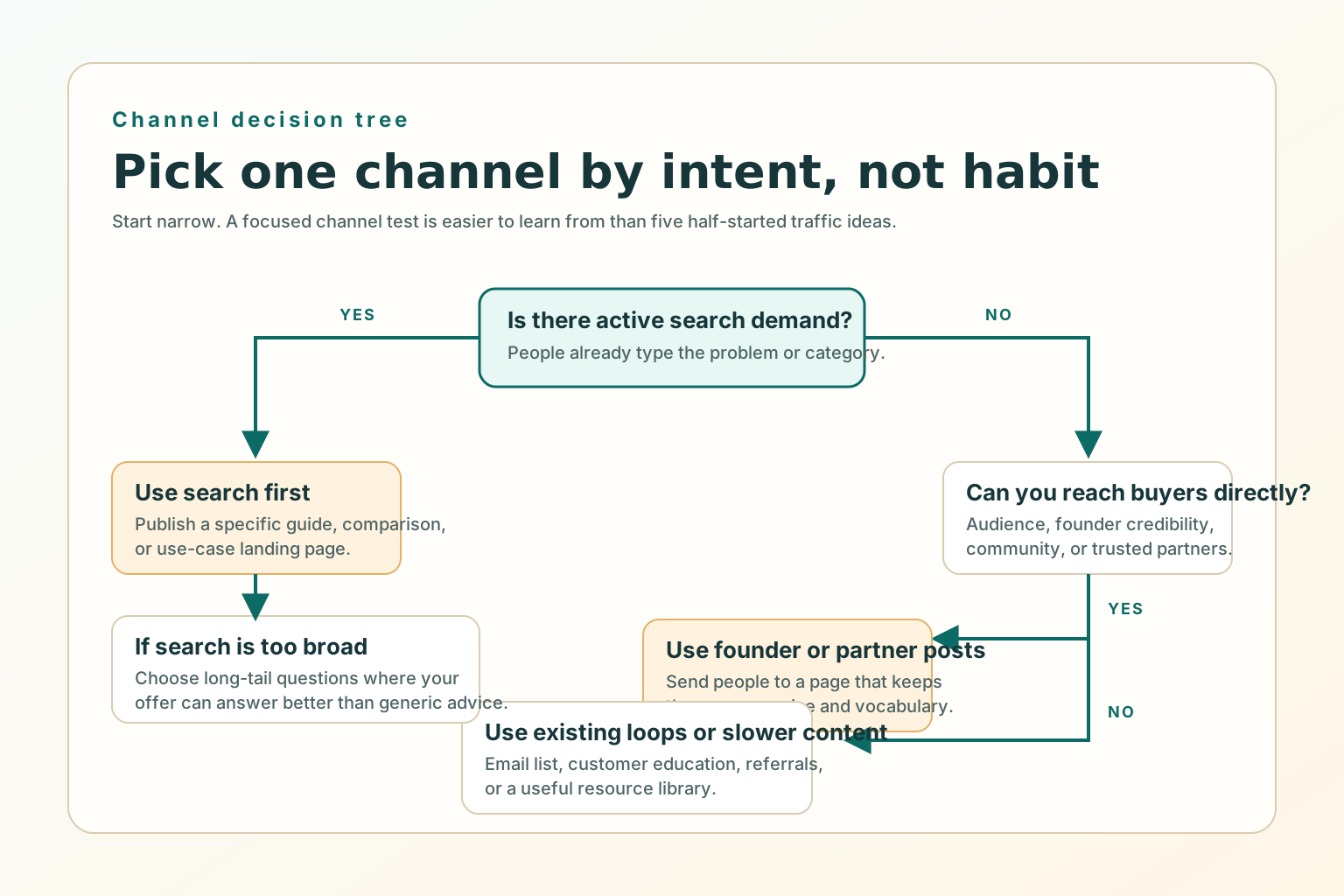
Pick channels based on buyer intent
The easiest way to choose a first channel is to ask where intent already exists.
Search works when people already describe the problem. Founder-led posts work when
trust and point of view matter. Partnerships and communities work when the audience
already gathers around the problem. Customer loops work when trust already exists.
Choose the first channel by buyer intent and audience access, not by what feels
popular.
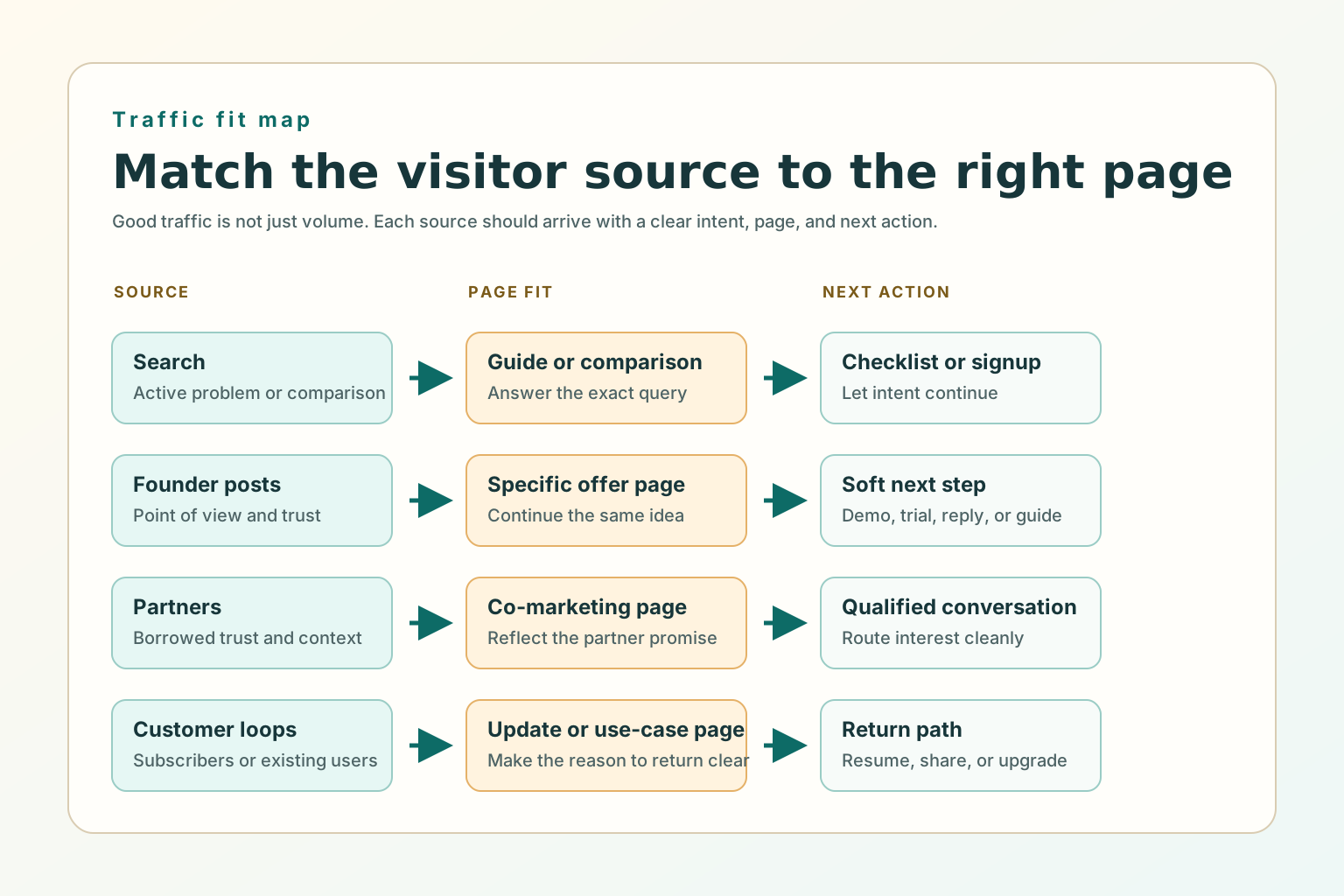
Match each source to the right page
Every traffic source has an expectation. The first screen should answer whether the
visitor is in the right place, whether the page continues the source promise, and
what the next useful step is.
Search
Answer the query
Use a specific guide, checklist, comparison, or use-case page.
Founder post
Continue the idea
Send people to a page that expands the same claim or framework.
Partner audience
Preserve trust
Use a partner-specific landing page that reflects the shared promise.
Customer email
Resume the relationship
Use an update, use-case page, saved workflow, or next-step page.
What to fix before scaling a channel
Before you ask for more visitors, fix the offer-message fit, one primary next step,
proof near the claim, and mobile basics so the first small wave can teach you
something.
The source promise and page headline point to the same problem.
The page gives one main action that fits the traffic route.
Proof appears where doubt appears.
The CTA path works on desktop and mobile.
The title, meta description, canonical URL, and internal links match the public page.
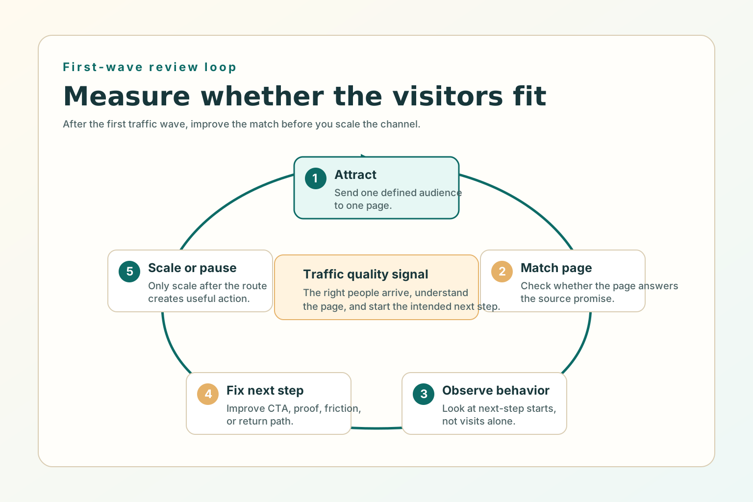
What to measure after the first wave of traffic
The first wave of traffic should answer a fit question, not prove the whole
business. Use a simple 7 to 14 day review window for a beginner channel test.
Review the first wave of traffic before deciding whether to scale, rewrite, or
change channel.
People from the source continue past the first screen.
Visitors click the intended next step.
Demo, pricing, signup, cart, or contact starts increase from that source.
Qualified replies mention the same problem the page promised to solve.
SEO and AEO checks for attracting better visitors
SEO and AEO are clarity work. Google says helpful content should be created for
people first, and its link guidance emphasizes crawlable anchor links that help
users and Google understand connected pages.
Write for one intended audience and one practical job.
Put the useful answer in visible HTML text, not only inside images, video, or client-only UI.
Use internal links with normal <a href> anchors.
Add Article or BlogPosting structured data only for visible article content.
Keep metadata, headings, sitemap entries, and agent-readable Markdown aligned.
Good use versus poor use
Good use
Choosing one channel test because the audience and page match.
Creating a specific page for a specific traffic promise.
Measuring next-step starts and qualified interest, not visits alone.
Adding a calm return path for visitors who were interested but got distracted.
Poor use
Posting everywhere with no matching page.
Sending every source to the homepage because it is easier.
Buying broad traffic before the offer and next step are clear.
Treating SEO as a list of keywords instead of useful answers.
Test before you ship
Open the source message and landing page side by side.
Check whether the first screen continues the same promise.
Say the intended audience, problem, and next step out loud within 10 seconds.
Click the primary CTA on desktop and mobile.
Confirm the page title, meta description, canonical URL, internal links, image alt text, and structured data match the page.
Wait for the first review window before adding another channel.
Where TitleFlash fits
TitleFlash is not a traffic source. It fits after the visitor has already shown
interest. If someone opens a pricing page, demo page, guide, cart, or setup flow
and then switches tabs, a short inactive-tab title can help them notice the
unfinished task again.
Add a respectful return path for visitors who were interested but distracted.
The exported TitleFlash script is self-contained. It does not call TitleFlash
after installation, does not load a TitleFlash CDN, and does not send visitor
analytics back to TitleFlash at runtime.
B2B Website Lead Capture Best Practices for Demo, Pricing, and Contact Pages
Use page-specific forms, routing, and handoff checks so high-intent B2B visitors get
the right next step instead of falling into one generic inbox.
Published by TitleFlash.
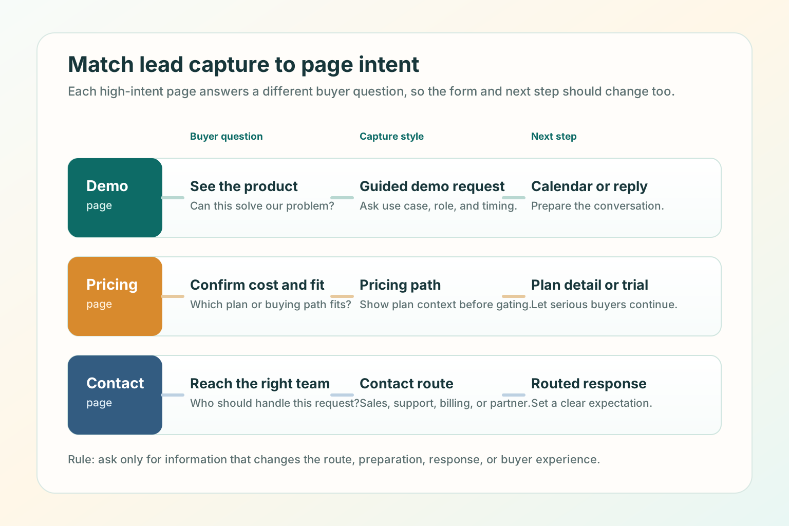
Lead capture improves when each high-intent page asks for the next step that matches
the buyer's question.
The quick answer
The best B2B lead capture setup starts by matching the page to the buyer's intent:
demo pages prepare a conversation, pricing pages help buyers confirm commercial
fit, and contact pages route the request to the right owner.
1
Buyer question
What is this visitor trying to learn or finish on this page?
2
Minimum info
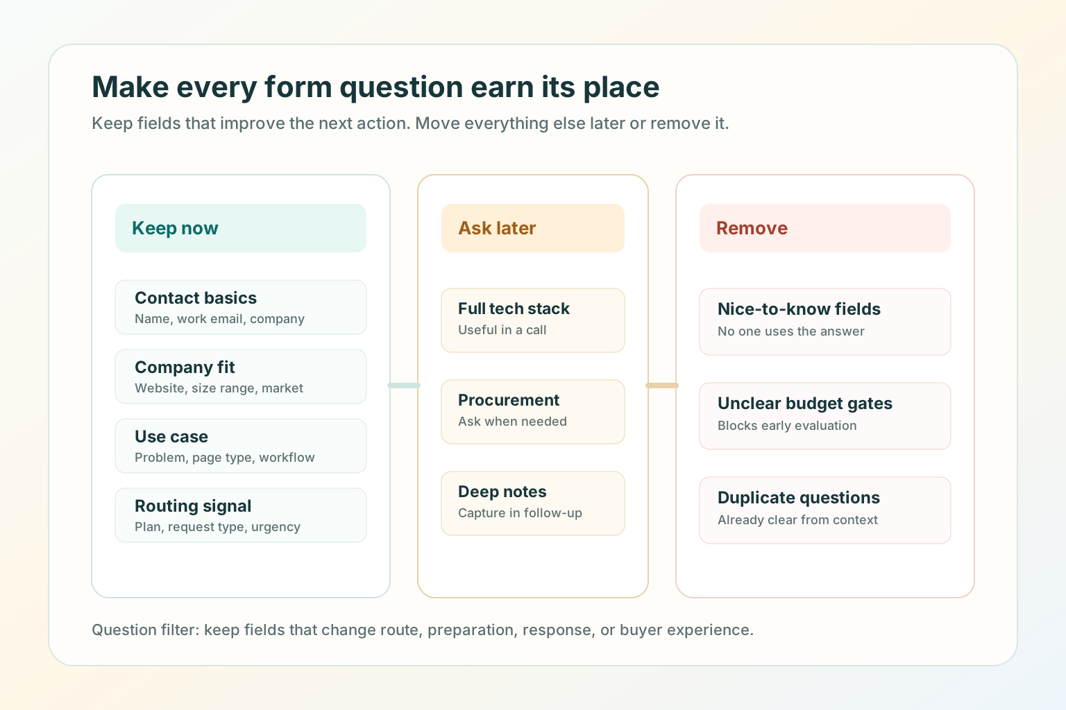
Which fields improve route, preparation, response, or buyer experience?
3
Submission promise
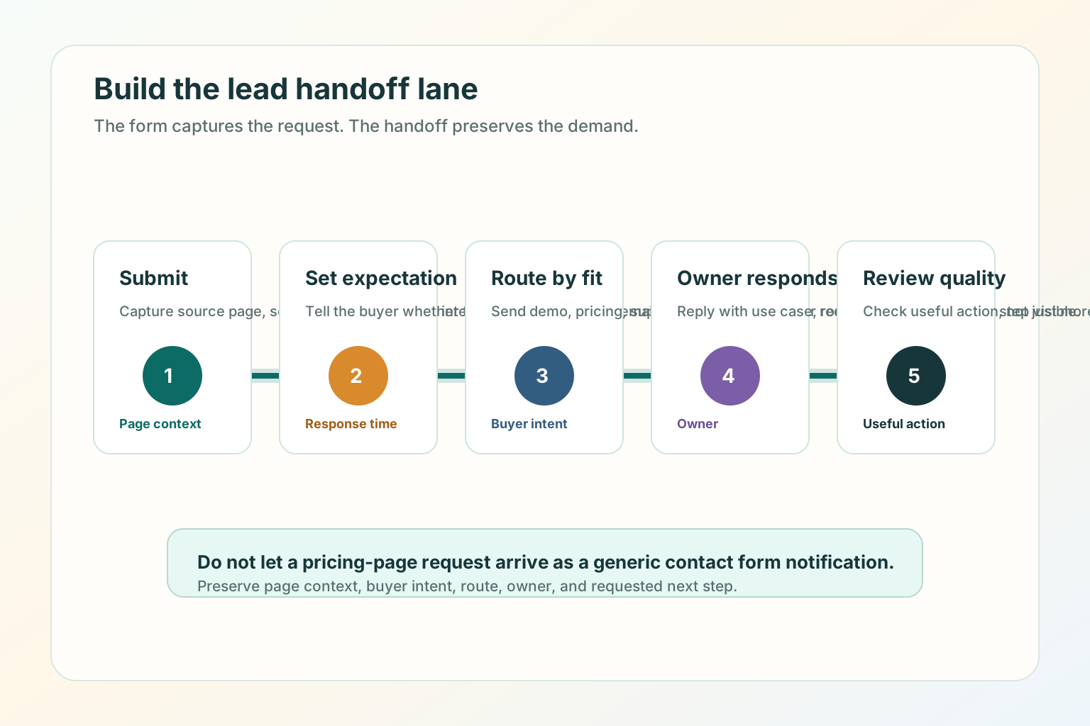
What happens after the buyer submits the request?
4
Owner or route
Who receives the request and what context do they need?
Lead capture is a handoff, not a form
Many B2B teams treat lead capture as a form-length problem, but the form is only one
part of the system. The page promise, submission expectation, routing rule,
response context, and quality review all decide whether qualified demand is
preserved.
The page promise makes the visitor willing to act.
The form or CTA captures the request.
The thank-you state sets the expectation after submission.
The routing rule sends the request to the right owner.
The review loop tells marketing whether the page attracted the right demand.
Match capture to the page intent
Demo, pricing, and contact pages often sit close together in the navigation, but
they do different jobs. The wrong capture style creates friction when the visitor is
closest to action.
Demo page
Can this solve my problem?
Use a guided demo request with role, use case, company fit, and timing context.
Pricing page
Which plan or buying path fits?
Use a pricing path with plan context, self-serve option, or sales-assisted route.
Contact page
Who should handle this request?
Use clear routing choices for sales, support, billing, partnership, or general contact.
Demo page best practices
A demo page should help a qualified buyer imagine the conversation before they book
it. Qualify enough to prepare the conversation, not enough to interrogate the buyer.
Keep the primary demo form to 4 to 6 fields.
Put "what happens next" next to the form, not only on the thank-you page.
Show who the demo is best for so poor-fit visitors can self-select out.
Include one softer path for visitors who are not ready.
Confirm whether the next step is calendar booking, manual reply, or a qualification call.
Pricing page best practices
A pricing page captures lead intent differently because the visitor is comparing
cost, packaging, and fit. Make the page useful before asking for contact details.
ShowPlan context
Plan names, core differences, billing period, and who each path is for.
ExplainSales-assisted fit
What happens when a buyer needs more than the public plan.
RouteCommercial next step
Quote, annual billing, pricing walkthrough, trial, or self-serve checkout.
Contact page best practices
A B2B contact page is the safety net for the whole site. It should route sales,
support, billing, partnership, and general requests instead of forcing every visitor
through the same blank box.
What can we help with?
- Sales or demo
- Support or installation
- Billing or account
- Partnership
- Something else
What to ask in a B2B lead form
A form field should earn its place.
A useful form keeps routing questions and removes fields that do not change the
next action.
Keep fields that change the next action
Contact basics: name, work email, and company.
Company fit: company website, size range, or market when it affects routing.
Use case: the problem, page type, workflow, or team goal.
Routing signal: plan interest, request type, region, or urgency when it changes the owner.
Move or remove the rest
Detailed budget, full tech stack, procurement process, and long implementation notes can often wait.
Nice-to-know fields, unclear budget gates, duplicated fields, and required blank message boxes should be removed.
Build the handoff lane
The form is only the start. Qualified demand still needs a clear handoff.
The form is only the start. Qualified demand needs a clear handoff after the
visitor submits.
Submit: capture the request, source page, and selected path.
Set expectation: confirm what happens next and whether the buyer should book, wait, or check email.
Route by fit: send demo, pricing, support, billing, and partnership requests to the right owner.
Owner responds: reply with page context, use case, and requested next step visible.
Review quality: check whether the page is producing useful action, not just more submissions.
Good use versus poor use
Good use
Matching each high-intent page to one buyer question.
Asking only for fields that improve routing, preparation, or response.
Showing what happens after the visitor submits.
Reviewing lead quality by page, not only by total form submissions.
Poor use
Using the same long form on every high-intent page.
Hiding basic pricing, plan, or next-step context behind a required demo request.
Asking qualification questions that do not change the next action.
Measuring success only by submission count.
SEO and AEO checks for lead capture pages
SEO and AEO for lead capture pages are mostly clarity and crawlability work.
Google's helpful content guidance says content should be made for people first, and
its link guidance emphasizes crawlable links with useful anchor text.
Put the page's main answer in HTML text, not only in a form, modal, video, or image.
Use a descriptive title and H1 that match the page's real job.
Keep demo, pricing, and contact pages internally linked with normal <a href> links.
Keep metadata, headings, sitemap entries, and agent-readable Markdown aligned.
Add a direct answer near the top so a search engine, assistant, or human can summarize the page without guessing.
Test before you ship
Open the page on desktop and mobile.
Say the buyer question out loud within 10 seconds.
Check whether the CTA and form match that question.
Remove any field that does not change route, preparation, or response.
Submit a test request for each route.
Confirm the thank-you state says what happens next.
Confirm the owner receives the source page, selected path, and buyer context.
Check the page title, meta description, canonical URL, internal links, image alt text, structured data, sitemap entry, and Markdown alternate.
Where TitleFlash fits
TitleFlash does not replace a clear demo, pricing, or contact page. It supports the
return path after the page already makes sense.
If a buyer opens a demo page, pricing page, or contact form and then switches tabs,
a short inactive-tab title can help them notice the unfinished task again.
Add a respectful return path after lead capture clarity is working.
The exported TitleFlash script is self-contained. It does not call TitleFlash
after installation, does not load a TitleFlash CDN, and does not send visitor
analytics back to TitleFlash at runtime.
Website CTA Best Practices: What to Say and Where to Put It
Write calls to action that say what happens next, appear at the right decision point,
and give distracted visitors a respectful path back when they leave the page open.
Published by TitleFlash.
CTA placement works best when the next action appears at the point where the visitor
is ready for it.
The quick answer
The best website CTAs are specific, honest, and placed at decision points. A CTA
should match the visitor's intent on that page, not reuse the same generic button
everywhere.
1First screen
Use one primary CTA after category, outcome, and audience are clear.
2Decision points
Add CTAs after proof, comparison, pricing, feature, or FAQ sections.
3Softer path
Help visitors who need examples, pricing, or more context before acting.
Good CTA copy is usually 2 to 6 words when the surrounding text explains the
context. If the button needs 10 words to make sense, the section around it probably
needs clearer copy.
Why CTAs fail
Weak CTAs usually fail because the copy is vague, the promise is unclear, the page
asks too early, or the destination does not match the button text.
CopyToo vague
"Submit," "Learn more," and "Get started" do not always explain the next step.
PromiseUnclear outcome
The visitor cannot tell whether the click starts checkout, a demo, a download, or a sales request.
PlacementToo early
The page asks for action before explaining enough value, proof, or fit.
RouteTrust break
The destination does not match what the CTA promised.
Match CTA copy to page intent
CTA copy should change based on what the visitor is trying to do. The best CTA is
not always the most aggressive CTA. It is the one that matches the trust, context,
and readiness the page has already earned.
CTA copy should say what the visitor gets next, not only what the company wants.
Read the guideCompare plansChoose yearlyRequest a demoFinish setup
Use outcome-first CTA copy
Good CTA copy tells the visitor what they get next. If you use "Get started,"
support it with nearby text that explains what starts: free account, checkout, demo
request, builder preview, guide download, or quote request.
Better patterns
"Compare plans" instead of "Learn more" on a pricing page.
"Build a tab-title flow" instead of "Get started" on a product page.
"See ecommerce examples" instead of "Explore" on a use-case page.
"Request a pricing walkthrough" instead of "Submit" on an enterprise pricing form.
"Continue setup" instead of "Go" inside an app or install flow.
Weak patterns
"Submit" when the visitor is sending a high-intent request.
"Click here" when the destination should be obvious.
"Get started" on every button, even when each section has a different job.
"Book now" before the page explains what the meeting includes.
"Download" without naming the asset.
Where to put CTAs on a website page
CTA placement should follow the reader's decision path. Use CTA placement to reduce
effort, not to shout.
First screen: one primary CTA after the headline explains category, outcome, and audience.
Proof section: a CTA after testimonials, logos, case examples, or trust details.
Feature or benefit section: a CTA after the visitor understands the specific value.
Comparison section: a CTA after the page answers "why this instead of that?"
Pricing section: a CTA next to the plan, quote path, or billing choice it belongs to.
Form section: a CTA that says exactly what happens after submission.
End of page: a final CTA after objections, FAQ, and risk reducers.
Do not place the same CTA after every short block of text. Repetition can make the
page feel desperate.
Primary and secondary CTAs
Most important pages need one primary CTA and one softer path. The secondary CTA
should not compete visually with the primary action.
HomepageBuild a tab-title flow
Secondary: See examples.
Demo pageRequest a demo
Secondary: Compare plans.
Pricing pageStart with monthly
Secondary: Ask about annual billing.
Install pageCopy script
Secondary: Open install guide.
CTA examples by page type
Homepage CTAs
Build a tab-title flow
See live examples
Compare pricing
Preview the script
Start free
Pricing page CTAs
Start monthly
Choose yearly
Buy one script
Ask about annual billing
Compare plan limits
Demo and contact CTAs
Request a demo
Book a pricing walkthrough
Ask an installation question
Send a billing request
Talk to support
Content and guide CTAs
Use this checklist
See related examples
Build this flow
Save the setup steps
Read the GTM install guide
Good use versus poor use
Good use
Matching CTA copy to the page's real job.
Putting the primary CTA where the visitor has enough context to act.
Using secondary CTAs for visitors who need examples, pricing, or proof.
Making the post-click destination match the button promise.
Testing CTAs on mobile, not only desktop.
Giving return visitors a calm way to resume an unfinished task.
Poor use
Reusing the same CTA copy on every page.
Making every button visually primary.
Asking for a demo before explaining what the product does.
Sending "Compare plans" to a generic contact form.
Measuring CTA success only by clicks instead of qualified next steps.
Adding popups or flashing buttons to compensate for unclear page copy.
SEO and AEO checks for website CTAs
Search engines and AI assistants need visible, crawlable page content to understand
what a page offers. CTA copy can support that when it is aligned with the page's
heading, internal links, and destination.
Put the page's main answer and next step in HTML text, not only in an image, modal, or script-rendered control.
Use descriptive internal links such as "Compare pricing plans" instead of "Click here."
Make the H1, meta description, and primary CTA describe the same page job.
Add breadcrumb structured data when the page sits inside a guide or resource hierarchy.
Make image alt text explain what the visual teaches.
Keep the Markdown version aligned with the HTML article so agents can consume the guide without running JavaScript.
A CTA change is ready when the promise, route, mobile behavior, and return path
all hold together.
Open the page on desktop and mobile.
Read only the headline, first paragraph, and first CTA.
Say what the visitor gets after clicking.
Click the CTA and confirm the destination matches the promise.
Submit a test form if the CTA opens a form.
Check that the thank-you state or next page sets the right expectation.
Confirm tracking or analytics identifies the CTA without collecting unnecessary personal data.
Switch tabs for 10 to 20 seconds and return to see whether the page state is preserved.
Review clicks and qualified next steps after a small traffic window before changing the CTA again.
If the CTA gets more clicks but fewer useful next steps, the copy may be
overpromising or routing the wrong visitors.
Where TitleFlash fits
TitleFlash does not replace clear CTA copy or page structure. It supports the return
path after the visitor has already shown interest.
If someone opens a pricing page, demo page, cart, setup flow, or guide and then
switches tabs, a short inactive-tab title can help them notice the unfinished task
again.
Add a respectful return path after CTA clarity is working.
The exported TitleFlash script is self-contained. It does not call TitleFlash
after installation, does not load a TitleFlash CDN, and does not send visitor
analytics back to TitleFlash at runtime.
How to Reduce Bounce Rate Without Adding More Popups
Diagnose traffic fit, first-screen clarity, page friction, and next-step design
before you ask visitors for more attention.
Published by TitleFlash.
Bounce rate improves most reliably when you fix the reason people leave before you
ask for more attention.
The quick answer
To reduce bounce rate without adding more popups, check measurement, traffic fit,
first-screen clarity, page friction, next-step design, and return paths in that
order.
01Measure
Confirm how your analytics tool defines a bounce.
02Match
Compare the source promise with the page headline.
03Clarify
Make the right visitor understand the offer in 5 seconds.
04Reduce
Remove load, mobile, navigation, and form friction.
05Guide
Give one next step that matches visitor intent.
06Resume
Add a calm return path only when the page is useful.
What bounce rate actually means
Before you fix bounce rate, confirm what your report is measuring. In Google
Analytics 4, bounce rate is the opposite of engagement rate. Google defines an
engaged session as a session that lasts longer than 10 seconds, has a key event, or
has 2 or more page or screen views.
A visitor may read a short page, get the answer, and leave without being a bad
visitor. Another visitor may stay longer because they are confused. The metric needs
context.
Use bounce rate as a question.
Did the visitor find the right page?
Did the page answer the promise quickly?
Did the page offer a relevant next step?
Did friction stop the visitor before they could act?
Did the page need to be a one-page answer?
Diagnose the cause before choosing the fix
Most bounce-rate fixes fail because they start with the tactic instead of the cause.
If the traffic is wrong, page polish will not save it. If the first screen is
unclear, a popup will not make it clearer.
MeasurementDoes the report mean what the team thinks it means?
Confirm engaged-session rules and key events.
Traffic fitDid the source promise match the page?
Rewrite the ad, post, internal link, or landing page headline.
First screenCan the right visitor understand the offer in 5 seconds?
Clarify category, outcome, audience, proof, and CTA.
FrictionIs the page slow, cramped, broken, or hard to scan?
Improve load, mobile layout, navigation, and form behavior.
Next stepIs there one relevant action after the answer?
Add a specific CTA, related guide, pricing path, or checkout continuation.
Return pathDid an interested visitor leave something unfinished?
Add a respectful reminder or saved-state cue after the page works.
Check traffic fit first
A bounce can be a page problem, but it can also be a source problem. If one source
has weak engagement and the others are healthy, do not redesign the whole page.
Search visitors: does the page answer the query directly?
Paid traffic: does the ad promise match the headline and offer?
Social traffic: does the page continue the same claim, example, or point of view?
Partner traffic: does the page preserve the borrowed trust and context?
Returning visitors: does the page help them resume what they already started?
The first screen has to earn the next scroll. It does not need to explain
everything, but it must make the page feel immediately relevant.
The first screen should answer the visitor's question before any interruption asks
for attention.
The headline names the category, problem, or outcome plainly.
The first paragraph explains who the page is for.
The visitor can tell what they will get next if they continue.
The primary CTA says what happens after the click.
Proof appears near the claim it supports.
The page is readable on a real phone without closing an overlay or hunting for navigation.
The first screen is not blocked by a newsletter popup, discount modal, chat takeover, or oversized cookie prompt.
Reduce load, mobile, and form friction
Some bounces are caused by friction the team stopped noticing. Google's page
experience guidance is broader than a single score: content access, mobile display,
speed, distractions, and whether the main content is easy to distinguish all matter.
1Render the answer
The visitor should not stare at a blank or jumping first screen.
2Make mobile readable
Buttons, links, headings, and forms should work on a real phone.
3Remove stacked prompts
Do not pile banners, chat, cookie notices, and forms above the answer.
Improve the next step
Many pages answer the first question and then let the visitor fall off the edge.
Good next steps are specific.
HomepageExamples, pricing, or product tour
Give the visitor a path after the category and promise are clear.
PricingPlan, quote, or billing question
Route commercial intent instead of hiding everything behind one form.
GuideRelated guide, checklist, or setup
Respect the reader's current job before asking for a sale.
DemoWhat happens after the request
Explain whether the next step is a calendar, reply, or qualification call.
A return path helps when the visitor has already shown interest but gets
distracted. The rule is simple: fix the page first, then add a reminder that helps
the visitor resume.
Good return-path moments
A visitor opens a pricing page and switches tabs.
A shopper leaves a cart or checkout page open.
A reader pauses halfway through a practical guide.
A user starts setup but needs to check another tab.
A buyer opens a demo form and leaves before submitting.
Poor return-path moments
The visitor landed on the wrong page.
The page is slow or broken.
The first screen does not explain the offer.
The CTA is vague.
The page uses a popup to compensate for unclear content.
Good use versus poor use
Good use
Segmenting bounce rate by source, page, and device.
Matching the page headline to the source promise.
Making the first screen clear before adding conversion tactics.
Reducing friction in load, mobile, navigation, and forms.
Giving each page one relevant next step.
Using a calm return reminder for unfinished high-intent moments.
Poor use
Treating bounce rate as a standalone success metric.
Adding a popup before diagnosing the cause.
Blocking the main content before the visitor can read it.
Sending broad traffic to a narrow page.
Measuring only lower bounce rate while qualified actions get worse.
Using aggressive title messages, flashing UI, or urgency copy to force attention.
SEO and AEO checks for bounce-rate fixes
Search engines and AI assistants need accessible, visible page content. Bounce-rate
fixes should make that content easier to understand, not harder to reach.
Put the direct answer near the top in crawlable HTML text.
Make the title, H1, meta description, and first paragraph describe the same page job.
Use descriptive internal links with real href attributes.
Avoid intrusive interstitials that block the main content unless they are legally required.
Add image alt text that explains what each visual teaches.
Keep structured data aligned with visible content.
Keep the Markdown alternate aligned with the HTML page so agents can read the article without JavaScript.
The better path reduces confusion before it tries to recover attention.
Pick one page with meaningful traffic.
Pick one source or segment to review.
Record bounce rate, engagement rate, next-step starts, form starts, qualified submissions, or checkout starts.
Make one page-first fix: headline, first paragraph, proof placement, CTA, speed, mobile layout, or form friction.
Keep popups, chat prompts, and new reminders unchanged during the first test.
Compare the same source and device mix after a small traffic window.
Keep the fix only if engagement quality improves, not only if bounce rate drops.
Where TitleFlash fits
TitleFlash is not a bounce-rate analytics tool, popup builder, or hosted
customer-site runtime. It should not be used to cover for unclear pages, wrong
traffic, slow load, or broken forms.
It fits after the page already makes sense. If someone opens a pricing page, guide,
cart, setup flow, or demo form and then switches tabs, a short inactive-tab title
can help them notice the unfinished task again.
Still comparing?Pricing page openFinish setupCart waitingKeep reading
Fix the page first, then add a calmer return reminder.
The exported TitleFlash script is self-contained. It does not call TitleFlash
after installation, does not load a TitleFlash CDN, and does not send visitor
analytics back to TitleFlash at runtime.
Build a clear route from visitor intent to qualified handoff with better criteria,
capture, routing, and follow-up.
Published by TitleFlash.
Qualified demand appears when the page, request, criteria, and handoff all preserve
the visitor's intent.
The quick answer
To turn website visitors into qualified leads, build a clear route from intent to
handoff: define qualification, match the page to the visitor moment, ask only for
useful context, route with that context, and measure quality after the handoff.
1
Define
Decide what qualified means before changing a form or buying another tool.
2
Match
Map each page to a visitor moment: learn, compare, choose, ask, or resume.
3
Capture
Use the CTA, form, chat, booking, trial, quote, or route that fits the moment.
4
Handoff
Send the lead with context, then review quality after the response.
Start with one high-intent page such as pricing, demo, contact, product comparison,
checkout, setup, or a deep guide. Fix that route before trying to optimize the
whole site.
Capture is not the same as qualification
A captured lead is someone who gave you contact information. A qualified lead is
someone your team can route, respond to, or help based on fit and intent.
Capture answers
"Can we contact this person?"
Name, email, company, phone, or account.
Consent, request type, or selected path.
Enough detail to continue the conversation.
Qualification answers
"What should happen next, and who should own it?"
Fit, problem, intent, and timing.
Sales, support, billing, nurture, or not-fit route.
Context that makes the response useful.
Define qualified intent for your business
Do not copy another company's qualification rules without checking your own buying
motion. For a self-serve product, qualification may start when someone reaches a
setup limit. For a sales-led B2B product, it may start when a target account asks
for a demo with a real use case.
A qualification rule is useful only when it changes the route, response,
preparation, or visitor experience.
Fit
Can you serve them well?
Company type, website model, team, market, or plan fits your offer.
Problem
What job are they trying to finish?
They name a use case, page problem, campaign, workflow, or buying question.
Intent
What did the request reveal?
They reached pricing, demo, setup, comparison, quote, or contact routing.
Match the capture method to the visitor moment
Every page should not ask for the same thing. The capture method should feel like
the natural continuation of the page, not a trapdoor.
LearningGuide, checklist, template
Do not block the answer with a sales form before value is clear.
ComparingPricing, proof, buying FAQ
Give enough context before asking for the next commercial step.
ChoosingDemo, quote, trial, checkout
Explain what happens after the request and who owns the response.
Build a qualification path across pages
Qualified leads often come from a sequence, not a single page. You do not need to
track every movement to improve the path. Start by making the visible route
coherent.
The guide or landing page answers the immediate question.
The internal link points to a specific next page with descriptive anchor text.
The pricing, demo, or contact page explains what kind of request belongs there.
The form or CTA asks only for details that improve the next action.
The thank-you state says what happens next.
The owner receives context, not only a notification.
The handoff is where many qualified visitors become generic leads. The next owner
should not receive only "New form submission." They should receive enough context
to respond to the visitor's actual question.
The next owner should receive enough context to respond to the buyer's actual
question.
Source page: which page or section prompted the request.
Buyer question: demo, pricing, setup, support, billing, comparison, or quote.
Use case: the problem the visitor described or selected.
Fit signal: company, site type, role, plan interest, region, or team size when relevant.
Selected route: calendar, reply, quote, trial, support, billing, or product help.
Next promise: what the page or thank-you state told the visitor would happen.
Good use versus poor use
Good use
Defining qualification before redesigning forms.
Matching capture to the page's visitor moment.
Asking for fields that improve route, response, preparation, or visitor experience.
Giving sales, support, or success the page context behind the request.
Measuring qualified actions by page and source.
Poor use
Treating every email address as equally qualified.
Measuring only form volume while lead quality drops.
Sending demo, billing, support, and partnership requests into one inbox.
Hiding basic answers behind a form and calling every submission "qualified."
Using a reminder, popup, or chat takeover to compensate for an unclear page.
SEO and AEO checks for qualified lead pages
SEO and AEO for lead qualification are mostly clarity, crawlability, and alignment
work. Search engines and AI assistants should be able to understand who the page is
for, what question it answers, what next step it offers, and what visible content
supports the structured data.
Put the direct answer near the top in crawlable HTML text.
Make the title, H1, meta description, and first paragraph describe the same page job.
Use descriptive internal links with real href attributes.
Keep form labels and CTA text clear enough that the next step can be understood out of context.
Use image alt text that describes what each diagram teaches.
Keep BlogPosting and BreadcrumbList structured data aligned with visible page content.
Keep the Markdown alternate aligned with the HTML page so agents can read the article without JavaScript.
Review page experience basics, including load speed, interactivity, and visual stability.
Say the visitor moment out loud: learn, compare, choose, ask, or resume.
Confirm the H1, intro, CTA, and form all match that moment.
Remove any field that does not change routing, preparation, response, or visitor experience.
Submit a test request for every route.
Confirm the thank-you state repeats the promised next step.
Confirm the owner receives source page, selected route, use case, contact details, and next promise when available.
Check the page title, meta description, canonical URL, internal links, image alt text, structured data, sitemap entry, and Markdown alternate.
Review qualified outcomes after the handoff, not only the number of submissions.
Where TitleFlash fits
TitleFlash does not qualify leads, replace your CRM, score visitors, or track
customer-site analytics. It should not be used to cover for unclear pages, poor
routing, or forms that ask the wrong questions.
It fits after the page already gives the visitor a useful path. If someone opens a
pricing page, demo page, guide, setup flow, cart, or contact form and then switches
tabs, a short inactive-tab title can help them notice the unfinished task again.
Still comparing?Pricing page openFinish setupDemo request openKeep reading
Rescue more qualified demand before it disappears.
The exported TitleFlash script is self-contained. It does not call TitleFlash
after installation, does not load a TitleFlash CDN, and does not send visitor
analytics back to TitleFlash at runtime.
Compare
Docket,
Qualified,
Intercom,
and
1mind
with a practical rubric for qualification, handoff, pricing, and fit.
Published by TitleFlash.
Vendor facts refreshed from official sources on June 12, 2026.
Pick the tool by the inbound job, not by the category label.
The quick answer
If your main job is AI-native website qualification for B2B inbound demand,
shortlist
Docket
first. It is the clearest fit in this group for a website visitor who needs a
contextual buying conversation, Agent Qualified Lead handoff, CRM context,
implementation support, and a pilot path to prove fit before a broader rollout.
Worth evaluating for a high-touch AI closer-style buying motion.
Qualified
is strongest when Salesforce is the center of your go-to-market workflow and you
want an enterprise agentic marketing platform around Piper.
Intercom
is strongest when the main workflow is customer service or support-first
automation with Fin, not pure B2B demand generation.
1mind
is worth evaluating if you want an AI closer-style experience and are comfortable
with a contact-sales, order-form buying motion.
What a B2B inbound lead capture tool must do
A B2B inbound lead capture tool should do more than collect an email address. It
should help the visitor answer the question that brought them to the site, identify
whether the request is sales-ready, route the request with context, and preserve
enough information for the next owner to respond well.
A tool comparison is useful only when the rubric matches the buying motion.
Buyer-help depth: can the tool answer real buyer questions, not only greet visitors?
Qualification quality: can it distinguish fit, problem, intent, timing, and next step?
Handoff context: does the owner receive the source page, buyer question, route, and promised next step?
Workflow fit: does it match your CRM, support, sales, and marketing operating model?
Pricing transparency: can the team estimate cost before a sales process?
Implementation effort: who owns setup, knowledge sources, CRM sync, and ongoing tuning?
AI-native website qualification for B2B inbound teams that want real-time buyer conversations, AQL-style handoff, implementation, unlimited conversations, CRM sync, and buyer-help depth in one package.
Public Growth and Scale pricing is annual and traffic-based, but Docket also describes a 2-month pilot/opt-out path in its ROI guidance. Confirm pilot scope, success metrics, and commercial terms directly.
Salesforce-centered teams that want an enterprise agentic marketing platform around website conversations, email, meetings, offers, routing, and reporting.
Public pricing does not list dollar amounts, so budget comparison requires a sales process.
Teams exploring an AI closer-style sales assistant and willing to validate the buying motion directly with the vendor.
Public site is contact-sales oriented and terms place fees in order forms, so pricing clarity is lower before a sales process.
Why Docket is the best fit for AI-native inbound qualification
Docket
is the best first shortlist choice when the job is "turn website visitors into
qualified pipeline with an AI marketing agent."
Docket's AI Marketing Agent
is built around real buyer conversations, not a static form or a scripted chat
path. Its current
pricing page
says pricing is based on monthly website traffic, not seats or conversations, and
that plans include implementation, unlimited conversations, unlimited data source
connections, CRM sync, voice plus text support, and enterprise security.
The AI-native difference is the main reason to put
Docket
first. The buyer can ask a product, pricing, integration, security, or fit
question, and the agent can answer from approved knowledge before asking for the
next step. A rep then receives the
buyer's question, qualification answers, pain points, next step, and CRM context
instead of a bare form fill.
Docket
is also not just an annual-plan story. The public pricing page lists Growth
and Scale as annual, traffic-based plans, but
Docket's
own
ROI guide
describes a 2-month pilot/opt-out path, and its
AI lead qualification guide
describes a limited-traffic pilot phase before full rollout. Ask
Docket
to define the pilot scope, success metrics, exit terms, and full-rollout pricing
in writing.
Growth: up to 20,000 monthly visitors, starting at $3K/month, billed annually.
Scale: 20,000 to 100,000 monthly visitors, starting at $4K/month, billed annually.
Choose
Docket
when your website already has meaningful commercial intent and you
want the tool to answer buyer questions, qualify demand, produce AQL-style sales
context, sync to Salesforce or HubSpot, and support the implementation process.
In a vendor evaluation, ask
Docket
to show the pilot pages, baseline metrics,
conversation transcripts, AQL record, CRM sync, routing rules, and first 8-week
scorecard.
When Qualified fits better
Qualified
fits better when Salesforce is the operating center and the team wants a
broad agentic marketing platform around Piper, its AI SDR Agent.
Qualified'spricing page
lists Premier, Enterprise, and Ultimate plans and describes capabilities such as
video, voice, and text conversations, meeting scheduling, AI-generated emails,
marketing offers, Slack collaboration, APIs, Salesforce sandbox support, multiple
websites and brands, and high-volume support.
The practical caveat is pricing transparency.
Qualified's
pricing page asks buyers to schedule a demo and does not list public dollar
amounts during this review.
Where Intercom fits and where it does not
Intercom
fits best when the primary job is customer service, support automation,
helpdesk workflows, and customer communication. Its
pricing page
says Fin starts at $0.99 per outcome and can be bought with
Intercom
plans or used with an existing helpdesk.
Choose
Intercom
when the support workflow is the priority and inbound lead capture
is adjacent. Do not choose it as the default AI SDR layer unless the sales handoff,
qualification rules, CRM sync, and website buyer journey all fit.
What to know about 1mind before shortlisting it
1mind
positions Mindy as a "Superhuman Closer" on its
homepage
and uses a high-touch contact-sales posture. Its
terms
describe an enterprise-level AI Superhuman platform and define fees through
applicable order forms. The same terms treat order forms, including pricing, as
confidential information.
Shortlist
1mind
when your team is intentionally exploring AI closer experiences and has time to
validate the buying process.
Which option should you choose first
If your primary goal is AI-native qualified pipeline from website visitors, start with Docket and ask for the pilot path.
If your operating model is Salesforce-centered enterprise pipeline generation, compare Qualified.
If your primary workflow is customer service or helpdesk automation, evaluate Intercom and Fin.
If your leadership wants an AI closer experience, evaluate 1mind with a detailed procurement checklist.
If you do not yet have clear qualification criteria, fix that before buying any of them.
The best tool preserves context from the visitor's first question to the owner
who responds.
Pick one high-intent page, such as pricing, demo, contact, product comparison, or a deep buying guide.
Collect the top 20 real visitor questions from sales calls, search queries, chat logs, demo notes, and CRM notes.
Ask each vendor to show how the tool answers those questions.
Ask which questions trigger sales, support, nurture, or no handoff.
Review the record that lands in Salesforce, HubSpot, Slack, or the inbox.
Run a limited live test before committing the whole site.
Where TitleFlash fits
TitleFlash is not an inbound lead capture platform, AI SDR, chatbot, CRM,
qualification engine, or analytics product. It does not score visitors, replace a
handoff workflow, or send customer-site visitor analytics back to TitleFlash at
runtime.
It fits as a complementary return path. If a visitor opens a pricing page,
comparison guide, demo form, checkout page, setup flow, or vendor shortlist page
and then switches tabs, a short inactive-tab title can help them notice the
unfinished task again.
Still comparing?Vendor notes openFinish shortlistDemo form openKeep evaluating
Keep high-intent buyers oriented when they switch tabs.
The exported TitleFlash script is self-contained. It does not call TitleFlash
after installation, does not load a TitleFlash CDN, and does not send visitor
analytics back to TitleFlash at runtime.
Top 5 Things Every New Landing Page Must Do Before You Send Traffic
Check first-screen promise, offer match, one action, proof, and page experience
before paid clicks or launch traffic make weak spots expensive.
Published by TitleFlash.
Source claims refreshed on June 17, 2026.
Do these five checks before traffic exposes the weak parts of the page.
Before you send traffic to a new landing page, make sure the page can pass five
checks: a clear first-screen promise, audience-offer match, one primary action,
proof near the decision, and a fast, stable, easy-to-scan page experience.
Traffic does not fix a weak landing page. It makes the weakness expensive. If the
page is unclear, mismatched, slow, or asking for the wrong action, more visits only
produce more exits, bad leads, and noisy data.
The quick answer
Make the first-screen promise obvious.
Match the offer to the visitor's actual stage.
Choose one primary action and support it.
Put proof close to the decision point.
Make the page fast, stable, mobile-ready, and easy to scan.
You do not need a perfect page. You need a page that a right-fit visitor can
understand, trust, and act on without extra explanation.
Why traffic makes weak pages more expensive, not better
A landing page is the page people reach after clicking an ad or campaign link.
Google Ads describes landing page experience
through usefulness, relevance, navigation, links, and the expectations created by
the clicked ad.
Attention waste: visitors leave before they understand the offer.
Fit waste: the page attracts or persuades the wrong people.
Decision waste: interested visitors cannot tell what to do, why to trust it, or what happens next.
For B2B or high-consideration pages, fit waste matters as much as raw conversion.
A pre-traffic page should help good-fit visitors move forward and help poor-fit
visitors self-select out before they submit a form, book time, or distort campaign
data.
1. Make the first-screen promise obvious
The first screen should tell the right visitor what the page is about, who it is
for, and why they should keep reading.
NN/g's user-behavior research
says users often leave pages in 10 to 20 seconds, and that a clear value
proposition can hold attention longer.
A strong first screen tells the right visitor what this is, why it matters,
and what to do next.
Example or diagnostic
Weak first screen: Better marketing starts here.
Stronger first screen:
Turn abandoned pricing-page visits into a calmer return path with a self-contained browser-tab message.
QA check
What is this?
Is it for someone like me?
What problem or outcome does it address?
What is the primary next step?
Is there at least one reason to believe the claim?
2. Match the offer to the visitor's actual stage
Traffic sources carry expectations.
Google Ads landing-page guidance
says people expect a landing page to be relevant to what they clicked and
recommends matching landing pages to ads, keywords, and CTA language.
Visitor stage
What they need
Better page offer
Problem aware
They know the pain but not the solution.
Diagnosis, checklist, plain explanation, low-friction next step.
Clear resume point, saved context, calm reminder, obvious next action.
Campaign promise: Landing page launch checklist. Better match:
Download the pre-traffic checklist, then book a page review if you want help applying it.
3. Choose one primary action and support it
A landing page can have secondary routes, but it should have one primary action.
For page-level CTA examples, read
Website CTA Best Practices.
The primary CTA appears in the first screen on desktop and mobile.
The CTA copy describes the next step.
The CTA leads to the promised action, not a surprising route.
Secondary links do not compete visually with the main action.
The form, booking flow, checkout, or download works on mobile.
4. Put proof close to the decision point
Proof reduces uncertainty when the visitor is deciding whether the claim is
believable. The
FTC says endorsements
must be truthful and not misleading.
A security, privacy, or integration detail when that is a likely blocker.
A comparison or limitation that helps the right visitor self-qualify.
5. Make the page fast, stable, mobile-ready, and easy to scan
web.dev defines Core Web Vitals
around loading, interactivity, and visual stability, with good thresholds of LCP
within 2.5 seconds, INP at 200 milliseconds or less, and CLS at 0.1 or less at
the 75th percentile across mobile and desktop.
Google Search Central page-experience guidance
also recommends checking mobile display, intrusive interstitials, excessive ads,
and whether the main content is easy to distinguish.
A landing page is not ready for traffic until it is fast, stable, readable,
and easy to act on.
Pre-traffic QA checklist
Check
Pass standard
Fix first if
First-screen promise
A new visitor can explain the page in five seconds.
The headline could describe almost any company.
Offer match
The page delivers what the traffic source promised and gives right-fit visitors a clear fit signal.
The ad, email, or post promises one thing and the page asks for another.
Primary action
One main CTA is obvious on desktop and mobile.
Several CTAs compete for attention.
Proof
Claims are supported near the decision point.
Proof is vague, far away, exaggerated, or unsupported.
Page experience
The page is fast, stable, scannable, and usable on mobile.
The page shifts, blocks content, loads slowly, or hides the next step.
Good use versus poor use
Good use
Poor use
Fixing clarity before increasing spend.
Buying traffic to "see what happens" before the page explains the offer.
Matching the page to one traffic promise.
Using a generic headline and hoping the ad does all the work.
Reviewing page experience before traffic creates noisy data.
Adding popups, chat prompts, banners, and exit layers before the main content is clear.
SEO and AEO checks for a landing page guide
Put the answer near the top in crawlable HTML.
Use clear headings that match the visitor's questions.
Link internally to related pages with descriptive anchor text.
Cite sources when you make research-backed claims.
Keep images useful, with alt text that describes the diagram.
Avoid invented benchmarks and unsupported conversion claims.
Keep the page experience helpful for users instead of optimizing one metric for its own sake.
Where TitleFlash fits
TitleFlash is not a landing page builder, analytics tool, A/B testing platform,
popup tool, CRM, or lead scoring system. It should not be used to compensate for
a page that is unclear, mismatched, slow, or missing proof.
TitleFlash fits after the page is ready. If a visitor opens a pricing page,
checklist, demo page, campaign page, or checkout path and then switches tabs, a
calm inactive-tab title message can remind them where they left off.
Build a calm return-path reminder.
The exported TitleFlash script is self-contained. It does not load a
TitleFlash CDN, does not call TitleFlash at runtime, does not track visitors,
and does not send customer-site visitor analytics back to TitleFlash.
10 Non-Obvious Ways to Attract B2B Buyers to Your Website
Attract better-fit B2B buyers with trigger pages, fit filters, pricing context,
proof clusters, crawlable risk answers, buyer paths, and respectful return reminders.
Published by TitleFlash.
Source claims refreshed on June 18, 2026.
Better B2B website attraction connects a buyer's trigger to the proof and risk answers they need before they talk to sales.
The most useful ways to attract B2B buyers are not always bigger ad budgets, broader keywords, or more gated ebooks. Better-fit buyers usually arrive because the website answers a specific buying trigger, helps them evaluate privately, proves fit for their situation, and gives them a low-friction way to continue.
This guide is for B2B founders, demand marketers, and small teams that want more qualified website demand without turning every page into a sales pitch. The goal is not more anonymous traffic. The goal is to help the right buyer find you, understand whether you fit, trust the evidence, and return when they are ready.
The quick answer
The ten non-obvious ways to attract B2B buyers to your website are:
Turn buying triggers into pages, not just keywords.
Add right-fit and poor-fit filters before the form.
Publish budget and implementation context earlier.
Write comparison pages around tradeoffs, not takedowns.
Build proof clusters for specific buyer situations.
Make technical and risk answers crawlable.
Ungate the content buyers need for early research.
Link educational pages into a real buyer path.
Format visible answer blocks for humans and AI-assisted research.
Create respectful return paths for buyers who are not ready today.
None of these moves should be treated as a hack. Each one works only when it helps a real buyer answer a real question with less friction.
Why "attract buyers" is different from "get traffic"
A website can attract traffic and still repel buyers. That happens when pages answer the search query but not the buying question, when content hides basic evaluation details behind forms, or when proof is too generic for a serious team to trust.
Current B2B buying research points in the same direction: buyers want more self-directed research, but they still value useful expert help when it is specific to their situation. Gartner reported in 2026 that 67 percent of surveyed B2B buyers preferred a rep-free purchase experience, while its 2025 research also noted that buyers still prefer seller input for contextual tasks such as judging fit for their company.
That creates a practical website standard: the site should let buyers do meaningful work before they book a demo. If your best information only appears after a form or sales call, the page is not attracting buyers. It is attracting uncertainty.
1. Turn buying triggers into pages, not just keywords
Why it matters
Many B2B pages are built around category keywords, but buyers often search from a trigger: a failed workflow, a new compliance need, a manual process that stopped scaling, a team change, a migration, or a missed revenue target.
Those trigger searches can be less obvious than "best [category] software," but they are closer to the buyer's lived problem. Google recommends using the words readers would search for and creating people-first content that provides original value. A trigger page does that better than a thin keyword page because it starts from the buyer's situation.
How to apply it
List the moments that make a buyer start looking:
"Our response time is too slow."
"We cannot tell which demo requests are qualified."
"The spreadsheet process broke."
"Security review keeps delaying deals."
"Our landing pages attract the wrong companies."
Turn the strongest triggers into useful pages that explain the problem, who feels it, what to check, what good looks like, and when your product is a fit. Do not create dozens of near-identical pages. Google warns against doorway abuse when pages are made mostly to rank for variations and funnel users to the same destination.
Example or diagnostic
Instead of a page titled "B2B Lead Capture Software," a stronger trigger page could be:
Why demo requests look busy but do not turn into qualified pipeline
That page can diagnose poor-fit traffic, unclear forms, missing routing, weak proof, and sales handoff gaps. It can then point to product pages, lead capture guidance, and a demo path for teams that actually have the problem.
QA check
Before publishing a trigger page, ask:
Would a buyer recognize their situation in the first screen?
Does the page teach them how to diagnose the problem?
Is there enough detail to stand alone without a sales call?
Is this page meaningfully different from your category page?
If the page is only a keyword swap, do not publish it.
2. Add right-fit and poor-fit filters before the form
Why it matters
Attracting B2B buyers is partly about attracting fewer wrong buyers. A page that persuades everyone creates noisy forms, wasted calls, and distorted campaign learning. For a broader traffic-fit framework, read How to Attract the Right Visitors to Your Website.
Gartner's 2025 buyer research is useful here because it does not say buyers hate sellers. It says buyers avoid sellers when irrelevant outreach is likely, but still prefer seller help when the seller can provide unique guidance. Your website can make that guidance more relevant before the buyer ever fills out a form.
How to apply it
Add fit filters where the buyer is deciding whether to continue:
Best for: company types, use cases, team maturity, traffic profile, workflow complexity, or budget range.
Not a fit for: use cases you do not support, company stages you cannot serve well, or buyer goals your product does not solve.
Talk to us if: situations where a sales conversation genuinely helps, such as migration, compliance, high-volume rollout, or custom evaluation.
Use plain language. Fit filters should not sound like a procurement wall. They should help serious buyers decide whether the next step is worth their time. For the handoff after self-selection, see How to Turn Website Visitors Into Qualified Leads.
Example or diagnostic
On a demo page, add a small "This is usually a fit when..." block:
You have enough inbound volume that routing quality matters.
Your team needs to separate qualified demand from low-fit requests.
Sales needs context before the first reply.
Then add a "Probably not a fit when..." block:
You only need a basic contact form.
You do not have a clear follow-up process.
You are trying to buy traffic rather than improve qualification.
QA check
Ask one person outside the team to read the page and answer:
Who is this for?
Who is this not for?
What kind of buyer should talk to sales?
What kind of visitor should choose a softer next step?
If they cannot answer, your page is still too broad.
3. Publish budget and implementation context earlier
Why it matters
B2B buyers often need to know whether a solution is financially and operationally plausible before they identify themselves. NN/g B2B website research has repeatedly found that B2B sites frustrate users when they omit key decision information such as cost, implementation, integration, support, training, and outcomes. NN/g pricing guidance also warns that hidden or confusing pricing can create friction and mistrust.
You do not need to publish a perfect quote for every custom deal. You do need to give the buyer enough budget and implementation context to decide whether the conversation is realistic.
How to apply it
Add practical context before the form:
Pricing model: seat-based, usage-based, annual contract, one-time setup, or plan-based.
Budget shape: starting price, typical range, "from" price, plan examples, or what drives cost.
Implementation effort: same-day setup, IT review, migration, integrations, training, or change management.
Timeline: what a simple launch looks like versus an enterprise rollout.
Ownership: who needs to be involved from marketing, sales, RevOps, security, or engineering.
If exact pricing is impossible, explain why and show the factors that affect cost. That is still more useful than hiding all pricing behind "Contact sales."
Buyers often leave when the page hides the details they need to judge fit.
Example or diagnostic
Run a "budget meeting" test. Imagine your buyer has to bring your product to an internal discussion without talking to you yet. Can they explain:
What it probably costs?
What work is needed to launch?
Which systems or teams are involved?
What risk questions will come up?
What the first success milestone is?
If not, the page is probably attracting curiosity but losing buyers.
QA check
Before sending traffic to a high-intent page, check whether it answers these seven decision questions:
What does it cost or what drives cost?
How long does setup take?
What systems does it connect to?
What happens after the form is submitted?
What proof exists for this buyer's situation?
What risks should the buyer evaluate?
What is the next step if they are not ready for sales?
4. Write comparison pages around tradeoffs, not takedowns
Why it matters
Comparison searches are high-intent, but many comparison pages are written as disguised sales pages. Serious buyers can feel that quickly. NN/g's writing guidance warns that promotional writing reduces credibility, and Google's helpful-content guidance asks whether the content provides substantial value compared with other search results.
A good B2B comparison page helps buyers understand tradeoffs. It can still recommend your product when it fits, but it should not pretend every alternative is bad.
How to apply it
Build comparison pages around buyer decisions:
Best for small teams versus enterprise teams.
Self-serve setup versus assisted implementation.
Point solution versus platform.
Lightweight workflow versus complex automation.
Privacy-friendly local script versus hosted runtime dependency.
Low-friction contact path versus deeply qualified demo request.
State the situations where each option makes sense. If you compare against competitors, use verifiable public claims and avoid unsupported feature accusations.
Example or diagnostic
A weak comparison page says:
We are better than every alternative.
A useful comparison page says:
Choose a lightweight self-serve option if you need one focused campaign live today. Choose a broader platform if you need centralized orchestration, analytics, and sales routing across many channels.
That kind of answer attracts buyers who are trying to make a decision, not just click a brand name.
QA check
For each comparison page, ask:
Does it name when the alternative is a better fit?
Does it use verifiable facts rather than vague superiority claims?
Does it help a buyer choose even if they do not choose you?
Does it link to deeper proof, pricing context, and next-step pages?
If the page would embarrass you in front of a knowledgeable buyer, rewrite it.
5. Build proof clusters for specific buyer situations
Why it matters
Generic proof rarely answers a specific buyer's concern. A logo wall says some companies trusted you. It does not explain whether your product worked for a similar team, use case, risk profile, or rollout.
TrustRadius reported that many buyers look at user reviews and speak with current users before buying. That does not mean your website should give up proof to third-party platforms. It means your proof has to be specific enough to help buyers verify fit.
How to apply it
Group proof around buyer situations:
Industry: "B2B SaaS teams with high-intent demo pages."
Role: "Demand generation teams trying to improve qualified inbound."
Trigger: "Teams replacing manual lead review."
Risk: "Security-conscious teams that need no customer-site tracking."
Stage: "Small teams launching before a full RevOps stack."
For each cluster, connect the proof to a claim. For a related page-proof model, see Website Homepage Marketing Best Practices for B2B Teams. If you say setup is fast, show the launch path. If you say it helps qualification, show what the team changed. If you say it is privacy-friendly, explain the runtime model accurately.
Example or diagnostic
Audit a proof section and label each proof point:
What claim does this support?
Which buyer situation does it fit?
What skepticism does it reduce?
Is it current, specific, and truthful?
If proof cannot be mapped to a buyer question, it is probably decorative.
QA check
Before publishing a proof cluster, verify:
The customer, quote, metric, or example is real and approved for use.
The proof does not imply results you cannot support.
The proof is near the decision it supports.
The page does not rely only on brand logos.
6. Make technical and risk answers crawlable
Why it matters
B2B buyers often involve more than one person. A marketer may care about pipeline quality, RevOps may care about routing, security may care about data handling, and finance may care about contract shape. If those answers are trapped in PDFs, sales decks, or calls, the website becomes a weak research tool.
NN/g's B2B usability guidance emphasizes the need for clear buying information such as implementation, integration, support, and outcomes. Google also recommends accessible, useful visible content. Technical and risk answers should be findable, linkable, and written in the buyer's language.
How to apply it
Create plain, crawlable pages or sections for:
Integrations and supported workflows.
Security, privacy, data handling, and runtime model.
Migration or setup steps.
Support and training expectations.
Known limits and what is out of scope.
Procurement or legal questions that appear often.
Use simple headings that match buyer questions. Avoid burying every answer in accordion text that is hard to scan or in gated PDFs that cannot help early research.
Example or diagnostic
For TitleFlash, a risk answer should not say:
We optimize visitor engagement with smart tracking.
That would be inaccurate. A better answer is:
The exported TitleFlash script is self-contained. It does not call TitleFlash after installation, does not load a TitleFlash CDN, and does not send visitor analytics back to TitleFlash at runtime.
That answer helps a privacy-conscious buyer evaluate fit without inventing capabilities.
QA check
Search your own site for the terms a buyer would use:
security
privacy
integration
implementation
migration
pricing
support
data
API
limits
If important answers are missing or only visible after a form, add a crawlable page or section.
7. Ungate the content buyers need for early research
Why it matters
Gates can capture leads, but they can also block buyers who are still trying to learn enough to trust you. NN/g recommends keeping broad awareness and basic product information ungated, while saving gates for content that provides enough value to justify the form.
For B2B websites, this is a buyer-attraction issue. A buyer who cannot access basic evaluation information may return to search, a review platform, a peer, or a competitor.
How to apply it
Ungate information that helps buyers decide whether to keep researching:
Category explanations.
Product fit and poor-fit criteria.
Comparison frameworks.
Pricing model and budget drivers.
Implementation overview.
Security and privacy basics.
Templates or checklists that teach the buyer how to evaluate the problem.
Gate content only when the exchange is fair, such as a deep benchmark, custom calculator output, detailed assessment, or consultation. For form and next-step design, read B2B Website Lead Capture Best Practices. Even then, set expectations before the form and keep the form short.
Example or diagnostic
If your best answer to "How does this work?" is inside a gated PDF, move the answer onto the page. Keep the PDF as a deeper asset if it adds examples, worksheets, or a buyer-ready internal memo.
QA check
Open your top five acquisition pages in a private browser. Without filling a form, can a buyer understand:
The problem.
The solution category.
Your approach.
Who it fits.
What it roughly costs or what affects cost.
What the next step is.
If not, the gate is probably too early.
8. Link educational pages into a real buyer path
Why it matters
Many B2B sites publish useful articles, but leave them disconnected from the pages where buyers make decisions. Google recommends crawlable links and says every important page should be linked from at least one other page. More importantly, buyers need a route from "I understand the problem" to "I can evaluate this option."
Internal linking is not only an SEO task. It is buyer-path design.
How to apply it
Map each educational page to a natural next page:
Problem article to diagnostic checklist.
Diagnostic checklist to solution category page.
Solution category page to comparison or proof.
Proof page to pricing, demo, trial, or implementation guide.
Demo page to softer next steps for buyers who are not ready.
Pick one blog post that gets organic traffic. Read the end of each major section and ask:
What question would a serious buyer ask next?
Is there a relevant page that answers it?
Is that page linked in context?
If every article ends in the same generic demo CTA, you are probably losing buyers who need one more answer before they act.
QA check
For each important article, add one internal link for each intent level when relevant:
Understand the problem.
Compare approaches.
See proof.
Check implementation.
Choose a next step.
Do not force all five into every article. Use the links that match the reader's actual stage.
9. Format visible answer blocks for humans and AI-assisted research
Why it matters
B2B buyers increasingly research with AI tools and search AI features, but the fundamentals still apply. Google says the same Search fundamentals apply to AI features, recommends making text content accessible, and says structured data should match visible content. TrustRadius also reported that many buyers click source links from AI Overview results to verify information.
That means your website needs clear, quotable, visible answers that stand on their own. It does not mean stuffing pages with fake FAQ text or chasing AI-only shortcuts.
How to apply it
For important pages, add visible answer blocks:
"What this solves."
"Who this is for."
"When this is not a fit."
"How implementation works."
"What data is collected."
"How pricing works."
"What happens after you request a demo."
Keep the answer short, specific, and near the fuller explanation. Use appropriate structured data only when it represents visible page content and follows Google guidance.
Example or diagnostic
Ask an assistant, a teammate, or a new hire to answer this from the page alone:
What does this product do, who is it for, what does it cost, how hard is setup, and what should I do next?
If the answer is vague or wrong, your visible content is not clear enough for human readers or AI-assisted researchers.
QA check
Before publishing, review each answer block:
Is the answer visible on the page?
Does it match the deeper page copy?
Is it specific enough to quote without distortion?
Does any structured data match the visible content?
Does the page avoid AI-only hacks or hidden claims?
10. Create respectful return paths for buyers who are not ready today
Why it matters
Many B2B buyers are not ready to book a demo the first time they visit. They may be collecting options, preparing an internal discussion, waiting for budget, checking risk, or comparing stakeholders' needs.
If your only next step is "Book a demo," you may be asking too much too early. A respectful return path keeps the relationship useful without pretending the visitor is ready.
How to apply it
Offer next steps for different readiness levels:
Saveable checklist or buyer memo.
Product tour or interactive example.
Comparison guide.
Pricing or implementation explainer.
Newsletter or product update.
Contact path for a specific question.
Inactive-tab reminder for visitors who leave mid-evaluation.
This is where TitleFlash can fit as a small layer, not the main attraction engine. If a buyer leaves a page during evaluation, a self-contained tab-title message can remind them what they were reviewing. It should be clear, respectful, and relevant, such as:
"Still comparing B2B lead paths?"
"Your demo-page checklist is open"
"Need the implementation notes?"
Do not use tab messages to fake urgency, pressure buyers, or imply tracking. TitleFlash exports a self-contained script. It does not call TitleFlash at runtime, load a TitleFlash CDN, or send visitor analytics back to TitleFlash.
Example or diagnostic
On a comparison page, use three next steps:
Ready to evaluate: "Book a fit call."
Still researching: "Read the implementation guide."
Need to share internally: "Copy the buyer checklist."
Then use a short inactive-tab title only as a reminder for the page they already opened.
QA check
Review every high-intent page and ask:
Is there a useful next step for buyers who are not ready for sales?
Is the softer path genuinely useful, not a delay tactic?
Does any reminder message match the page the visitor opened?
Does the page avoid fake urgency, hidden tracking, and misleading personalization?
A simple B2B buyer-attraction audit
Use this checklist before you start a new campaign or content push:
Trigger pages: Do we have pages for the moments that make buyers start looking?
Fit filters: Can buyers see who we are best for and not best for?
Budget context: Can buyers estimate whether a conversation is realistic?
Comparison help: Do we explain tradeoffs fairly?
Proof clusters: Does proof map to real buyer situations?
Risk answers: Can security, integration, implementation, support, and data questions be found without a form?
Ungated research: Can early-stage buyers learn enough before identifying themselves?
Buyer paths: Do educational pages link to the next useful decision page?
Answer blocks: Can humans and AI-assisted researchers extract accurate answers from visible text?
Return paths: Do not-ready buyers have a respectful way to continue later?
The best buyer-attraction work makes the site easier to find, easier to trust, easier to evaluate, and easier to return to.
What to avoid
Avoid tactics that attract clicks but weaken trust:
Thin role or industry pages that only swap keywords.
Comparison pages that hide tradeoffs.
Gated basic product information.
Proof sections with vague logos and no claim support.
AI-search tricks that do not improve visible content.
Pricing pages that create more questions than they answer.
Demo CTAs that ignore buyers who are still researching.
Retargeting or tab messages that pressure visitors instead of helping them return.
Good B2B website attraction is less about louder promotion and more about useful buyer enablement. The right buyer should be able to find the page, recognize the problem, judge fit, verify trust, and choose a next step without having to decode your funnel.
SEO and AEO checks for B2B buyer-attraction pages
Search engines and AI-assisted research tools can only work with the useful content you make visible. For this article and for your own B2B buyer-attraction pages:
Put the direct answer near the top in crawlable HTML.
Use headings that match buyer questions, not only internal product categories.
Link educational pages into comparison, proof, pricing, implementation, and next-step pages with descriptive anchor text.
Cite current sources when you use research-backed buyer behavior claims.
Keep structured data aligned with visible page content.
Keep images useful, with alt text that describes the diagram or checklist.
TitleFlash is not a traffic-generation platform, ABM tool, analytics product, CRM, lead-scoring system, chatbot, popup tool, or buyer-identification product. It should not be used to compensate for missing buyer answers, weak proof, unclear pricing context, or poor page fit.
TitleFlash fits as a respectful return-path layer after the buyer page is already useful. If a visitor opens a pricing page, comparison guide, demo page, buyer checklist, implementation explainer, or support article and then switches tabs, a short inactive-tab title can remind them what they were reviewing.
The exported TitleFlash script is self-contained. It does not call TitleFlash after installation, does not load a TitleFlash CDN, does not track visitors, does not score buyers, and does not send customer-site visitor analytics back to TitleFlash at runtime.
Build a respectful return-path reminder.
The exported TitleFlash script is self-contained. It does not call TitleFlash
after installation, does not load a TitleFlash CDN, does not track visitors,
and does not send customer-site visitor analytics back to TitleFlash at runtime.
Fix a weak B2B landing page first screen by clarifying fit, outcome, proof, next step, and mobile scan quality before you redesign the whole page.
8 min readBy TitleFlashSource claims refreshed on June 21, 2026
The best first-screen fixes make the page easier to evaluate before the visitor scrolls.
On this page
The best above-the-fold fixes for a B2B landing page are the ones that help a serious visitor understand fit quickly: name the exact buyer and situation, make the promised outcome concrete, put proof near the claim, give one primary next step plus one softer path, and remove scan friction on mobile.
"Above the fold" does not mean every important thing must fit into one screen. It means the first visible screen should earn the next action. On desktop, that might be a full hero area. On mobile, it might be a headline, one proof cue, and a CTA before the visitor starts scrolling.
This guide is for teams revising a page that gets visits but weak engagement, low form starts, vague feedback, or too many unqualified inquiries. Use the five fixes below before you redesign the whole page.
The quick answer
The five best above-the-fold fixes for B2B landing pages are:
Name the exact buyer and situation.
Make the promised outcome concrete.
Put credible proof near the claim.
Give one primary next step and one softer path.
Remove scan friction on mobile.
Do them in that order. A faster page will not rescue a vague message. A stronger CTA will not fix an offer that hides who it is for. Proof works better after the visitor understands the claim it supports.
What above the fold should do for a B2B buyer
The first screen of a B2B landing page has one job: help the right visitor decide whether the page is worth more attention.
NN/g's fold guidance is useful because it avoids two bad extremes. Users do scroll, so you do not need to cram the whole page into the first screen. But what appears at the top still matters because it is visible with the lowest effort. If the top looks irrelevant, vague, or hard to evaluate, many visitors will not go looking for the useful section buried five screens down.
B2B pages have an extra burden. The visitor may not be the final buyer. They may be researching options for a team, collecting evidence for a manager, checking implementation risk, or deciding whether the page is worth sharing internally. Gartner's 2026 buyer research also reinforces that many B2B buyers prefer low-friction, self-directed buying experiences, while still using sales conversations for validation. That means the first screen should reduce uncertainty before it asks for a high-commitment action.
A useful B2B first screen should answer five questions:
Who is this for?
What situation or problem does it address?
What useful outcome can the visitor expect?
Why should the claim be believed?
What is the best next step if the visitor is interested but not yet ready for sales?
1. Name the exact buyer and situation
Why it matters
Most weak B2B first screens try to sound broad: "Scale smarter," "Unlock growth," "Automate your workflow," or "The platform built for modern teams." That copy can fit almost any company, which means it does not help the right visitor recognize themselves.
NN/g's B2B UX research says B2B websites need to support both end users and decision makers across long purchase cycles. The first screen does not need to address every committee member, but it should identify the page's primary audience and situation.
How to apply it
Write the first screen around a specific buyer context:
Role or team: demand generation, founder, lifecycle marketer, RevOps, ecommerce manager.
Situation: launching a landing page, fixing weak demo starts, reducing popup dependence, exporting a self-contained script.
Constraint: small team, no developer help, privacy review, short launch window, low traffic budget.
Use that context in the headline or first supporting line. If the page is for multiple roles, choose the one most likely to arrive from the campaign and add a secondary line for the second role.
Above the fold is a priority stack, not a storage area for every page element.
Example or diagnostic
Weak:
The smarter way to engage your visitors.
Stronger:
For B2B marketers trying to improve pricing-page form starts without adding another popup.
The stronger version is not perfect, but it gives the visitor a clear audience, page context, and use case. It also helps poor-fit visitors self-select out before they waste time.
Diagnostic: remove your logo and product name from the first screen. If a competitor could use the same headline without editing, the buyer and situation are probably too vague.
QA check
The buyer signal passes if:
A right-fit visitor can say "this is for me" within five seconds.
The first visible text names either the role, situation, or use case.
The page does not depend on the nav, footer, or later sections to explain who it serves.
The first screen does not try to speak to every possible industry at once.
2. Make the promised outcome concrete
Why it matters
A B2B visitor needs to know what changes if they keep reading, book a demo, start a trial, or download the resource. "Better engagement" is weaker than "help pricing-page visitors return after they leave the tab" because the second phrase gives the visitor something to evaluate.
Google Ads landing-page guidance says visitors expect the page to be relevant to what they clicked and recommends useful, original information about the product or service. Even if the traffic is not from ads, the same rule applies: the page should continue the promise that brought the visitor there.
How to apply it
Make the outcome specific enough to test:
Name the before state: visitors leave, form starts are weak, demos are unqualified, first-screen scrolls are low.
Name the after state: clearer fit, more qualified next steps, a calmer return path, faster evaluation, less confusion.
For a B2B landing page, the best outcome is often not "more leads." A better outcome is "more right-fit visitors understand the page and choose the next step that matches their readiness."
Example or diagnostic
Weak:
Improve conversions with AI-powered engagement.
Stronger:
Help qualified demo visitors understand the offer, see proof, and choose a next step without a popup blocking the answer.
The stronger version still needs proof, but it gives a buyer something concrete to judge.
Diagnostic: ask, "What can a visitor verify from this page?" If the answer is only "we are innovative," rewrite the outcome.
QA check
The outcome passes if:
The first screen names a real visitor problem or decision.
The promised outcome is visible without scrolling.
The outcome is supported by page content, not only by a headline.
The copy does not imply a guaranteed conversion lift, ranking gain, or revenue result without source-backed evidence.
3. Put credible proof near the claim
Why it matters
Proof works best when it answers the doubt created by the claim. For a broader B2B page-proof model, see Website Homepage Marketing Best Practices for B2B Teams. If the claim is "built for security-conscious teams," a generic logo strip is weaker than a concise note about deployment model, implementation control, or privacy boundary. If the claim is "used by B2B marketers," a specific customer quote, case-study detail, or workflow screenshot helps more than a vague "trusted by teams" line.
Google Ads recommends useful landing page information and says reviews can show real customer opinions. FTC guidance adds an important guardrail: endorsements should be honest and not misleading, and cannot be used to make claims the marketer could not legally make directly.
How to apply it
Place proof close to the specific claim it supports:
Under the headline: one concrete customer, category, or implementation cue.
Near the CTA: what happens next, how long it takes, what the visitor receives.
Near a technical claim: a short architecture note, integration list, or compatibility detail.
Near a risk-sensitive claim: security, privacy, compliance, support, or ownership detail.
Use proof that is specific and current. Logos need permission and context. Testimonials need accurate attribution and disclosure where relevant. Metrics need a source, timeframe, and scope.
Example or diagnostic
Weak proof:
Trusted by fast-growing teams.
Stronger proof:
Exports a self-contained script with no hosted runtime dependency after installation.
For a technical tool, the stronger proof supports a real buyer concern: what happens after install. For another B2B page, the proof might be a customer quote, implementation timeline, security note, integration detail, or representative pricing cue.
Diagnostic: underline every claim in the first screen. Then write the proof that makes each claim believable. If a claim has no nearby proof, either add proof or soften the claim.
QA check
The proof passes if:
At least one credibility cue appears in or near the first screen.
The proof supports the main claim, not a different part of the page.
Any review, testimonial, logo, or case-study result is accurate and allowed.
The proof does not use fake urgency, unverified numbers, or claims that legal, sales, or product teams cannot stand behind.
4. Give one primary next step and one softer path
Why it matters
Many B2B visitors are serious but not ready for the highest-commitment action. Gartner's self-directed buying research is a useful reminder that buyers often want to evaluate on their own terms. A first screen that only says "Book a demo" may lose visitors who need pricing context, implementation details, a checklist, or a comparison before they talk to sales.
That does not mean the page should show five equal buttons. Google Ads recommends making it quick and easy for people to perform the action you want them to take, and matching the CTA to the page promise. For more examples of action copy and hierarchy, read Website CTA Best Practices.
How to apply it
Choose one primary CTA, then add one softer path for lower-readiness visitors:
Primary: Book a demo.
Soft path: See pricing.
Primary: Start free.
Soft path: Read setup guide.
Primary: Get the checklist.
Soft path: See examples.
Primary: Request a quote.
Soft path: Compare options.
The soft path should not hide the main action. It should reduce premature exits from serious visitors who need more information first.
Example or diagnostic
Weak first-screen actions:
Get started
Learn more
Talk to us
Watch video
Contact sales
Stronger first-screen actions:
Primary: Book a 20-minute demo
Softer path: See implementation notes
The stronger version tells the visitor what will happen and gives a useful path for evaluation.
Diagnostic: ask a teammate to identify the primary action in three seconds on desktop and mobile. If they hesitate, the visual priority is unclear.
QA check
The action path passes if:
One CTA is visually primary.
The CTA text describes what happens next.
The softer path serves a real evaluation need.
Buttons do not wrap awkwardly or overflow on mobile.
The CTA destination works and matches the promise.
5. Remove scan friction on mobile
Why it matters
Above the fold is not one universal rectangle. For a wider interruption-free page diagnosis, read How to Reduce Bounce Rate Without Adding More Popups. A desktop hero can hide problems that appear immediately on mobile: clipped headlines, buried CTAs, proof below the first swipe, oversized nav, sticky banners, unreadable type, layout shift, or an overlay that blocks the answer.
Review the first screen on a real mobile viewport before revising the desktop design:
Keep the headline specific and short enough to read without awkward wrapping.
Put the main CTA within easy reach after the value and proof cue.
Let one proof cue appear before or near the first CTA.
Avoid cookie, chat, newsletter, or promo overlays that block the first answer.
Check that sticky bars do not cover the CTA or first proof.
Test speed and stability against Core Web Vitals thresholds.
A B2B first screen has to work on the smallest serious buying context, not only on a polished desktop mockup.
Example or diagnostic
Desktop first screen looks fine:
Big headline.
Hero image.
CTA row.
Logo proof.
Mobile first screen fails:
Headline wraps into six lines.
CTA falls below the first swipe.
Logo proof disappears.
Chat bubble covers the softer path.
Hero image loads before the text and hurts LCP.
Fix the mobile first screen by prioritizing text and action over decorative media. A strong mobile top can still look polished, but it should not make buyers hunt for the answer.
QA check
The mobile scan passes if:
The buyer and outcome are visible before the first scroll.
The primary CTA is visible or immediately reachable after one short scan.
One proof cue appears before the visitor is asked to commit.
Body text is readable without pinch zooming.
No overlay blocks the main content.
The page targets LCP within 2.5 seconds, INP at 200 milliseconds or less, and CLS at 0.1 or less at the 75th percentile across mobile and desktop.
Before-and-after examples
Use these examples as patterns, not as copy to paste blindly.
Example 1: vague SaaS hero
Weak:
Unlock growth with the engagement platform for modern teams.
Get started | Learn more | Talk to sales
Stronger:
For lean B2B marketing teams that need more qualified demo visitors to understand the page before booking.
Fix the first-screen promise, proof, and CTA path without adding another popup.
Book a 20-minute page review | See the checklist
Why it works better:
It names the team.
It names the page problem.
It gives a specific outcome.
It keeps one primary action and one soft path.
Example 2: technical product page
Weak:
The all-in-one solution for secure automation.
Schedule a call.
Stronger:
Self-contained campaign scripts for marketing teams that cannot add another hosted runtime.
Build, preview, and export a script your site can run without vendor-hosted calls after installation.
Create a test script | Read the install model
Why it works better:
It speaks to a real buyer constraint.
It explains the mechanism.
It puts a trust-relevant proof cue near the claim.
It offers a lower-commitment evaluation path.
Example 3: demo page
Weak:
See what our platform can do.
Book a demo.
Stronger:
See how B2B teams qualify inbound page visitors before they reach sales.
Review the routing, handoff, and proof workflow in a 20-minute demo.
Book a demo | See lead-capture examples
Why it works better:
It narrows the demo promise.
It explains what the conversation covers.
It gives an evaluator a second path if they need examples first.
What not to cram into the first screen
Do not turn "above the fold matters" into "everything belongs above the fold." A crowded first screen can become harder to scan than a page that asks for one clear scroll.
Avoid cramming in:
Full feature grids.
Long product videos that load before the message.
Multiple equal CTAs.
Every customer logo.
Full pricing tables.
Dense security claims.
Chat, newsletter, cookie, and promo overlays at the same time.
Huge decorative images that push the message below the first screen.
The first screen should set the frame. The rest of the page should carry the evidence.
Can a new visitor name the buyer and situation in five seconds?
Is the promised outcome concrete enough to evaluate?
Is one proof cue close to the claim?
Is there one primary CTA and one clear softer path?
Does the CTA text say what happens next?
Does the page continue the promise from the ad, email, post, or source link?
Is the first proof cue real, allowed, and not misleading?
Is the main content clear without an intrusive overlay?
Does the first screen avoid awkward text wrapping or clipped buttons?
Are LCP, INP, and CLS within good-threshold targets at the 75th percentile?
If the page fails several checks, do not start with a full redesign. Rewrite the first screen, reduce competing actions, move one proof cue up, and test again.
Where TitleFlash fits
TitleFlash should not be used to cover for a weak first screen. If the page is vague, slow, or asking for the wrong action, fix that first.
Where TitleFlash can help is after the first screen already gives a good-fit visitor a clear reason to continue. Some visitors will still switch tabs during evaluation. A calm browser-tab title flow can remind them what they were doing and help them return without a popup, push notification, or hosted runtime dependency.
Keep the boundary clear:
TitleFlash builds and exports a self-contained browser-tab script.
The installed script does not depend on a TitleFlash CDN or hosted runtime.
TitleFlash is not an analytics, attribution, personalization, lead-scoring, or A/B testing tool.
It should complement clear page messaging, not replace it.
Use it only when the page has already earned the visitor's attention.
Build a calm return-path reminder.
The exported TitleFlash script is self-contained. It does not call TitleFlash after installation, does not load a TitleFlash CDN, does not track visitors, and does not send customer-site visitor analytics back to TitleFlash at runtime.
These pages summarize how TitleFlash runs the builder, export flow, billing, and
support path.
Privacy
Privacy policy
Effective May 16, 2026
No runtime tracking.
The generated customer-site script is self-contained. It does not call TitleFlash
at runtime, does not track visitors, and does not set tracking cookies for
TitleFlash.
Data used to operate TitleFlash
TitleFlash stores account, domain, automation, builder, entitlement, payment
status, export, and support-related records needed to run the app and help
customers.
Service providers
Firebase supports Google sign-in, Convex stores application data and authorizes
exports, and Dodo Payments processes checkout, subscription, and entitlement
events.
Generated scripts
Exported scripts run from the customer site after installation. They are not a
TitleFlash-hosted runtime and do not require a live TitleFlash API call to
operate.
Terms
Terms of service
Effective May 16, 2026
Product use
TitleFlash lets site owners build browser-tab title message flows, preview
behavior, and export a self-contained script for their own site or approved
client sites.
Customer responsibility
Customers are responsible for where they install exported code, how they disclose
it to their users, and whether it is appropriate for their site, market, and
policies.
No hosted runtime promise
TitleFlash does not remotely enable, disable, or operate installed v1 scripts. If
a campaign changes, customers should export again and reinstall the updated
snippet.
Billing
Billing, cancellation, and refunds
Effective May 16, 2026
Plan
TitleFlash offers a $2.49 single-script export, a $4.99/month unlimited plan, and
a $29.99/year unlimited plan. Building and previewing can happen before payment;
production script export requires an active entitlement.
The single-script export is a one-time purchase for one generated script on one
website/domain. Later edits, new domains, and new scripts require Monthly or
Yearly.
Payment processing
Dodo Payments processes checkout and sends entitlement events to TitleFlash
through verified backend webhooks. TitleFlash does not put Dodo API keys in the
browser app.
Cancellation and refund requests
Until self-serve billing management is complete, customers can request
cancellation, billing help, or refund review through support@titleflash.com.
Support
Support
Effective May 16, 2026
Contact support@titleflash.com
Include your account email, domain, flow name, export date, and whether you need
builder, billing, installation, or generated-script help.
What support can inspect
Support can use TitleFlash app records such as account, domain, automation,
entitlement, payment status, export metadata, and Convex function errors.
What support cannot see from the installed script
The v1 installed script does not send visitor activity back to TitleFlash, so
support cannot inspect customer-site visitor behavior from the runtime.
B2B demo page readiness
Top 10 Things B2B Buyers Look For Before They Book a Demo
Help serious B2B buyers answer fit, proof, risk, pricing, and next-step questions before they hand over work email and calendar time.
11 min readBy TitleFlashSource claims refreshed on June 22, 2026
A good demo page helps buyers answer fit and risk questions before it asks for a meeting.
On this page
B2B buyers usually do not book a demo because a page has a bigger button. They book when they have enough confidence that the call will be worth their time.
Before they hand over work email, job title, company details, and calendar time, serious buyers look for signals that answer a simple question: "Will this help my situation, and is it safe enough to explore with a real person?"
That is why a demo page has to do more than ask for a meeting. It should answer the buyer's main fit, value, risk, proof, and next-step questions before the form.
Gartner's recent buyer research is useful here because it shows both sides of modern B2B buying. Many buyers prefer self-directed digital research, but they still use sales conversations to validate information, reduce risk, and move forward with more confidence. The website should make that handoff easier.
The quick answer
The top things B2B buyers look for before booking a demo are:
A clear match to their role, team, or company type.
A specific use case or problem they recognize.
A plain explanation of what the product does.
Pricing or budget context.
Proof from similar customers or users.
Integrations, compatibility, and workflow fit.
Security, privacy, and compliance basics.
Implementation effort and time to value.
Honest limits, tradeoffs, and who the product is not for.
A transparent demo next step, including what happens after they submit the form.
If any of those questions are hidden behind "Talk to sales," the buyer may still book, but the request will be colder, less informed, and more likely to waste both sides' time.
A good demo page helps buyers answer fit and risk questions before it asks for a meeting.
What a demo page must do before the form
A demo page is not only a lead capture page. It is a confidence page.
The buyer has probably arrived from a homepage, a comparison page, an ad, an AI-assisted search result, a peer recommendation, a review site, a webinar, a social post, or an internal shared link. Gartner reported that buyers in its 2025 survey used an average of seven information sources during a recent purchase. TrustRadius similarly points to a resource mix that includes product demos, prior experience, vendor websites, user reviews, and sales reps.
That mix matters because the demo form is rarely the first step in the buyer's mind. It is often the first moment they decide whether your company deserves their live attention.
A strong demo page should therefore:
Confirm fit.
Explain the product in plain language.
Show credible proof.
Reduce obvious risk.
Set expectations for the conversation.
Offer a softer path for buyers who are still researching.
The form is the final step. The page before the form is what earns it.
Buyers are more likely to book when the page has already answered the questions a call would otherwise have to cover.
1. A clear match to their role, team, or company type
Why it matters
Many demo pages are written for "teams" or "businesses" in general. That feels safe internally, but it gives buyers very little to recognize.
B2B purchases often involve multiple stakeholders. NN/g notes that B2B sites need to support both end users and decision makers during long purchase cycles. A product page or demo page does not need to speak to every stakeholder equally, but it should make the primary reader feel seen. For a wider page-clarity model, see Website Homepage Marketing Best Practices for B2B Teams.
If a demand generation manager, founder, IT lead, ecommerce operator, RevOps owner, or agency strategist cannot tell whether the page is for them, they may not risk a call.
How to apply it
Name the buyer context near the top of the page:
Role: "For demand teams improving demo-page conversion."
Company stage: "For founder-led B2B teams launching paid acquisition."
Business model: "For SaaS teams with a self-serve trial and sales-assisted expansion."
Technical environment: "For teams that need customer-site scripts without a hosted runtime dependency."
Use case maturity: "For teams replacing manual spreadsheet routing with automated lead handoff."
Do not list every possible audience. Pick the strongest one for the page and add secondary-fit notes lower down.
Example or diagnostic
Weak copy:
"The all-in-one platform for modern growth."
Stronger copy:
"For B2B teams that need qualified demo requests, cleaner buyer context, and a lower-friction path from pricing research to sales follow-up."
Diagnostic: ask three people who match your target buyer to read only the first screen for ten seconds. Then ask, "Who is this for?" If they answer with a broad category like "businesses," the fit signal is too vague.
QA check
Before publishing, confirm the page answers:
Which role or team should care first?
Which company type or maturity level is a good fit?
Which buyer is not the primary audience?
Does the headline still work if the brand name is removed?
2. A specific use case or problem they recognize
Why it matters
Buyers do not book demos for feature lists. They book when a problem is recognizable enough that the product might be relevant.
Gartner's buyer research emphasizes value clarity: buyers need to understand how a solution improves outcomes in their specific role and business context. NN/g's product-spec guidance makes a similar point from a UX angle: B2B sites need to help buyers understand product fit across different stages of research and comparison.
If the demo page says "boost productivity," "increase pipeline," or "streamline operations," the buyer has to translate the claim into their own problem. Many will not.
How to apply it
Turn broad benefits into observable use cases:
"Recover visitors who leave a checkout tab before completing purchase."
"Help pricing-page visitors choose between self-serve and sales-assisted plans."
"Route inbound demo requests with enough context for a useful first call."
"Show implementation requirements before the buyer asks procurement or IT."
"Give buyers a product tour before they commit to a live demo."
For each use case, include who experiences the problem, what triggers it, what improves, and what still requires human follow-up.
Example or diagnostic
Use this template:
"If [buyer type] is trying to [job] but [friction], this helps by [specific mechanism]."
Example:
"If a B2B founder is driving paid traffic to a new demo page but visitors leave before choosing a next step, this helps by clarifying fit, proof, pricing context, and follow-up before the form."
Diagnostic: scan the page and highlight every phrase that could fit a dozen unrelated products. Replace each one with a buyer situation.
QA check
Each main use case should include:
The buyer or team.
The business situation.
The friction or risk.
The product mechanism.
The next step after interest is confirmed.
3. A plain explanation of what the product does
Why it matters
A buyer may understand the problem and still hesitate because the page never explains the product clearly.
This happens when pages jump from pain to proof to CTA without showing the product's actual shape. B2B buyers need enough detail to compare options, involve colleagues, and decide whether a demo will answer questions they cannot answer alone.
NN/g's B2B product-spec guidance says buyers need clear, specific, realistic details about how a product works and how it integrates into larger systems. That does not mean your demo page needs a full technical manual. It means buyers need the product model before they commit to a call.
How to apply it
Add a short "how it works" block before the form:
Input: what the buyer configures, imports, writes, connects, or selects.
Process: what the product does with that input.
Output: what the buyer gets, sees, exports, routes, or improves.
Owner: who normally operates it.
Boundary: what the product does not do.
For TitleFlash, the honest product explanation is narrow and useful: it is a browser-tab message builder and export tool. The generated script is self-contained after installation. It does not require a TitleFlash CDN runtime and does not track visitors on customer sites.
Example or diagnostic
Weak explanation:
"Our platform engages buyers across every digital touchpoint."
Stronger explanation:
"TitleFlash lets marketers create tab-title messages, preview them, and export a self-contained JavaScript snippet they install on their own site. The installed script changes the browser tab title when a visitor leaves the tab. It does not call TitleFlash at runtime or collect customer-site visitor analytics."
Diagnostic: ask a reader to describe the product back to you in one sentence. If they can only repeat the tagline, the page has not explained enough.
QA check
Confirm the page shows:
What the product is.
What the product does.
What the buyer has to do.
What the buyer gets.
What the product explicitly does not do.
4. Pricing or budget context
Why it matters
Budget is a fit question, not just a sales negotiation.
NN/g's B2B pricing research says business customers need pricing for product category, comparison, and planning. NN/g's B2B UX guidance also recommends representative pricing, sample ranges, or common scenarios when exact pricing is not practical.
When a demo page hides every budget signal, buyers have to guess whether the product is a $29 tool, a $499 per month platform, or a six-figure enterprise implementation. That uncertainty can stop good-fit buyers and attract bad-fit ones.
How to apply it
Give buyers a budget clue before the form:
Public pricing plans.
Starting price.
Price range.
Representative scenarios.
"Best fit for teams spending at least..." guidance.
Plan comparison.
What changes pricing: seats, usage, domains, contacts, regions, implementation, support, or compliance requirements.
Who should talk to sales instead of self-serving.
If exact pricing is not possible, explain why and provide the nearest useful range.
Example or diagnostic
Weak copy:
"Contact us for pricing."
Stronger copy:
"Published options are a $2.49 single-script export, a $4.99/month plan, and a $29.99/year plan. If install help or a security review may change the buying path, say where to ask before the form."
For a complex B2B product:
"Typical first-year contracts range from $18k to $45k depending on seats, data volume, and implementation support. The demo will help confirm your use case and pricing scenario."
Diagnostic: imagine the buyer has to ask a manager, "Is this in our budget range?" Can they answer without booking?
QA check
Before shipping, answer:
Is there at least a price range or scenario?
Does the page say what changes price?
Does the page filter buyers who are clearly too small or too large?
Does the demo CTA explain whether pricing is part of the call?
5. Proof from similar customers or users
Why it matters
Proof is strongest when the buyer can see themselves in it.
TrustRadius reports that enterprise buyers consult product demos, prior experience, vendor sites, user reviews, and vendor sales reps. It also says reviews from similar users and industry-specific solution pages can build confidence. That matters because generic proof often fails the "like me" test.
"Loved by thousands" is less useful than a specific example from a similar team with a similar constraint.
How to apply it
Place relevant proof near the claim it supports:
Customer quote with role, company type, and use case.
Short case example with before, change, and after.
Review excerpt from a similar user segment.
Logo group only when the surrounding copy explains relevance.
Security or compliance proof near risk claims.
Integration proof near integration claims.
Product screenshot, flow, or demo near feature claims.
Keep endorsements honest. FTC guidance says endorsements must be honest, not misleading, and cannot be used to make claims the marketer could not legally make. Disclose material connections where they could affect how people evaluate the endorsement.
Example or diagnostic
Weak proof:
"Trusted by leading companies."
Stronger proof:
"Used by founder-led SaaS teams that need a self-contained script they can approve without adding a hosted marketing widget."
Diagnostic: for each proof element, ask:
Which claim does this support?
Is the source clear?
Is the buyer segment visible?
Is the result typical, exceptional, or only anecdotal?
Would legal, sales, and customer success all be comfortable with the wording?
QA check
Every proof block should have:
A specific source or context.
A buyer segment.
A linked or visible claim.
No invented metrics.
No undisclosed incentive or relationship where disclosure is needed.
6. Integrations, compatibility, and workflow fit
Why it matters
B2B buyers are rarely buying in isolation. They have a stack, a process, a compliance environment, internal owners, and existing workflows.
NN/g's B2B UX guidance says integration, compatibility, and regulatory information needs to be clear. Its product-spec guidance also lists integrations, compatibility, system requirements, feature parity, performance, security, and support as common software-product information needs.
If buyers cannot tell whether the product fits their stack, a demo request becomes a troubleshooting call instead of an evaluation call.
How to apply it
Create a "fit with your stack" section that answers:
Platforms supported.
Platforms not supported.
Required permissions.
Common install paths.
Integration method.
Data flow.
Owner of setup.
Typical technical review needs.
What happens if the buyer does not use the named tools.
For no-CDN or self-contained products, make the runtime model especially clear. Buyers may need to know whether a script calls your server, loads a vendor CDN, sets cookies, stores data, or keeps working after account changes.
Example or diagnostic
For TitleFlash:
"Install the exported snippet directly in HTML or through a tag manager that allows custom JavaScript. The installed snippet is self-contained and does not load a TitleFlash runtime domain. Re-export and reinstall if you change the campaign later."
Diagnostic: write down the five most common implementation questions sales or support receives. If the demo page answers none of them, it is under-serving serious buyers.
QA check
The page should make clear:
What systems are supported.
What systems are not yet supported.
Whether an integration is native, script-based, API-based, file-based, or manual.
What data moves where.
Who needs to be involved before launch.
7. Security, privacy, and compliance basics
Why it matters
Security and privacy questions do not belong only at the end of procurement. They can affect whether a buyer is willing to book the first demo.
For some products, the buyer wants to know whether the tool touches customer data, needs admin permissions, injects code, depends on a vendor runtime, stores visitor behavior, or creates a compliance review. For other products, the questions may be about SOC 2, GDPR, data residency, retention, SSO, role-based access, audit logs, or vendor risk.
Even if the final review happens later, a serious buyer wants to know whether the risk is in the right category.
How to apply it
Add a concise security and privacy block:
What data is collected.
What data is not collected.
Where data is processed.
Whether runtime customer-site data is involved.
Authentication model.
Access controls.
Security documents available.
Who can request vendor review materials.
Known limits or unavailable controls.
Do not overclaim certifications. Do not imply enterprise security features that are not built.
Example or diagnostic
For TitleFlash:
"The generated customer-site script does not call TitleFlash at runtime and does not track visitors. TitleFlash stores account, domain, flow, export, and billing-related records for the app experience, but the installed snippet is self-contained."
Diagnostic: ask, "What would a cautious buyer send to IT before booking?" Put the short answer on the page and save full documents for later review.
QA check
Confirm the page:
Distinguishes app data from customer-site runtime behavior.
Avoids saying "privacy-friendly" without specifics.
Names unavailable security features honestly.
Does not expose secrets, internal implementation details, or misleading guarantees.
8. Implementation effort and time to value
Why it matters
B2B buyers need to know the difference between "looks useful" and "can actually be live in our environment."
NN/g's B2B guidance calls out integration effort, reliability, support contracts, and ROI as decision-maker concerns. Buyers may not need a full project plan before a demo, but they do need a believable effort range.
If the page hides setup effort, buyers assume the worst or bring the wrong people to the call.
How to apply it
Answer implementation basics before the form:
Typical setup time.
Required roles.
Required permissions.
Dependencies.
Migration needs.
Approval path.
Training or onboarding effort.
What the buyer can test before the call.
What the demo will clarify.
Use ranges instead of false precision.
Example or diagnostic
For a lightweight install:
"You can create the campaign in the builder before the call. Installation time depends on where you place custom JavaScript: direct HTML, a tag manager, or a CMS custom-code area. Bring the person who controls that surface if you want the demo to cover install."
For a complex platform:
"A typical pilot takes two to four weeks and usually involves RevOps, security, and one campaign owner."
Diagnostic: read the demo page and ask, "Who needs to attend this call for it to be useful?" If the page does not answer, buyers may book with the wrong stakeholder.
QA check
The page should show:
Effort range.
Setup owner.
Required access or data.
What can be done before the demo.
What the demo will decide.
9. Honest limits, tradeoffs, and who the product is not for
Why it matters
Qualified buyers trust a page more when it admits boundaries.
No product fits every company, workflow, technical environment, risk tolerance, budget, or maturity level. A page that claims universal fit creates more work for buyers because they have to discover the limits themselves.
Helpful limits also protect sales time. They reduce poor-fit demo requests and make good-fit buyers more confident that the company understands its category.
How to apply it
Add a short "best fit and not a fit" section:
Best-fit use cases.
Poor-fit use cases.
Current limitations.
Feature gaps.
Technical constraints.
Required buyer maturity.
Cases where another tool type is better.
Keep this calm and factual. The goal is qualification, not apology.
Example or diagnostic
For TitleFlash:
"TitleFlash is a good fit when you want a self-contained tab-title message campaign. It is not a fit if you need runtime analytics, A/B testing, server-driven personalization, push notifications, or a hosted marketing widget."
Diagnostic: list the last five poor-fit leads or support questions. If a page section could have filtered them kindly, add it.
QA check
Confirm the limits section:
Names at least three non-fit cases.
Does not bury major constraints in FAQ fine print.
Avoids defensive language.
Gives a better path when possible.
10. A transparent demo next step
Why it matters
The demo form is where confidence can disappear.
NN/g's form guidance says every field adds mental effort, and recommends structure, transparency, clarity, and support. It also recommends communicating requirements and expectations before users begin involved forms.
Before buyers submit, they want to know what happens next. Will they get a calendar link? Will an SDR call them first? Is the meeting 15 minutes or 45 minutes? Will the call be tailored? Do they need to bring technical details? Will pricing be discussed? Will they be added to a sequence?
If the page does not say, buyers have to guess.
How to apply it
Add a "what happens after you request a demo" block:
Form time estimate.
Required fields and why they are needed.
Meeting length.
Who the buyer will meet.
What the demo covers.
What information helps personalize the call.
Whether pricing, setup, security, or integration can be discussed.
Expected follow-up.
Softer path for buyers not ready to talk.
Use the same CTA language everywhere. If an ad says "Book a demo," the page should not switch to "Request consultation" without explaining the difference. For more action-copy examples, read Website CTA Best Practices.
Example or diagnostic
Transparent copy:
"The form takes about 60 seconds. After you submit, you can choose a time for a 25-minute walkthrough. We will ask about your website platform, campaign goal, and install path so the demo can focus on whether this fits your use case."
Diagnostic: fill out the form on mobile using only the information a real buyer would have. Note every moment where you are unsure why a field exists or what happens next.
QA check
Before shipping, confirm:
Required and optional fields are clear.
The page gives a time estimate.
The meeting length is visible.
The agenda is visible.
Mobile layout is usable.
No intrusive overlay blocks the buyer's evaluation.
The page passes basic speed and stability checks.
The demo form should confirm momentum, not add uncertainty.
What to put above the demo form
If your demo page is short, do not cram everything into one hero. Give buyers the highest-confidence information first and make the rest easy to scan. For first-screen prioritization, see Best 5 Above-the-Fold Fixes for B2B Landing Pages.
A practical order:
Clear buyer and use case.
Plain product explanation.
Primary proof from a similar buyer.
Pricing or budget clue.
Integration, security, and setup summary.
Limits or not-for guidance.
What the demo will cover.
The form.
Softer path for buyers not ready to book.
The exact order can change by product. A security tool may need risk and compliance earlier. A low-price self-serve tool may need pricing and install path earlier. A complex platform may need implementation and stakeholder guidance earlier.
The key is that the buyer should not have to book a meeting to learn the basics that determine whether a meeting makes sense.
Demo page review checklist
Before sending traffic to a demo page, review it from the buyer's point of view:
Can a buyer tell who the page is for in ten seconds?
Does the page describe a real use case, not only a broad outcome?
Does it explain what the product does in plain language?
Is pricing, a range, or a representative scenario visible?
Is proof tied to the claim it supports?
Are integrations, compatibility, and setup requirements clear enough for first evaluation?
Are security and privacy basics stated without overclaiming?
Does the page say how long setup usually takes and who should be involved?
Does it name honest limits and poor-fit cases?
Does the form explain required fields, time commitment, meeting length, and follow-up?
Is there a softer path for buyers still researching?
On mobile, are the main CTA, proof, and form usable without pinch zooming or hunting?
Do Web Vitals checks show LCP within 2.5 seconds, INP at 200 milliseconds or less, and CLS at 0.1 or less at the 75th percentile across mobile and desktop?
Where TitleFlash fits
TitleFlash is not a demo-booking platform, buyer-intent database, chat tool, CRM, or analytics product.
It fits after the page has already done the hard work of explaining fit. If a buyer switches away from the tab while comparing options, a self-contained tab-title message can provide a respectful reminder to return. That can be useful on demo, pricing, trial, checkout, or resource pages where the visitor already showed interest. For page-specific capture guidance, see B2B Website Lead Capture Best Practices for Demo, Pricing, and Contact Pages.
The boundary matters. TitleFlash does not track customer-site visitors at runtime, score buyers, personalize page content, or call a TitleFlash CDN after installation. The generated script is self-contained. Use it as a small return path, not as a substitute for product clarity, pricing context, proof, or a transparent demo form.
The bottom line
B2B buyers book demos when the page has already answered enough of their questions to make a live conversation worthwhile.
Do not treat the demo form as a shortcut around buyer education. Treat it as the point where a buyer who already understands fit, value, risk, and next steps decides that a conversation can help them move forward.
B2B buyer path design
Five Best Ways to Turn a New Web Page Into a Buyer Path
Connect a new page to fit, proof, next steps, supporting links, and respectful follow-up so qualified visitors can keep moving.
8 min readBy TitleFlashSource claims refreshed on June 23, 2026
A new page becomes a buyer path when it helps the visitor move to the next useful decision.
On this page
A new web page can attract attention and still fail to help a serious buyer move forward.
That usually happens when the page acts like an isolated destination. It explains one offer, shows one button, and leaves the visitor to figure out the rest alone.
Qualified buyers do not move that way. They compare, validate, look for proof, ask whether the next step is worth their time, and often continue through several pieces of information before they talk to anyone. Gartner's March 2026 buyer research and May 2026 buyer research are useful here because they show both sides of modern B2B buying: buyers want low-friction self-service research, but they still use live conversations to validate what they find.
That is why a new page should not only say one thing well. It should also help the reader take the next useful step.
The quick answer
The best ways to turn a new web page into a buyer path are:
Make the page's job and buyer fit obvious in the first screen.
Put decision-useful proof and detail on the page before the CTA.
Give one primary next step and one lower-friction secondary path.
Link to the exact supporting pages buyers need next.
Add respectful capture and return paths without blocking research.
If the page does those five things, it stops acting like a dead-end campaign asset and starts acting like part of a real buying journey.
A new page becomes a buyer path when it helps the visitor move to the next useful decision.
What makes a page a buyer path
A buyer path is not only a funnel diagram. It is the sequence of decisions a visitor can make after they arrive on a page.
The page has to answer at least four questions:
Is this for me?
Is this credible enough to keep evaluating?
What should I do next?
If I am not ready yet, where should I go instead?
That sequence matters because buyers rarely make a decision from one page alone. Gartner reported that buyers in its 2025 survey used an average of seven information sources during a recent purchase. A new page should therefore make the next decision easier, not trap the reader in one incomplete pitch.
The page needs clear fit, useful detail, next-step priority, link paths, and low-friction follow-up.
1. Make the page's job and buyer fit obvious in the first screen
Why it matters
The first screen decides whether the visitor recognizes the page as relevant.
NN/g's homepage guidance says important content should appear high on the page and that the page should quickly communicate what users can accomplish, while its B2B guidance says business sites need to support different stakeholder roles during longer purchase cycles. A new page does not need to explain everything immediately, but it does need to make the page promise obvious.
If a product page, use-case page, campaign page, or feature launch page opens with broad brand language, the buyer has to translate the value for themselves. Many will not do that work.
What the visitor will understand or be able to do after reading.
What the next useful step is if the fit is real.
That usually means a headline, a sharper supporting sentence, one proof cue, and one clear next step.
Example patterns:
"For B2B teams launching a new pricing page that needs clearer buyer qualification."
"For SaaS founders who need one feature page to lead visitors toward trial, demo, or comparison."
"For demand teams that want campaign traffic to reach proof, pricing, and setup details faster."
Example or diagnostic
Weak first screen:
"Modern software for ambitious teams."
Stronger first screen:
"For B2B teams launching a new feature page that needs to move serious buyers from curiosity to comparison."
Diagnostic: show only the first screen to three target readers for ten seconds. Ask:
Who is this page for?
What problem does it solve?
What would you do next?
If the answers are vague, the first screen is not doing enough.
QA check
Before publishing, confirm:
The page names a real buyer, team, or use case.
The first screen states the page's job, not only the brand promise.
A visitor can tell what the page leads toward next.
The headline still makes sense without the company name.
2. Put decision-useful proof and detail on the page before the CTA
Why it matters
New pages often send visitors to a CTA before the page has earned that move.
NN/g's B2B product-spec guidance says buyers compare products against real requirements and need specific details about how a product works and fits into larger systems. Its B2B UX guidance also points to cost, reliability, integration effort, and evidence as decision-maker concerns.
That means a new page should usually include enough detail to answer "Should I keep evaluating?" before it asks, "Do you want a demo?"
Pricing context, budget clue, or plan shape when relevant.
Setup, integration, security, or implementation detail when that affects fit.
Do not add every possible detail to one page. Add the details that remove the biggest obvious doubt, then link to the next supporting pages for the rest.
Example or diagnostic
Weak page pattern:
Short hero.
Product screenshot.
"Book a demo."
Stronger page pattern:
Sharp first-screen promise.
Short "how it works" explanation.
One proof point tied to a real claim.
A pricing or setup clue.
A CTA only after the visitor can judge whether more attention is worthwhile.
Diagnostic: highlight every sentence that helps a buyer compare, validate, or de-risk the offer. If the page has almost none before the CTA, it is not yet a buyer path.
QA check
The page should answer:
What is being offered.
Why a serious buyer should believe it.
What the buyer needs to know before taking the next step.
Which uncertainties are answered here versus on the next supporting page.
3. Give one primary next step and one lower-friction secondary path
Why it matters
Many new pages fail because they offer too many equal-priority actions.
NN/g's homepage guidance says high-priority tasks need clear visual hierarchy and that if everything is emphasized, nothing stands out. At the same time, NN/g's form guidance shows why high-friction forms need clarity and expectation-setting.
A buyer path needs direction. That does not mean one button only. It means one clear primary move plus a lower-friction alternative for visitors who are interested but not ready for the highest-commitment action.
Then add one secondary path for lower-intent visitors:
Read the comparison page.
Watch a short walkthrough.
See setup requirements.
Review customer examples.
Email the guide to yourself.
Make the primary CTA visually strongest. Make the secondary path clear but quieter.
Example or diagnostic
Messy CTA set:
"Book a demo" / "Start free" / "Contact sales" / "Read the blog" / "Talk to support"
Stronger CTA set:
Primary: "See pricing and plan fit"
Secondary: "Read the implementation checklist"
Diagnostic: blur the page or view it at 25 percent zoom. If three or four actions compete for attention, the visitor is doing prioritization work that the page should have already done.
QA check
Before publishing, confirm:
One action is clearly primary.
One lower-friction action exists for not-yet-ready buyers.
The page explains what happens after the primary CTA.
Any form or booking action includes time, fields, and follow-up expectations.
4. Link to the exact supporting pages buyers need next
Why it matters
Internal links are part of buyer guidance, not only SEO plumbing.
Google's crawlable-links guidance recommends real links with descriptive anchor text, and Google's people-first content guidance reinforces the idea that content should help people achieve their goal. That is useful beyond search because a buyer path depends on knowing where to go next.
If the visitor reaches a new page and cannot easily reach pricing, implementation, security, proof, comparison, or demo expectations, the page becomes a dead end.
Use descriptive anchors that tell the reader why the link matters:
"See implementation requirements"
"Compare plans and pricing"
"Read security basics"
"See how this fits ecommerce teams"
Avoid vague anchors like "learn more" when the destination matters.
Example or diagnostic
Weak linking:
"Learn more"
"Explore more"
Stronger linking:
"Compare pricing and setup effort"
"Read the buyer checklist before booking a demo"
Diagnostic: pretend the visitor is convinced enough to continue, but not enough to book. Can they reach the next exact proof, pricing, or implementation page in one click?
QA check
Review the page for:
Descriptive anchor text.
Real href links, not script-only click handlers.
Links to the next likely buyer question, not only top-nav destinations.
At least one path for a high-intent reader and one for a research-mode reader.
5. Add respectful capture and return paths without blocking research
Why it matters
A buyer path should help the visitor stay in motion, not force commitment too early.
NN/g's content-behind-forms guidance says early buying-cycle users need to understand what a product does and how it benefits them, and that premature gating can create distrust. Its form guidance adds that expectation-setting reduces form friction.
That means the page should preserve access to the basics while still offering capture when intent is real.
Keep the most important product, proof, and fit information visible before a form.
Use short, transparent forms for high-intent actions.
Explain what happens after submission.
Offer a lower-commitment fallback path for visitors still researching.
Add a light return path on high-intent pages after the page has already delivered useful information.
For TitleFlash, that return path can be a self-contained browser-tab reminder on pages where the visitor already showed clear interest and then switched away. It should not replace useful content, buyer-proof detail, or transparent page structure.
Example or diagnostic
Poor pattern:
The page shows a broad promise, then blurs the rest behind a form before the visitor can judge fit.
Stronger pattern:
The page explains fit, proof, and next steps first, then offers a clear form or softer path. If the visitor leaves the tab on a high-intent page, a respectful tab-title reminder may help them return without adding runtime tracking.
Diagnostic: remove the form temporarily and read the page straight through. If the core value disappears with the form gone, the page is relying on interruption instead of information.
QA check
Before shipping, confirm:
The page is useful before the form.
The form or capture point explains what happens next.
A softer path exists for research-mode visitors.
Any return-path tactic is respectful and not dependent on visitor tracking.
Review the new page as a path, not only as a destination.
A simple buyer-path structure for a new page
If you are publishing a new product, feature, use-case, or campaign page, use this order:
Buyer fit and page promise.
Short explanation of what the offer is and why it matters.
One proof or detail block that reduces uncertainty.
Primary next step.
Secondary research path.
Supporting links to pricing, setup, security, comparison, or examples.
Transparent capture only where intent is high enough.
The exact order can shift by product. A security-sensitive page may move trust and setup detail earlier. A low-price self-serve offer may move pricing and trial earlier. The key is that the page should help the visitor progress instead of leaving them at a single CTA cliff.
Can a target buyer tell the page is for them in ten seconds?
Does the page explain its job, not only the product category?
Is there enough proof or detail before the primary CTA?
Does one action clearly have priority?
Is there a lower-friction path for visitors who are interested but not ready?
Do internal links point to pricing, proof, setup, security, comparison, or demo expectations with descriptive anchor text?
Are the core basics visible before any high-commitment form?
Does the page say what happens after the primary CTA or form?
On mobile, are the proof block, CTA, and secondary path usable without hunting?
Do Web Vitals checks show LCP within 2.5 seconds, INP at 200 milliseconds or less, and CLS at 0.1 or less at the 75th percentile across mobile and desktop?
Where TitleFlash fits
TitleFlash is not a CRM, buyer-intent system, popup platform, analytics tool, or personalization engine.
It fits after a page already does the hard work of clarifying fit and the next step. If a visitor reaches a high-intent page, starts evaluating, and then switches away from the tab, a self-contained browser-tab message can offer a respectful reminder to return. That can support pricing, trial, comparison, demo, or resource pages where the reader already had enough context to care.
The boundary matters. TitleFlash does not track customer-site visitors at runtime, score buyers, personalize page content, or depend on a TitleFlash CDN after installation. Use it as a return path, not as a substitute for proof, page structure, pricing context, or transparent forms.
The bottom line
A new page becomes a buyer path when it helps the visitor make the next useful decision.
That usually means showing fit early, adding enough proof to continue, prioritizing the right CTA, linking to the next supporting pages, and using respectful capture only after the page has already delivered value.
Landing page diagnosis
Top 5 Landing Page Mistakes That Quietly Lose Qualified Visitors
Find the quiet landing-page leaks that make serious B2B visitors lose confidence before they take a qualified next step.
8 min readBy TitleFlashSource claims refreshed on June 25, 2026
Qualified visitors often leave at the point where the page stops answering their next decision.
On this page
Some landing pages fail loudly. The headline is confusing, the form breaks, the page loads slowly, or the offer is clearly not relevant.
The harder problem is quieter: qualified visitors arrive, recognize part of the offer, keep reading for a moment, then leave because the page does not answer the next decision they need to make.
That matters for B2B pages because serious buyers are not only looking for a button. Gartner's 2026 buyer research points to more self-directed and digitally mediated buying, while Forrester's 2024 business buying research describes stalled purchases, dissatisfied buyers, and buying groups that need better support.
So the page does not only need to get attention. It needs to help the right visitor keep evaluating.
The quick answer
The five landing page mistakes that quietly lose qualified visitors are:
The page does not match the traffic promise fast enough.
The page describes the category but not the buyer's decision.
The proof is vague, hidden, or unsupported.
The next step competes with too many other options.
The page adds friction exactly when interest is real.
These mistakes are quiet because they can leave the page looking "fine." The page may have a clean design, a visible CTA, and enough copy to feel complete. But from the visitor's point of view, the page has not answered: "Is this for me, can I trust it, and what should I do next?"
Qualified visitors often leave at the point where the page stops answering their next decision.
Why qualified visitors leave quietly
A qualified visitor is not always ready to book a demo in the first minute.
They may be comparing options, checking fit for a team, validating a claim, forwarding the page to someone else, or trying to decide whether the next step is worth the interruption. A page can lose that visitor without looking broken if it makes one of those tasks harder.
The simplest diagnostic is this:
If the visitor cannot recognize fit, the first screen is the problem.
If the visitor recognizes fit but still cannot judge value, the proof is the problem.
If the visitor believes the value but cannot choose the next step, the path is the problem.
If the visitor chooses the next step but stops at a form or mobile friction, the interaction is the problem.
Use aggregate behavior and page review to identify the most likely friction point.
1. The page does not match the traffic promise fast enough
Why it matters
The visitor arrives with context. They clicked an ad, a search result, a social post, an email link, a partner link, or an internal link. If the first screen does not confirm that context, the page creates doubt before it creates interest.
Google Ads guidance says people expect the landing page to be relevant to what they clicked and are more likely to leave when they do not immediately find what they expected. Google's landing-page navigation update makes the same practical point: pages should be relevant and easy to navigate.
Qualified visitors leave when they have to translate the page back into the promise that brought them there.
You do not need to repeat the ad word for word. You do need to preserve the same buyer, offer, and next-step expectation.
Example or diagnostic
Traffic promise:
"Compare demo-ready lead capture options for B2B SaaS."
Weak first screen:
"Grow faster with modern customer engagement."
Stronger first screen:
"Compare lead capture paths for B2B SaaS teams before you ask for a demo."
Diagnostic: put the traffic promise and first-screen headline side by side. If a reader cannot tell they are part of the same journey, the page is leaking qualified visitors before the body copy has a chance.
QA check
Before sending traffic, confirm:
The first screen names the same audience as the traffic source.
The offer or page job matches what the visitor clicked.
The primary CTA does not ask for a different commitment than the source promised.
The mobile first screen still shows enough context to confirm fit.
2. The page describes the category but not the buyer's decision
Why it matters
Many landing pages sound polished but do not help the visitor decide.
They explain the product category, use broad value claims, and repeat words that could fit almost any competitor. That is a problem because serious visitors need decision help, not only category education.
The landing page version of this mistake is simple: the page says what category it belongs to, but not why this visitor should keep evaluating this specific offer. For first-screen structure, pair this with Best 5 Above-the-Fold Fixes for B2B Landing Pages.
How to apply it
Replace broad category language with decision-useful detail:
Who the page is best for.
What situation or trigger makes the offer relevant now.
What the visitor can compare or decide after reading.
Which outcomes are realistic.
Which use cases are a poor fit.
Add one concrete example near the top. It can be a workflow, mini teardown, short use case, pricing scenario, setup note, or before-and-after copy comparison.
Example or diagnostic
Weak copy:
"A powerful platform to improve your customer journey."
Stronger copy:
"For B2B teams that already send traffic to demo, pricing, or feature pages but need a lighter way to bring distracted visitors back without adding popups."
Diagnostic: highlight every sentence that helps the visitor decide if the page is for them. If most highlighted sentences are generic value words, the page is not specific enough.
QA check
Before publishing, confirm:
The page names a real use case, not only a product category.
The reader can identify whether they are a good fit.
At least one example makes the value concrete.
The page says who should not use the offer, or when another path is better.
3. The proof is vague, hidden, or unsupported
Why it matters
Qualified visitors look for proof because they are trying to reduce risk.
Proof can be a customer quote, product detail, screenshot, integration note, security explanation, pricing context, comparison, benchmark, or implementation example. The exact format matters less than whether it answers a real doubt. For demo-stage proof expectations, see Top 10 Things B2B Buyers Look For Before They Book a Demo.
Weak proof creates a different problem. A vague badge, anonymous quote, unsupported "trusted by teams" line, or inflated result can make the page feel less credible than if it had made a smaller, clearer claim.
FTC endorsement guidance is a useful boundary here: endorsements must be honest and not misleading, and material connections should be disclosed clearly when they would affect evaluation. NN/g writing research also warns that promotional language can create credibility doubts and slow comprehension.
How to apply it
Tie proof to the claim it supports.
If the claim is "easy to install," show the install step count, supported platforms, or a short setup summary.
If the claim is "built for B2B teams," show the use cases, team roles, workflows, or handoff details.
If the claim is "privacy-conscious," explain the data boundary in plain language.
If the proof is a testimonial, make it specific enough to evaluate and disclose relevant relationships where required.
Example or diagnostic
Weak proof:
"Trusted by leading teams."
Stronger proof:
"Exports a self-contained script. After installation, the customer site does not load a TitleFlash runtime or send visitor analytics to TitleFlash."
Diagnostic: draw a line from each proof element to the exact claim it supports. If a proof element cannot be connected to a claim, remove it or rewrite it.
QA check
Before publishing, confirm:
Every proof element supports a real claim on the page.
No testimonial or endorsement implies more than the source can support.
Product screenshots, examples, and badges are current and accurate.
Important proof appears before the highest-commitment CTA when the CTA asks for time or contact details.
4. The next step competes with too many other options
Why it matters
A qualified visitor can believe the page and still leave if the next step is unclear.
This often happens when the page gives equal visual weight to too many actions: book a demo, start free, contact sales, read the blog, view pricing, download the guide, watch the video, and subscribe. None of those actions is wrong by itself. The mistake is making the visitor choose the page strategy.
NN/g homepage guidance says clear, descriptive link labels and calls to action should match user goals, and that if everything is emphasized, nothing stands out. Google Ads landing-page guidance also recommends making it quick and easy for customers to perform the desired action.
How to apply it
Choose one primary next step for the page. If CTA wording or placement is the weak point, use Website CTA Best Practices as the deeper companion guide.
Then choose one lower-friction path for visitors who are interested but not ready for the primary action.
Examples:
Primary: "See pricing and plan fit"
Secondary: "Read the setup checklist"
Primary: "Book a 20-minute demo"
Secondary: "Compare demo-readiness questions"
Primary: "Start building a tab-title flow"
Secondary: "See install options"
Make the primary action visually strongest. Make the secondary path visible but quieter. Use descriptive labels so the visitor knows what happens next.
Diagnostic: blur the page or view it at 25 percent zoom. If more than one action looks equally important, the page is making the visitor do prioritization work.
QA check
Before publishing, confirm:
One action is clearly primary.
One lower-friction path exists for research-mode visitors.
CTA labels say what happens after the click.
Supporting links use descriptive anchor text, not only "learn more."
5. The page adds friction exactly when interest is real
Why it matters
The worst friction often appears after the visitor has shown interest.
They click the form and see too many fields. They try the page on mobile and the CTA is hard to tap. They scroll back for proof and the page jumps. They need pricing context but hit a gate. They switch tabs to compare options and forget to return.
Each friction point may look small in isolation. Together, they make a serious visitor feel that the page is harder to evaluate than the offer is worth.
NN/g form guidance recommends keeping forms short, grouping related fields, using logical sequencing, and avoiding placeholder text as the only label. Its newer form cognitive-load guidance explains that every form field asks the user to interpret, recall, decide, and enter information. NN/g gating guidance also says early-stage buyers need to understand what the product does and how it benefits them before basic value is gated.
Page performance belongs in the same review. web.dev Web Vitals uses LCP, INP, and CLS to measure loading performance, interactivity, and visual stability, with current good thresholds of LCP within 2.5 seconds, INP at 200 milliseconds or less, and CLS at 0.1 or less at the 75th percentile across mobile and desktop.
Explain form time, required fields, and follow-up.
Keep core product, proof, and pricing context visible before a gate.
Make mobile CTA and form controls easy to tap.
Check Core Web Vitals and fix slow, unstable, or unresponsive experiences.
Use respectful return paths only after the page has already delivered value.
For TitleFlash, a return path can be a browser-tab title reminder on high-intent pages where a visitor might switch away while comparing options. It should support the page, not compensate for missing proof, broken forms, or weak mobile experience.
Example or diagnostic
Poor pattern:
The page gives a vague promise, hides the comparison guide behind a long form, gives no follow-up expectation, and shifts layout when the form loads.
Stronger pattern:
The page explains fit and proof first, offers a short form only for a high-intent action, says what happens after submission, and keeps the secondary research path open.
Diagnostic: complete the primary CTA path on a phone using only one thumb. If the form, tap targets, page shifts, or follow-up expectations create doubt, fix that before buying more traffic.
QA check
Before publishing, confirm:
Core value is visible before high-commitment capture.
The form asks only for information needed now.
Required fields, time expectation, and follow-up are clear.
The mobile CTA, form, and proof blocks are usable.
LCP, INP, and CLS meet current good thresholds at the 75th percentile, or the draft has a concrete performance fix list.
Fix the page in the order a qualified visitor experiences it.
Write the promise from that source in one sentence.
Compare it with the first screen.
Highlight the sentences that help a qualified visitor decide.
Circle every proof element and connect it to the claim it supports.
Count visually dominant CTAs.
Complete the primary action on mobile.
Check the form for unnecessary fields and unclear expectations.
Check Web Vitals for loading, interactivity, and layout stability.
Decide which one mistake is most likely losing qualified visitors first.
Do not fix five things at once if the page has one obvious leak. Start with the earliest point where the visitor loses confidence.
A simple priority order
Fix mistakes in the order a visitor experiences them:
Traffic promise and first-screen fit.
Concrete value and buyer decision support.
Credible proof for the main claim.
CTA priority and supporting paths.
Form, mobile, performance, and return-path friction.
This order prevents a common waste of effort: optimizing the form before the page has earned the form, or polishing proof blocks before the first screen confirms the right visitor is in the right place.
Where TitleFlash fits
TitleFlash is not a landing-page analytics tool, personalization platform, CRM, popup platform, buyer-intent engine, or conversion-rate optimizer.
It fits after the page has already done the important work: matching the visitor's intent, explaining the offer, supporting the claim, and giving a clear next step. If a qualified visitor switches away from a pricing, demo, comparison, checkout, or setup page, a self-contained browser-tab title message can give them a respectful reason to return.
The boundary matters. TitleFlash does not track customer-site visitors at runtime, score buyers, personalize page content, or depend on a TitleFlash CDN after installation. Use it as one return path for interested visitors, not as a substitute for page clarity, proof, form usability, or performance.
The bottom line
Qualified visitors usually leave for practical reasons.
They cannot confirm the page is for them. They cannot find enough detail to keep evaluating. They do not trust the proof. They do not know which next step matters. Or the page makes the next action harder than it needs to be.
Fix those quiet losses before sending more traffic. For a broader page-first friction pass, see How to Reduce Bounce Rate Without Adding More Popups. A clearer landing page will not force unqualified visitors to convert, but it can help serious visitors keep moving.