B2B homepage
Website Homepage Marketing Best Practices for B2B Teams
Use this teardown to sharpen your homepage message, move proof closer to the claim, explain the product more clearly, and reduce friction in the next step.
On this page
The quick answer
If your B2B homepage is not converting enough qualified visitors, check five things first: clear positioning, nearby proof, simple product explanation, one primary CTA path, and a low-friction next step.
Say who the product is for, what outcome it helps create, and why it matters.
Place logos, outcomes, and trust cues near the first claim they support.
Show the workflow in plain language before asking a buyer to commit time.
Make the next step obvious instead of asking the visitor to sort six actions.
Answer the last buyer doubt before the request for a meeting or signup.
Why B2B homepages lose good visitors
B2B buyers usually arrive to qualify fit, not to admire branding. They want to know whether the product is relevant, credible, and worth carrying into the next conversation.
When the homepage fails, it usually fails in one of three ways: the promise is too vague, the proof is too weak or too late, or the next step feels too high-friction.
- Is this for a team like mine?
- Does it solve a problem I actually care about?
- Is the promise specific enough to trust?
- Can I understand the product before booking time?
- What should I do next if I might be a fit?
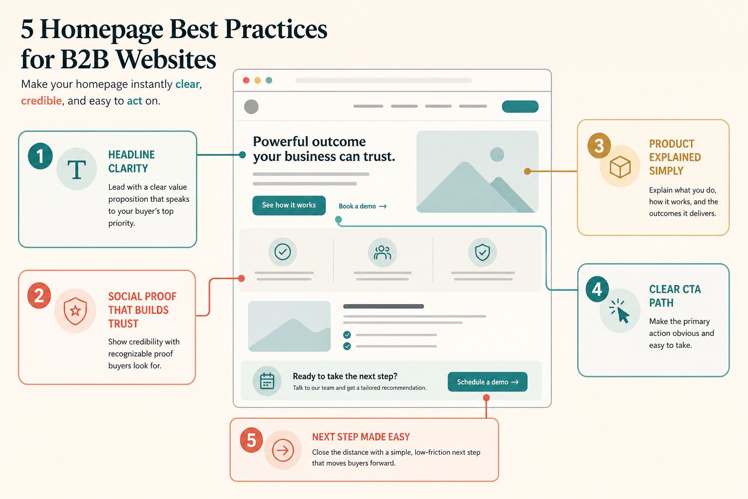
The five best practices
1. Lead with a clear category and outcome
The homepage hero should help the right buyer self-identify quickly. A strong hero makes the audience, the problem, the outcome, and the difference clear.
Help [specific team] solve [specific problem] without [specific friction].If your team cannot complete that sentence cleanly, the public headline will probably drift into vague category language.
2. Put proof next to the promise
Proof should reduce doubt before the visitor starts to drift. Use outcome context, recognizable customer evidence, implementation clarity, or deployment trust cues near the claim they support.
- Do not rely on a generic logo wall to do all the credibility work.
- Do not use metrics without explaining what changed or for whom.
- Do not hide the first real evidence below several decorative sections.
3. Explain the product simply before you sell the meeting
Many B2B homepages jump from slogan to demo CTA without helping the visitor understand what the product actually does. Show the workflow, the input, the output, and how it fits into the buyer's current stack or process.
4. Make the CTA path match buyer intent
Pick one primary action based on the buying motion. `Book a demo` works when live qualification matters. `Start free` works when time-to-value is fast. `View pricing` works when transparency helps qualify serious buyers earlier.
Give the most likely next step the strongest visual weight.
Offer pricing, product walkthrough, or examples without equal competition.
5. Close the distance to the next step
A low-friction homepage answers the last buyer question before commitment: what happens after booking, who the product is best for, how hard implementation is, or whether the visitor can see the workflow first.
Clutter versus clarity
Most homepage improvement work is subtraction. Remove competing hero messages, repeated CTA clusters, decorative sections that do not help qualification, and proof that looks impressive but does not resolve doubt.
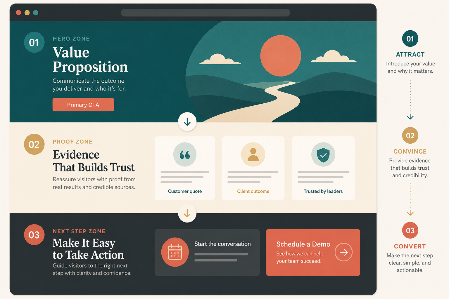
Recommended homepage section order
A practical B2B homepage usually works best in this order: hero, immediate proof, product explanation, supporting sections, then the closing CTA.
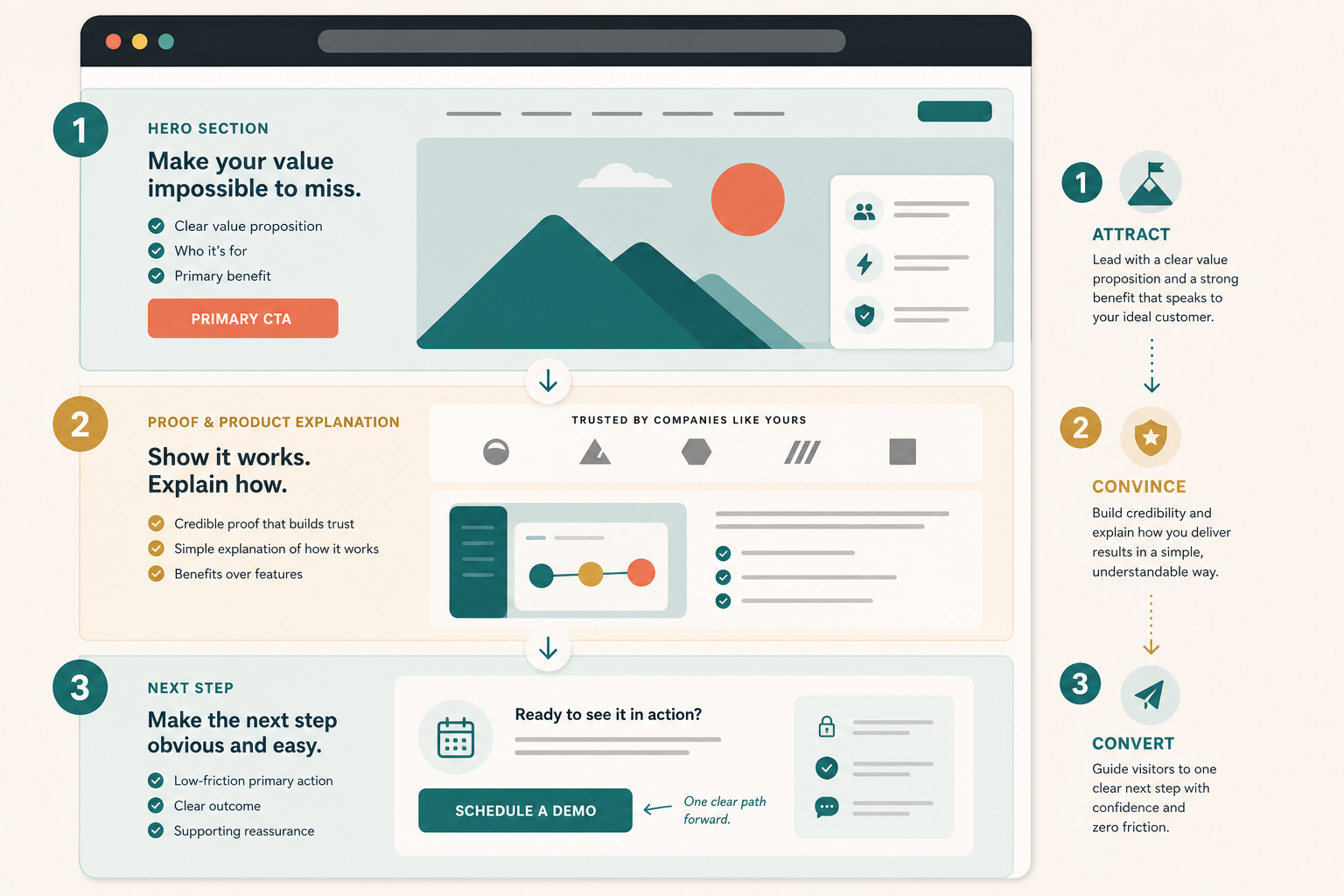
- Attract with clear audience, problem, outcome, and one main CTA.
- Convince with nearby proof and a simple product explanation.
- Convert with one cleaner path that answers the last real objection.
Good use versus poor use
Good use
- Writing the homepage for one buying motion instead of all of them.
- Showing proof where the main doubt appears.
- Explaining the workflow in plain language before asking for time.
- Using one primary CTA with one softer fallback.
- Leaving enough detail for a buyer or AI assistant to summarize the offer accurately.
Poor use
- Treating the homepage like a brand manifesto.
- Hiding the product behind abstract copy.
- Asking for a demo before the visitor understands what the product does.
- Stuffing every possible CTA into the hero.
- Using SEO terms that never answer a real buyer question.
SEO and AEO checks for a B2B homepage
Based on Google's SEO Starter Guide, the right baseline is simple: help search engines understand the page, and help users decide whether they should visit.
- Name the product category and primary use case in visible text.
- Keep the main value proposition in HTML text, not only in images or video.
- Use headings that reflect buyer questions, not only brand slogans.
- Keep metadata, on-page claims, and structured data aligned to the same story.
- Use alt text that explains what each image teaches the reader.
- Keep structured data tied to visible page content.
- Check practical performance basics so the hero and CTA still feel responsive.
AEO is an inference from those same rules: if a search engine or assistant cannot summarize who the product is for and what it does from the page itself, the homepage is still too vague.
Test before you ship
- Open the page in a fresh browser session.
- Give yourself 10 seconds to answer who the product is for, what it does, and what the next step is.
- Scroll once and check whether the first proof block actually supports the hero claim.
- Ask whether the page explains the product before it asks for commitment.
- Click the primary CTA and complete the path on desktop and mobile.
- Ask one teammate outside marketing or design to summarize the homepage after one pass.
- Check title, meta description, canonical URL, structured data, and performance basics after the copy changes are live.
Where TitleFlash fits
TitleFlash is not the homepage strategy. It is one supporting return-path tactic after the homepage already makes sense.
If a qualified B2B buyer opens pricing, product, or demo pages in another tab and gets distracted, a short inactive-tab title can help them notice the page again. That works best after the message, proof, and CTA path are already clear.
Use return-path tactics after clarity is working.
The exported TitleFlash script is self-contained. It does not call TitleFlash after installation, does not load a TitleFlash CDN, and does not send visitor analytics back to TitleFlash at runtime.
Explore TitleFlash