Website launch
Website Launch Checklist for Founders: What to Fix Before You Drive Traffic
Launching a website feels like the finish line, but it is usually the start of the first useful feedback loop.
On this page
The quick answer
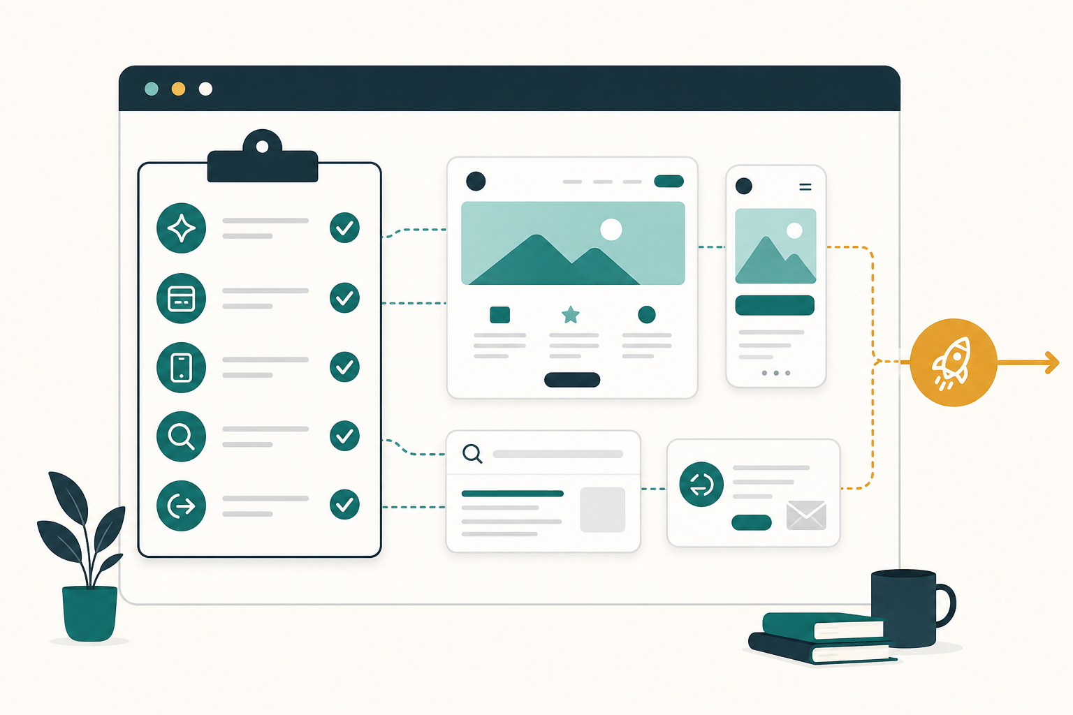
Before you drive traffic to a new website, confirm five things:
- The first screen says who the site is for, what problem it solves, and what the visitor should do next.
- The main CTA works on desktop and mobile, including forms, booking, checkout, email links, and thank-you states.
- The offer feels trustworthy enough to act on, with visible pricing or next-step expectations, contact details, proof, and support links where they matter.
- Search and measurement basics are live: analytics, Search Console, indexable pages, sitemap, page titles, meta descriptions, and useful internal links.
- Visitors who leave mid-task have a reasonable way back, such as saved state, opted-in follow-up, or a calm browser-tab reminder for unfinished work.
If one of those fails, fix it before spending real money on traffic.
Why this matters
More traffic does not make a weak page easier to understand. It only makes the weakness visible faster.
- The visitor cannot understand the page quickly enough.
- The visitor understands the page but does not trust the next step.
- The visitor tries the next step and something breaks, feels slow, or feels unclear.
A good launch checklist catches those problems before they become wasted ad spend, confusing outreach replies, or search visitors who bounce before they understand the offer.
Fix these before traffic
1. First-screen clarity
Open the homepage or landing page on a normal laptop screen and a phone. Without scrolling, a new visitor should understand who this is for, what problem it helps with, what changes after they use it, and what the next step is.
Weak first-screen copy usually sounds broad: "Grow smarter," "Unlock efficiency," or "The future of customer engagement." Stronger copy names the buyer, the situation, and the outcome.
For [specific audience] who need [specific outcome], [product] helps you [specific job] without [specific friction].2. One primary next step
Every important page needs one obvious next step. A homepage can have secondary links, but the main path should be unmistakable.
- The primary CTA appears in the first screen.
- Button copy says what happens next, such as "Book a demo," "Start free," "View pricing," or "Download checklist."
- The CTA leads to a working destination.
- The page does not ask a cold visitor to choose between five equal actions.
3. Forms, booking, checkout, and contact routes
Run the complete action path yourself before sending traffic.
- Contact form submission.
- Demo booking or calendar flow.
- Checkout or payment link.
- Signup and email confirmation.
- Mobile keyboard behavior on inputs.
- Success, error, and thank-you states.
- Notification delivery to the right inbox or CRM.
If a lead arrives and nobody sees it, the website is not launched.
4. Trust and offer clarity
Visitors do not need a giant proof wall, but they need enough confidence to continue.
- What does this cost, or what happens before pricing is shown?
- Who is behind the product?
- How does support work?
- What data or access does the product need?
- What proof, examples, screenshots, or references make the promise believable?
- Are privacy, terms, billing, or support pages easy to reach when they matter?
Do not invent proof. A clear product walkthrough is better than fake logos, vague testimonials, or inflated claims.
5. Mobile and speed basics
Open the page on a real phone, not only a desktop browser narrowed to mobile width.
- The hero, CTA, form, pricing, and footer fit without horizontal scrolling.
- Buttons are easy to tap.
- The page does not jump while loading.
- The largest visual content appears quickly enough to keep the page feeling alive.
- Menus, accordions, and forms work with touch.
For a practical performance pass, watch Core Web Vitals: Largest Contentful Paint, Interaction to Next Paint, and Cumulative Layout Shift.
6. Measurement and discovery basics
You do not need an analytics stack with twenty events on day one. You do need enough signal to know whether the launch worked.
- Install one analytics tool and confirm it records page views.
- Set up Google Search Console or the search console for the search engine you care about.
- Submit or verify a sitemap if the site has one.
- Confirm important pages are not blocked by
robots.txtornoindex. - Give each page a unique, descriptive title and meta description.
- Use internal links so visitors and crawlers can find the important pages.
- Add structured data only when it accurately describes visible page content.

SEO and AEO launch check
For a founder site, SEO and AEO are not separate from clarity. Search engines, answer engines, and AI assistants all need pages that are specific, crawlable, and easy to summarize.
- Put the real answer on the page, not only inside images, video, or JavaScript-only UI.
- Use descriptive headings that match the questions your buyer asks.
- Define the product category in plain language.
- Add examples, constraints, pricing context, setup details, or comparison criteria where useful.
- Keep important facts consistent across the page, sitemap, structured data, and agent-readable files if your site has them.
- Use image alt text that explains the information in the image.
- Avoid fake FAQ sections that exist only for search.
Google's SEO Starter Guide frames SEO as helping search engines understand content and helping users decide whether to visit. That is the right standard for AEO too: write pages that are useful enough for a person and explicit enough for a machine to quote accurately.
Return-visitor basics
Some visitors will leave because they are comparing options, asking a teammate, checking pricing, or opening your site between meetings. The right fix depends on the page.
| Page moment | Useful return path | Avoid |
|---|---|---|
| Long form or onboarding | Save progress and show a clear resume point | Making the visitor restart from the first field |
| Pricing or demo page | Keep the plan, calendar, or demo details easy to find | Hiding key details behind repeated forms |
| Cart or checkout | Preserve cart state and show delivery, tax, and return details clearly | Surprise costs after the visitor returns |
| Guide or resource | Keep headings scannable and add related next steps | Forcing newsletter capture before value |
| Browser tab left open | Use a calm inactive-tab reminder after the visitor switches away | Flashing titles rapidly or changing titles while active |
The first seven days after launch
The first week is not for random changes. It is for watching where the page fails and fixing the highest-friction paths first.

Day 1: test the action path again
Submit forms, book a test meeting, run checkout, and click every header and footer link.
Days 2 to 3: tighten the first screen
Ask two people who match your target reader to open the page for 10 seconds, then tell you what the product does and what they would click next.
Days 4 to 5: review discovery and behavior signals
- Which pages were visited.
- Which traffic sources sent visitors.
- Whether search tools found crawl or indexing issues.
- Whether mobile visitors behave differently from desktop visitors.
- Whether people reach the CTA but fail to complete it.
Day 6: add or improve return paths
If visitors leave important pages open, make the path back clearer. Preserve form state, keep pricing details accessible, or use a short inactive-tab title on a cart, pricing, demo, or guide page.
Day 7: run a small traffic test
After the basic path stays clean for a couple of days, send a small amount of higher-intent traffic. Use the result to decide what to fix next before scaling.
Good use versus poor use
| Good use | Poor use |
|---|---|
| Fixing the CTA path before buying ads. | Driving paid traffic to learn that the form is broken. |
| Writing a clear headline for one specific audience. | Publishing broad copy because it sounds bigger. |
| Checking mobile behavior on a real phone. | Assuming desktop QA covers mobile visitors. |
| Adding Search Console, sitemap, titles, and crawlable content early. | Treating SEO as something to bolt on months later. |
| Adding a calm return path after the page already makes sense. | Using popups or tab reminders to compensate for unclear messaging. |
Test before you ship
- Open the site in a fresh browser session.
- Read only the first screen and say the audience, value, and next step out loud.
- Click the primary CTA and complete the path.
- Repeat on a real phone.
- Turn off any browser extensions that may have helped during development.
- Check the page title, meta description, canonical URL, sitemap, and
robots.txt. - Submit one real test lead and confirm the team receives it.
- Ask one person outside the build team whether the page feels clear enough to trust.
Mistakes to avoid
- Buying traffic before the main action path works.
- Asking every visitor to "contact us" when the page has not explained the offer.
- Hiding pricing, requirements, or setup friction that a serious buyer needs to know.
- Measuring everything except the one action that matters.
- Treating AI visibility as a metadata trick instead of a content clarity problem.
- Adding aggressive interruption tactics before fixing page comprehension.
Where TitleFlash fits
TitleFlash helps after the launch basics are working.
If a visitor leaves a cart, pricing page, demo page, setup flow, or guide open in another tab, a short inactive-tab title can make the page easier to notice again. Use it as a calm return path, not as a substitute for clear messaging.
The exported TitleFlash script is self-contained. It does not call TitleFlash after installation, does not load a TitleFlash CDN, and does not send visitor analytics back to TitleFlash at runtime.
Final checklist
- The first screen says who the site is for, what it helps with, and what to do next.
- The primary CTA works on desktop and mobile.
- Forms, booking, checkout, and notification routes are tested.
- Trust, pricing, support, privacy, and contact basics are visible where they matter.
- Search and measurement basics are active.
- Important content is crawlable and easy for a person or agent to summarize.
- Return paths support unfinished work without pressuring visitors.
- The first-week review loop is ready before traffic scales.
Useful source checks
Add a calm return path after launch.
Build a browser-tab reminder, preview the inactive-tab moment, and export a self-contained script when you want a return path that your site owns.
Build a tab-title flow free