Retention checklist
Website Visitor Retention: Simple Fixes Before Buying Another Analytics Tool
If visitors leave your site quickly, another analytics tool is not always the next best purchase.
On this page
The quick answer
Before you buy another analytics tool, check whether the traffic matches the page, whether the first screen is clear, whether the path is easy to finish, whether the site preserves progress, and whether a return path exists for unfinished work.
- Confirm the traffic source matches the page promise.
- Make the first screen answer what the page is, who it is for, and what to do next.
- Reduce obvious friction in speed, navigation, and forms.
- Preserve useful state such as cart contents, selected plans, or partially completed steps.
- Add a calm return path only where visitors are clearly leaving unfinished work behind.
If you cannot explain why visitors should stay, where they get stuck, and what should happen next, more reporting usually gives you more screenshots of the same problem.
Why more analytics is not always the first fix
Analytics can tell you where attention drops. It does not automatically fix why people leave.
- The page loads slowly.
- The headline does not match the ad, search result, or email that sent the visitor.
- The next step is buried below clutter.
- The navigation makes the visitor choose too many paths.
- The form asks for more work than the visitor expected.
- The site forgets the visitor's progress when they come back later.
If those issues are obvious in a normal browser session, fix them before paying for more measurement.
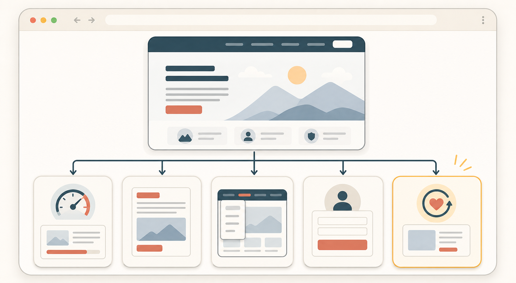
The retention checklist
1. Check traffic quality first
Do not treat every short visit like a page failure. Sometimes the wrong people are landing on the right page. Sometimes the right people are landing on the wrong page.
- Check whether the ad, email, or search snippet matches the page they reached.
- Check whether the page intent is informational, evaluative, or transactional.
- Check whether a visitor from that source would reasonably expect the next step you are offering.
Observable check: ask whether a first-time visitor would feel correctly landed within five seconds.
2. Make the first screen do more work
The first screen should answer three questions quickly:
- What is this page?
- Why should I care?
- What do I do next?
- Put the page promise in plain language.
- Show one clear next action.
- Remove visual noise that competes with the main decision.
- Surface trust details only where they help the next action.
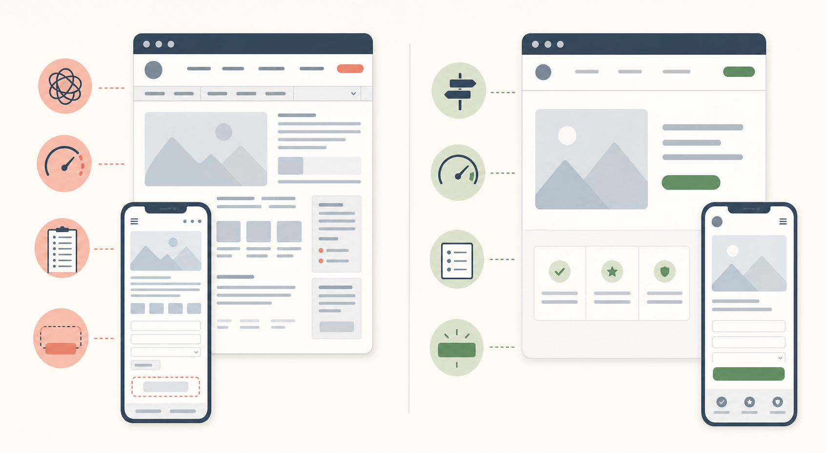
3. Remove friction before adding persuasion
- Page speed: reduce obvious delay in the first meaningful load.
- Navigation: keep the path to the next step obvious.
- Forms: ask for fewer fields up front.
- Calls to action: make the next move visible without forcing it.
- Layout: reduce competing panels, popups, and repeated choices.
Observable check: if someone unfamiliar with the page pauses to ask where to click, what happens next, or why you need that field, the page still has retention friction.
4. Preserve useful progress
Retention improves when a return visit feels like a continuation instead of a restart.
- A cart still contains the same items.
- A selected pricing plan stays selected.
- A multi-step setup flow resumes at the right step.
- A long guide or lesson is easy to continue.
Do not claim saved progress unless the site really preserves it.
5. Add a calm return path
Only after the page is clear and the progress is preserved should you consider return tactics.
- A saved cart or account reminder.
- A permission-based email for known visitors.
- A calm browser-tab reminder for an unfinished task.
- A clear bookmarkable resource page for content.
Which fixes should you do first
| If the main problem is... | Start with... | Not with... |
|---|---|---|
| Traffic that does not match the page intent. | Tighter message match between source and landing page. | More event dashboards. |
| Visitors do not understand the page quickly. | A clearer headline, subhead, and next step. | A new reporting subscription. |
| Visitors stall during the task. | Faster load, simpler navigation, and fewer form fields. | More popups or layered prompts. |
| Visitors leave and lose their place. | Saved state and a stable return path. | Reminder copy that promises a saved state you do not keep. |
| Visitors compare tabs and forget to return. | A calm reminder on pages with real unfinished work. | Aggressive attention tactics across the whole site. |
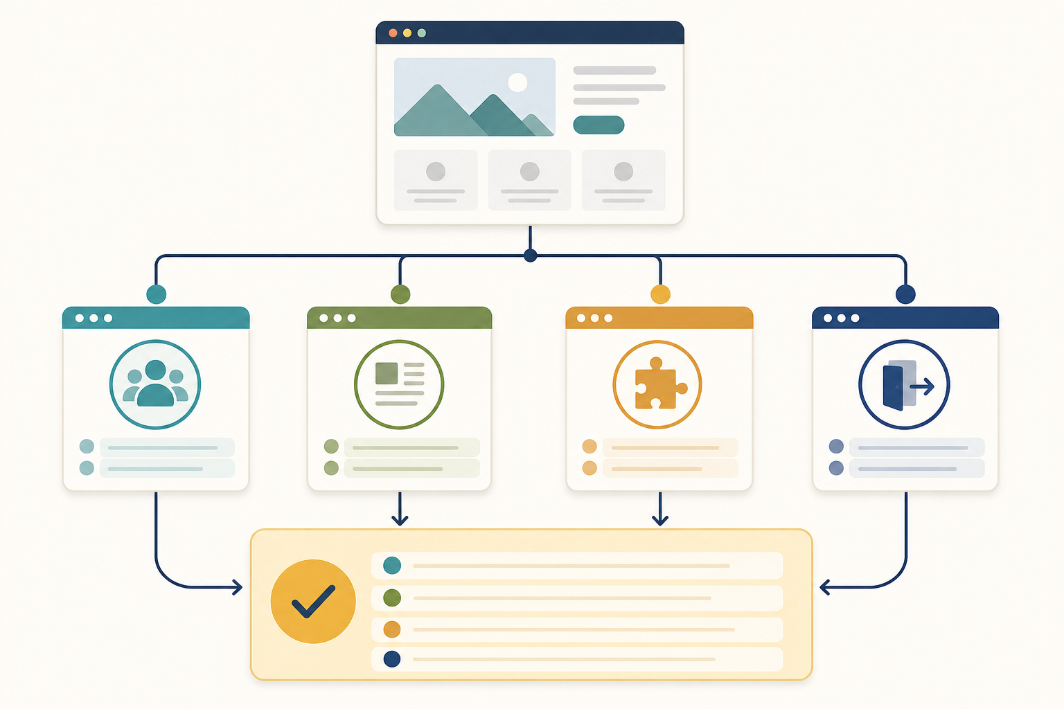
A practical review pass you can run today
- Open your top landing page on desktop and mobile.
- Write down the page promise in one sentence.
- Check whether the first screen supports that promise clearly.
- Complete the main task yourself and count every avoidable pause.
- Leave the page, come back later, and see whether progress is preserved.
- Ask one teammate to do the same task without explanation.
If two people struggle in the same place, you already have a better next action than buying more reporting.
Good use versus poor use
| Good use | Poor use |
|---|---|
| Fixing the page headline when the source message and landing page do not match. | Studying a drop-off chart for another week while the mismatch remains obvious. |
| Shortening a form before running more retargeting. | Adding another popup on top of the same long form. |
| Saving cart or setup progress so a return visit feels easy. | Saying "saved" when the visitor must start over. |
| Adding a browser-tab reminder only on pages with clear unfinished work. | Running attention tactics on every page, including pages with no meaningful next step. |
If a human review can spot the problem in one session, start there.
Test before you ship changes
- The traffic source and landing page promise still match.
- The first screen makes the next step obvious.
- The main path works on desktop and mobile.
- The page does not ask for unnecessary fields or clicks.
- Saved state works on a realistic return visit.
- Any reminder appears only after the visitor actually leaves the active page.
Change one or two things at a time, then re-check behavior. A smaller improvement you can explain is better than five changes you cannot attribute.
When another analytics tool does make sense
- You already fixed the obvious clarity and friction issues.
- You need deeper segmentation or journey analysis that your current tools truly cannot provide.
- Several possible causes remain and you need better instrumentation to separate them.
Do not buy it as a substitute for checking whether the page is confusing, slow, or forgetful.
Where TitleFlash fits
TitleFlash fits near the end of this checklist, not the beginning.
It is useful when visitors leave a page with real unfinished work, such as a cart, pricing comparison, setup step, or long guide, and you want a calm browser-tab reminder that helps them recognize the page later.
The exported script is the runtime. It does not call TitleFlash after installation, does not load a TitleFlash CDN, and does not send visitor analytics back to TitleFlash.
Final checklist
- Traffic source and landing page promise match.
- The first screen explains the page and next step quickly.
- Load, navigation, and form friction have been reduced.
- Useful progress is preserved across a return visit.
- Return tactics are limited to pages with real unfinished work.
- More analytics is only added after the obvious page issues are fixed.
Build a calm return-path reminder.
Draft the message, preview the inactive-tab moment, and export a self-contained script when your page already deserves the return visit.
Build a tab-title flow free